Loading subject page…


1,442 views


Video Summary: What Is Producer Surplus Graphical Explanation
Ever wonder why Apple can profit billions from iPhones priced far above manufacturing costs? The producer surplus graphical explanation reveals how businesses capture value between their minimum selling price and actual market price. This economic concept visualizes the triangular area above the supply curve and below market price on standard supply-demand graphs. For instance, if Tesla is willing to sell Model 3s for $25,000 minimum but markets them at $35,000, the difference represents producer surplus across all units sold. Watch the full video on JoVE Coach to master this concept with expert-led visuals and step-by-step explanations.
Producer surplus graphical explanation represents one of microeconomics' most visual and intuitive concepts. Unlike abstract economic theories, producer surplus appears as a clear triangular region on supply-demand graphs, making it accessible for students tackling AP Economics or introductory college courses.
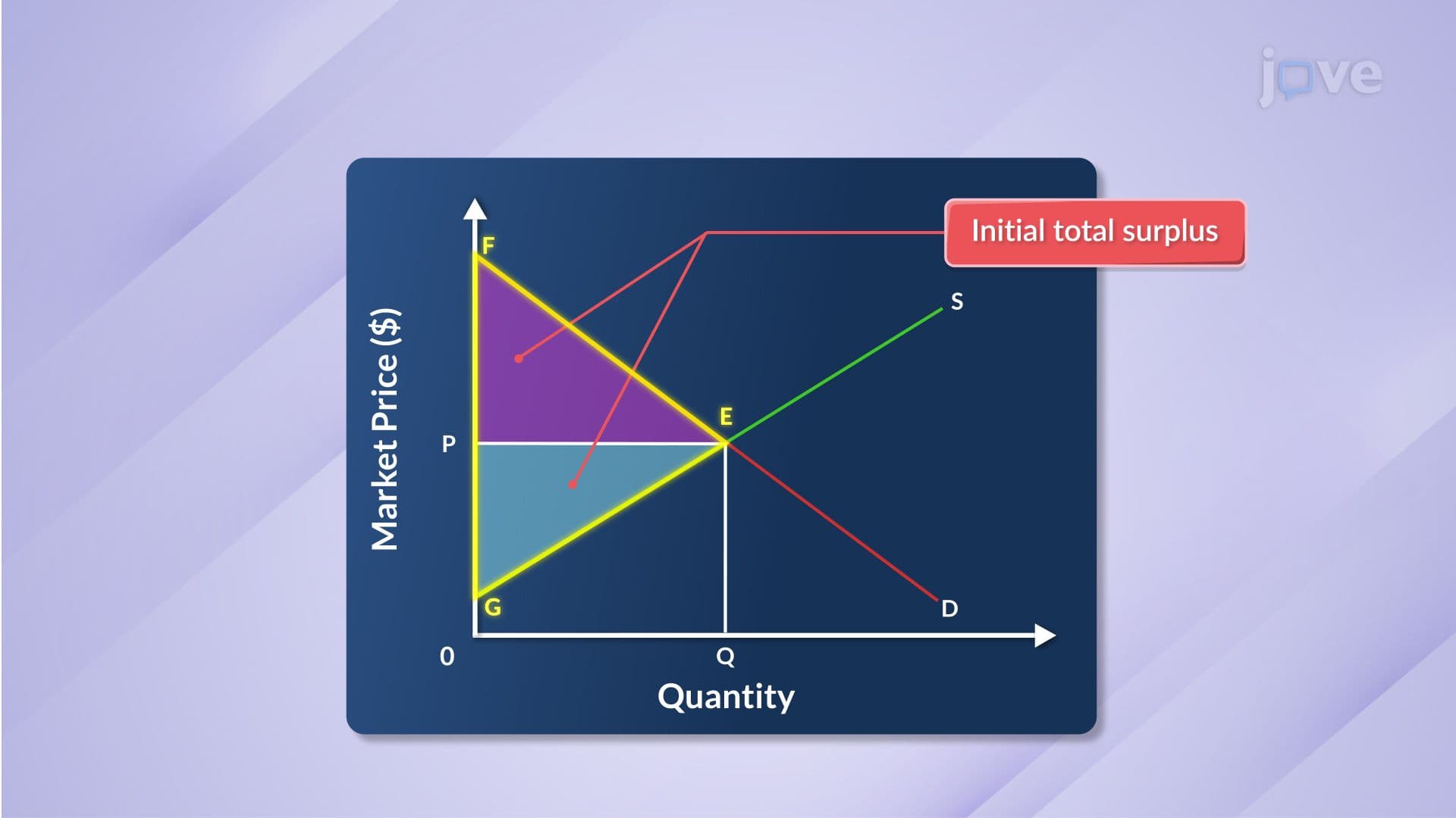
The concept builds on a simple premise: producers often receive more than their minimum acceptable price. This difference, multiplied across all units sold, creates measurable economic value. On graphs, this value manifests as the area above the supply curve and below the prevailing market price, bounded by the quantity actually sold.
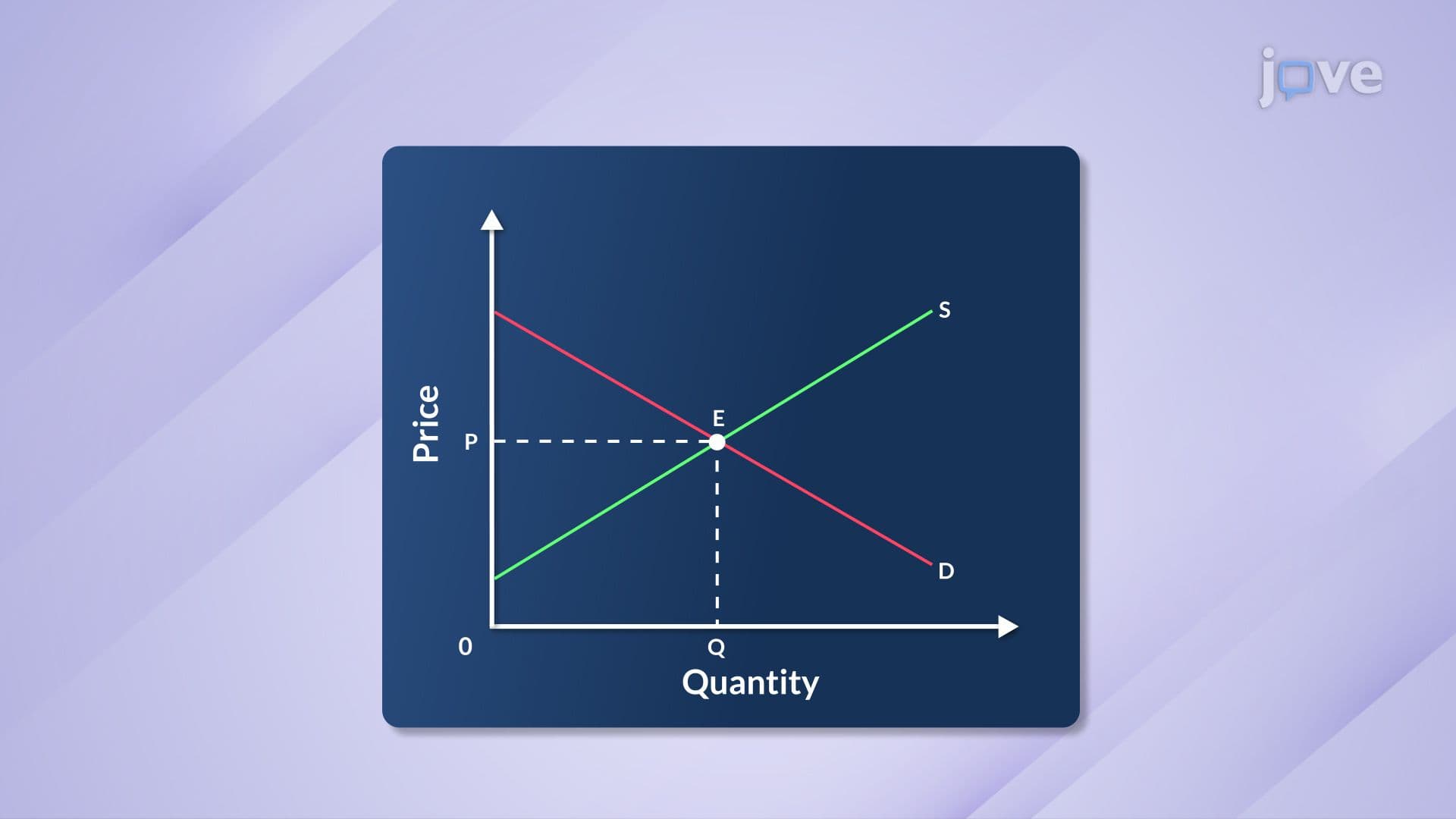
The producer surplus graphical definition relies on three distinct boundaries forming a triangle. The supply curve forms the bottom boundary, representing the minimum price producers accept for each unit. This curve typically slopes upward, reflecting increasing marginal costs as production expands.
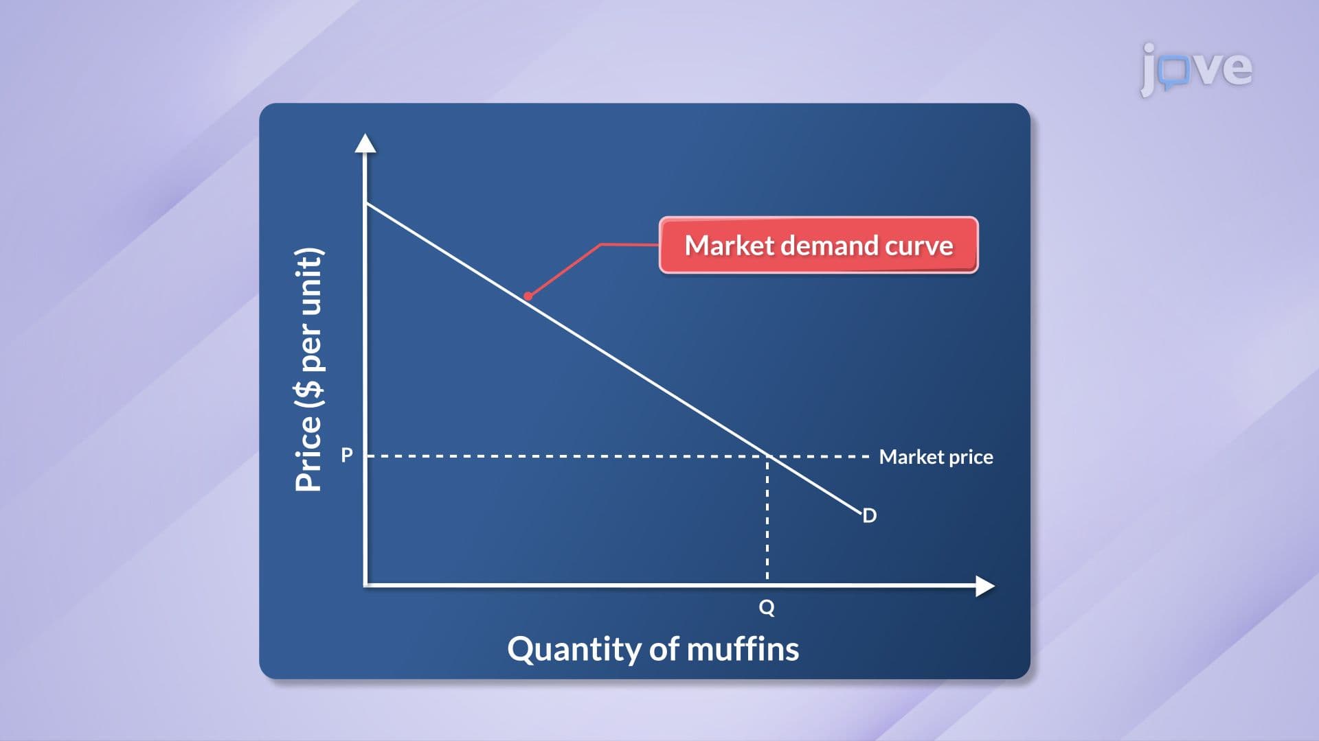
The horizontal market price line forms the top boundary. This price, determined by supply-demand intersection, represents what consumers actually pay. The vertical line at equilibrium quantity forms the triangle's base, showing how many units change hands at market price.
Consider Netflix's streaming service: if they'd accept $5 monthly minimum but charge $15, every subscriber generates $10 in producer surplus. Multiply this across 230 million US subscribers, and the surplus becomes substantial.
Students preparing for standardized tests like the SAT Subject Tests or AP Microeconomics frequently encounter producer surplus calculations. The formula uses basic geometry: Producer Surplus = 0.5 × base × height.
The base equals the equilibrium quantity sold. The height represents the difference between market price and supply choke price (where supply curve intersects the vertical axis). For linear supply curves, this calculation remains straightforward.
Real-world applications appear in industries like pharmaceuticals, where companies like Pfizer price medications significantly above marginal production costs, or technology sectors where Microsoft prices software far above replication costs.
Producer surplus overview concepts appear throughout American economics education. High school students encounter these graphs in AP Microeconomics courses, while college undergraduates explore more complex applications in intermediate microeconomics.
The concept proves particularly relevant when analyzing US agricultural markets. Consider corn producers: if farmers would sell corn for $3 per bushel minimum but market price reaches $6, the $3 difference multiplied across millions of bushels represents enormous producer surplus captured by American farmers.
Understanding producer surplus helps students analyze market efficiency, government intervention effects, and business strategy implications-skills valuable for future economics courses and real-world business decisions.
Related Micro-courses