Loading subject page…

280 views

Video Summary: What are Graphical Representation of Inequalities
Ever wondered how NASA engineers determine safe flight zones for spacecraft launches? The graphical representation of inequalities transforms mathematical relationships into visual regions on coordinate planes, making complex boundary conditions instantly understandable. When chemical engineers at companies like DuPont monitor reactor temperatures, they use inequality graphs to identify safe operating zones where temperature stays below critical thresholds. These powerful visualization tools convert abstract mathematical concepts into clear, shaded regions that show exactly where conditions are met or violated. Watch the full video on JoVE Coach to master this concept with expert-led visuals and step-by-step explanations.
The graphical representation of inequalities serves as a bridge between abstract algebra and visual mathematics, transforming complex mathematical relationships into intuitive coordinate plane diagrams. Unlike equations that define precise curves or lines, inequalities create regions-entire areas of the coordinate plane where specific conditions remain true. This fundamental shift from points and curves to areas and regions makes inequality concepts accessible to students while providing powerful problem-solving tools for real-world applications.
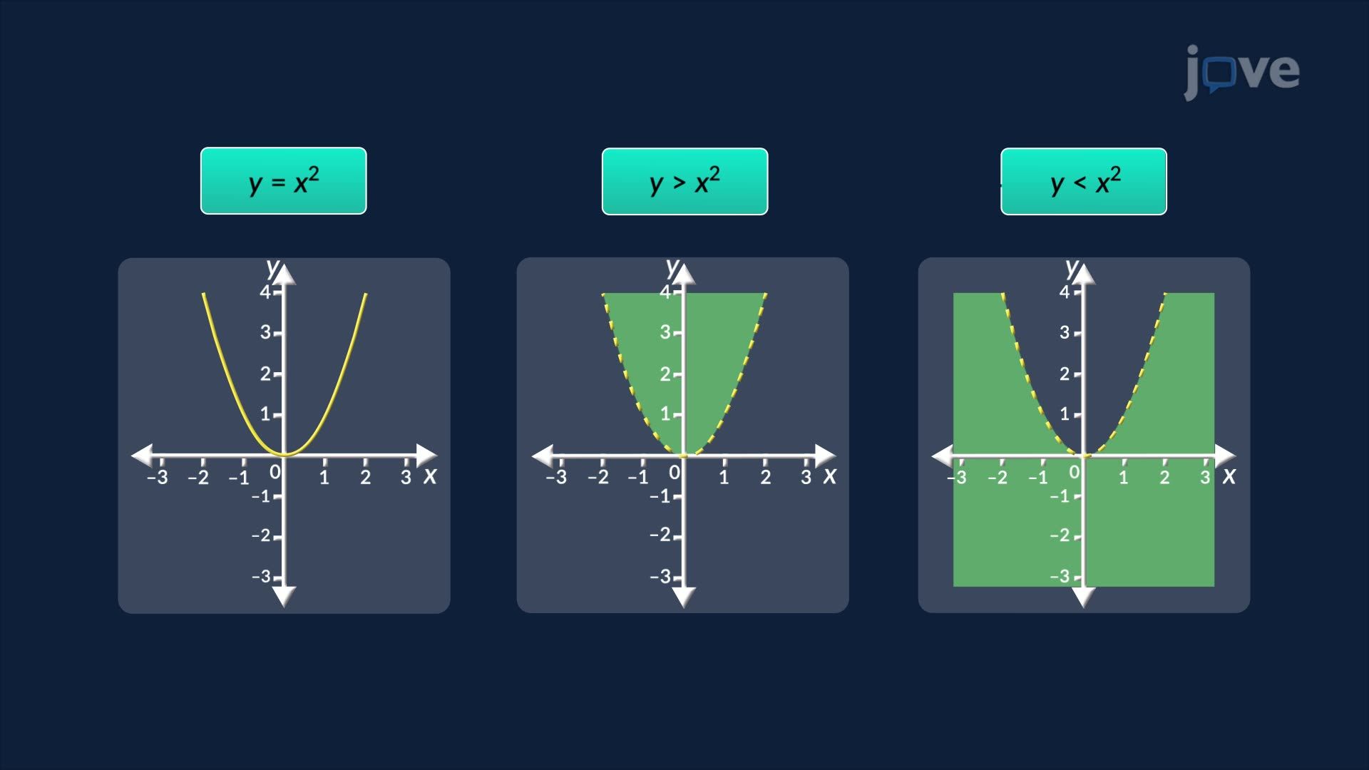
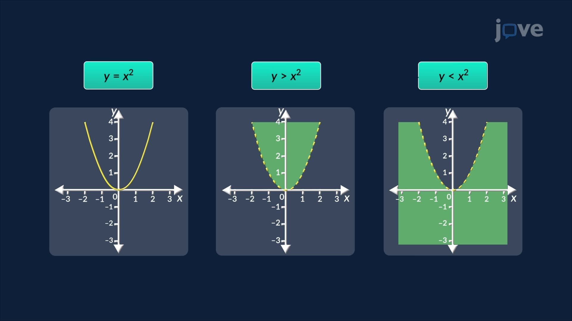
Different inequality symbols create distinct visual representations on coordinate planes. When graphing y > x², the parabolic boundary appears as a dashed curve, indicating that points exactly on the parabola don't satisfy the inequality. Conversely, y ≥ x² produces a solid boundary line, showing that parabola points are included in the solution set. This visual distinction between inclusive and exclusive boundaries proves crucial in applications like engineering tolerance specifications, where NASA engineers must clearly differentiate between acceptable and unacceptable operating parameters for spacecraft systems.
Linear inequalities like y < 2x + 3 create straight-line boundaries that divide planes into half-regions, while quadratic inequalities generate parabolic boundaries creating interior and exterior regions. Each type requires specific graphing techniques and offers unique applications in fields ranging from economics to environmental science.
The graphical representation of inequalities overview includes systematic methods for identifying correct solution regions. The test point method involves selecting coordinates from each region created by the boundary and substituting them into the original inequality. If a test point satisfies the inequality, its entire region gets shaded; if not, the opposite region becomes the solution area.
Consider the inequality y ≤ -x² + 4. After graphing the downward-opening parabola with vertex at (0,4), test point (0,0) gives 0 ≤ -0 + 4, which simplifies to 0 ≤ 4-true. Therefore, the region containing the origin gets shaded. This methodical approach eliminates guesswork and ensures accuracy in complex multi-step problems common on AP Calculus and SAT Math Level 2 exams.
Understanding graphical representation of inequalities proves essential across multiple academic disciplines and professional fields. Environmental engineers use inequality graphs to model pollution dispersal patterns, shading regions where contaminant concentrations exceed EPA safety limits. Economics students apply these concepts to constraint optimization problems, graphing feasible production regions for manufacturing companies.
In standardized testing contexts, inequality graphing appears frequently on AP Calculus AB/BC exams, SAT Subject Tests, and college placement assessments. Students typically encounter these concepts in Algebra II, Precalculus, and introductory college mathematics courses, making mastery crucial for academic progression in STEM fields.
Related Micro-courses