Loading subject page…
- Math Fundamentals
- Coordinates and Graphs
- Graphs of Equations in Two Variables
Micro-course: Coordinates and Graphs
397 views
Learn key concepts and earn your certificate.




Graphs of Equations in Two Variables

00:00
01:30
Video Summary: What are Graphs of Equations
Did you know that Netflix uses graphs of equations to predict which shows you'll binge-watch next? Graphs of equations transform abstract mathematical relationships into visual patterns that reveal hidden connections between variables. By plotting ordered pairs (x, y) that satisfy an equation, students can identify intercepts, analyze trends, and make predictions-like tracking Tesla stock prices or modeling pandemic spread across US states. What are graphs of equations becomes clear when you see how these visual tools bridge pure mathematics with real-world problem-solving. Watch the full video on JoVE Coach to master this concept with expert-led visuals and step-by-step explanations.
- Understand what are graphs of equations and how they visually represent mathematical relationships between two variables
- Identify x-intercepts and y-intercepts by setting variables to zero and interpreting their meaning in context
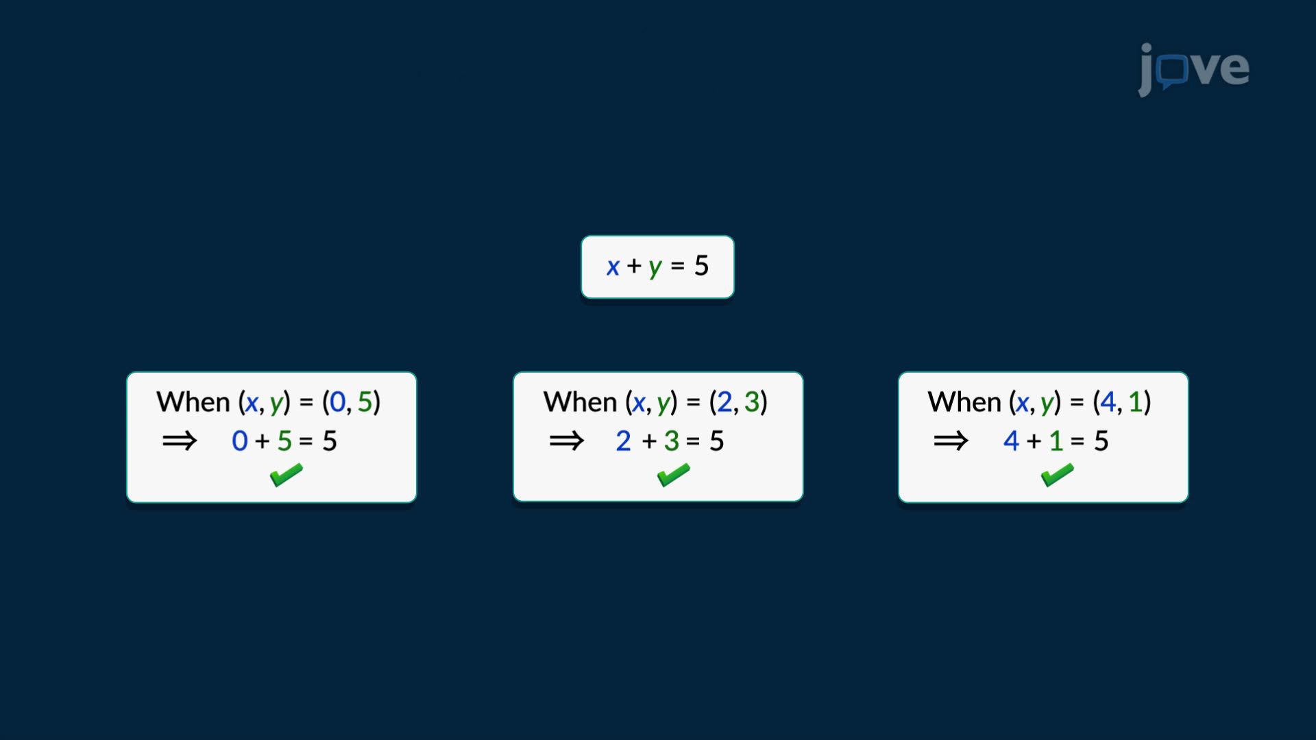
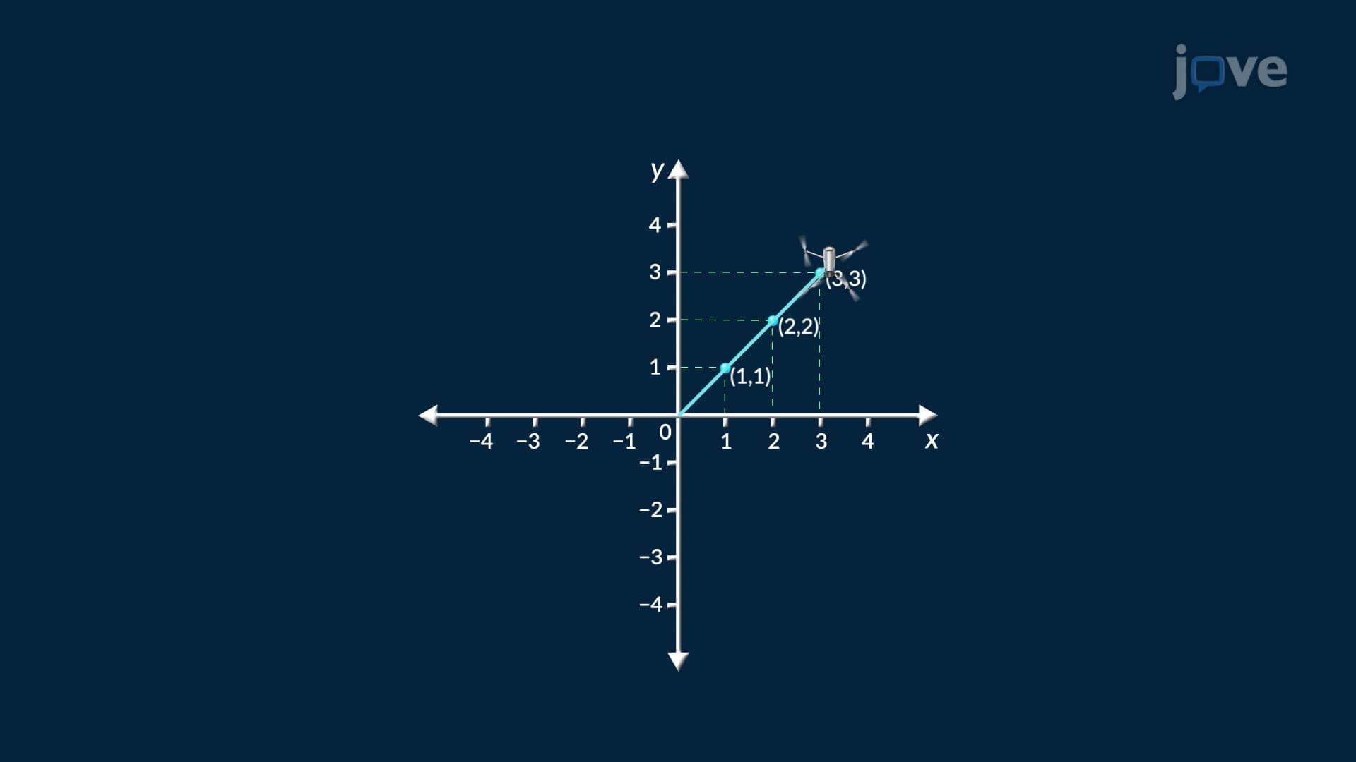
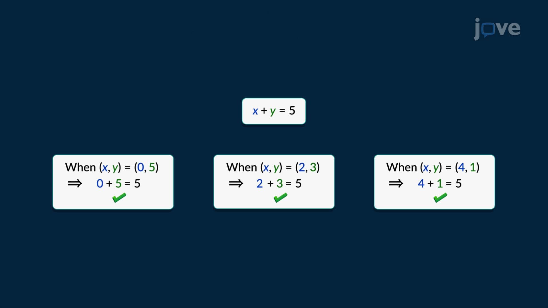
- Analyze the process of creating graphs by selecting x-values, calculating corresponding y-values, and plotting ordered pairs
- Compare different graph shapes (linear vs. curved) based on the underlying equation structure
- Apply graphing techniques to real-world scenarios like sales tracking, population growth, and scientific data analysis
- Evaluate trends and patterns in graphed data to make predictions about future behavior
- Recognize how graphing serves as a bridge between algebraic equations and visual problem-solving
- Explore the connection between equation types and their corresponding graph characteristics
Understanding What are Graphs of Equations
Graphs of equations serve as powerful visual translators, converting abstract algebraic relationships into concrete patterns we can see and interpret. When mathematicians developed coordinate systems in the 17th century, they revolutionized how we understand mathematical relationships. Today, these same principles help NASA track satellite orbits, economists model market trends, and epidemiologists predict disease spread across American communities.
Types of Graphs of Equations and Their Characteristics
The types of graphs of equations vary dramatically based on the underlying mathematical relationship. Linear equations produce straight lines, making them ideal for modeling constant rates of change like hourly wages or temperature conversion between Celsius and Fahrenheit. Quadratic equations create parabolic curves, perfect for modeling projectile motion-think of a baseball's path during a World Series game or the trajectory of SpaceX rocket launches from Kennedy Space Center.
Exponential equations generate curves that increase or decrease rapidly, modeling phenomena like viral social media posts or radioactive decay in medical imaging. Each equation type produces distinct visual signatures that trained students can recognize instantly, a skill heavily emphasized in AP Calculus and college algebra courses.
The Graphing Process: From Equations to Visual Insights
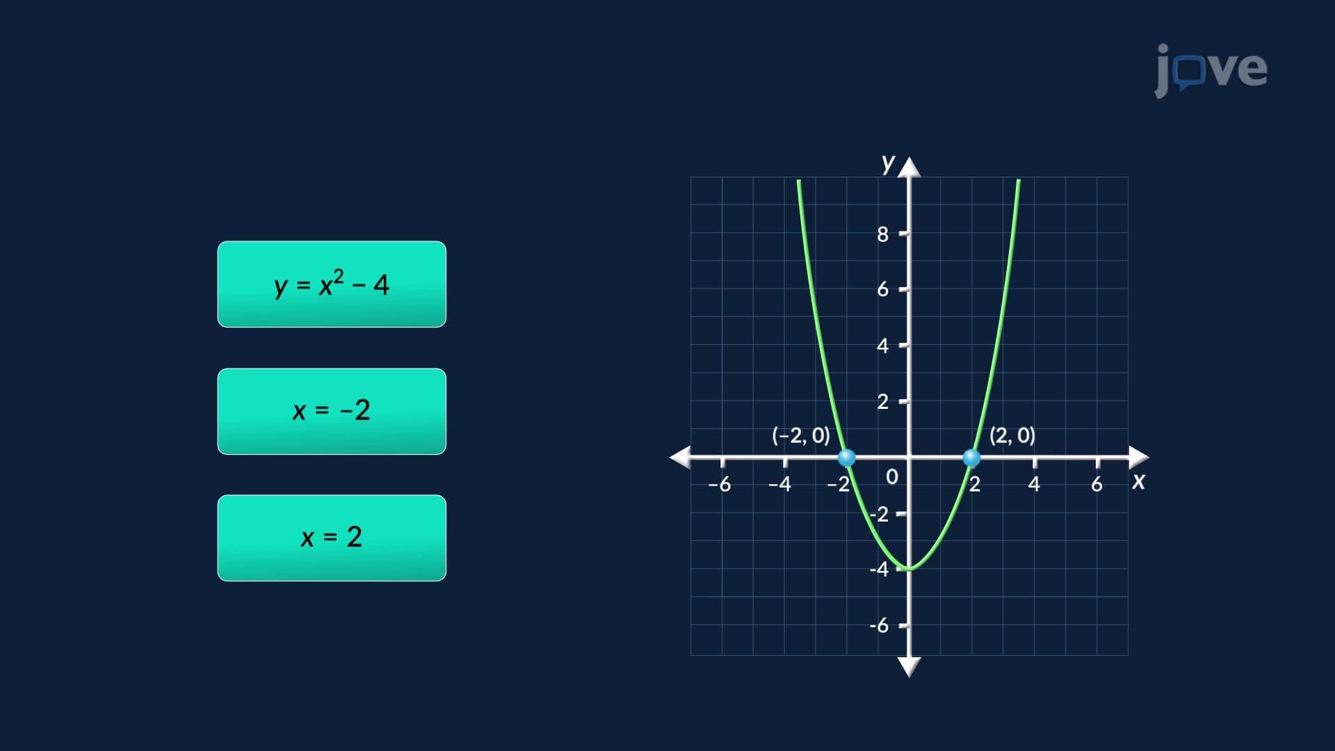
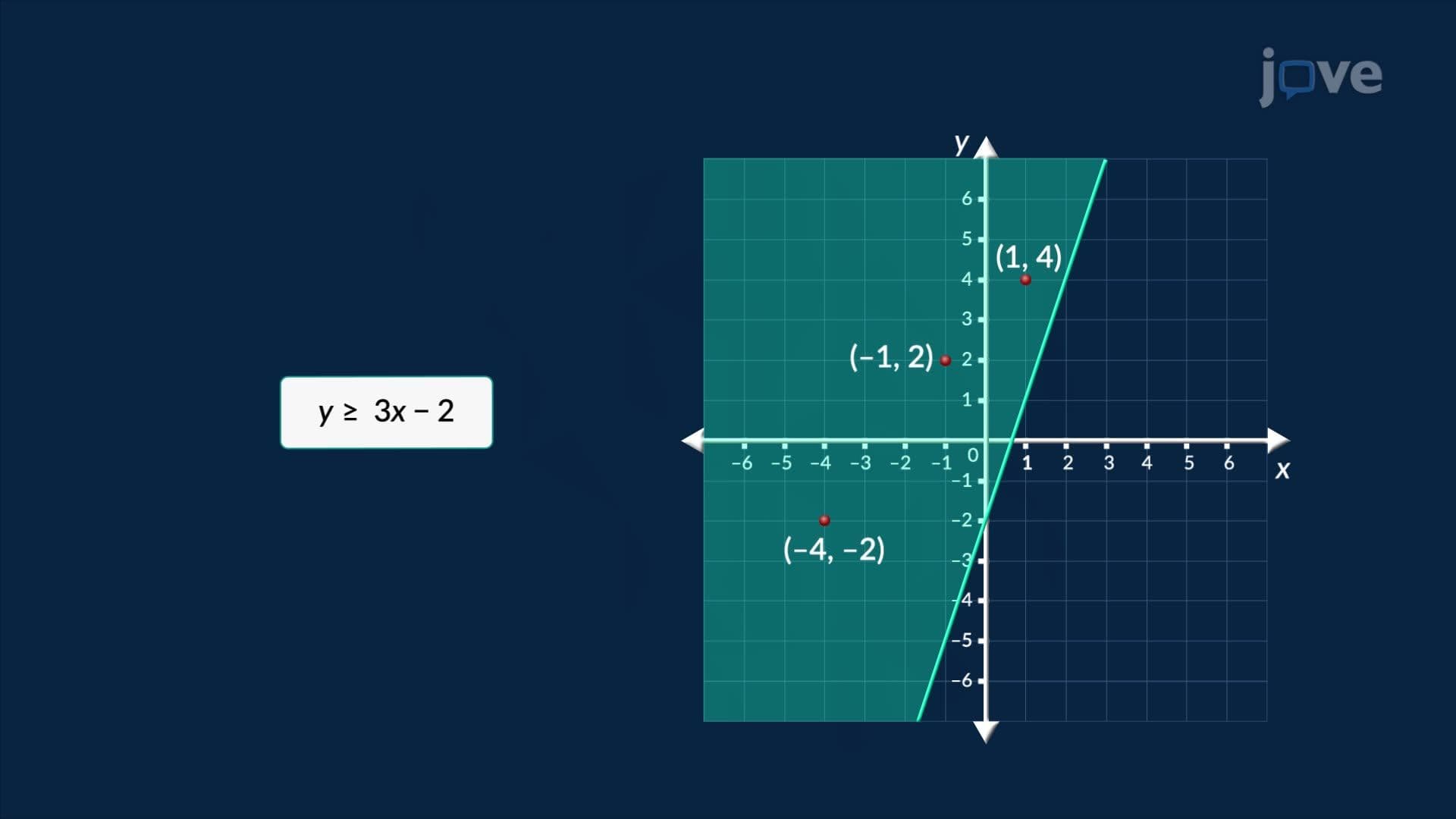
Creating accurate graphs requires systematic methodology. Students begin by selecting strategic x-values, including critical points like intercepts and boundary conditions. The x-intercept occurs where the graph crosses the horizontal axis (y = 0), while the y-intercept marks where it crosses the vertical axis (x = 0). These intercepts often carry real-world significance-in business contexts, the x-intercept might represent the break-even point where profit equals zero.
After calculating several ordered pairs, students plot these points on coordinate planes and connect them to reveal the underlying pattern. This process mirrors how data scientists at companies like Google analyze user behavior or how meteorologists track hurricane paths across the Atlantic.
Practical Applications in Academic and Professional Settings
Understanding graphs of equations proves essential for standardized tests like the SAT Math section, where students must interpret graphs representing everything from population demographics to environmental data. In AP Statistics courses, students use these skills to analyze correlation patterns, while pre-medical students apply similar concepts when studying dose-response relationships in pharmacology.
Professional applications span numerous fields: engineers graph stress-strain relationships for bridge design, economists plot supply and demand curves, and climate scientists track temperature changes over decades. These real-world connections demonstrate why mastering graph interpretation remains crucial for STEM careers and informed citizenship in our data-driven society.
Frequently Asked Questions
Graphs of equations are visual representations that show the relationship between two variables by plotting points that satisfy a mathematical equation. They transform abstract algebraic relationships into concrete patterns you can see, analyze, and interpret. Think of them as mathematical pictures that reveal how one quantity changes in response to another.
The SAT Math section frequently includes graph interpretation questions where you'll analyze trends, find intercepts, and determine equation types from visual patterns. AP Calculus exams emphasize understanding how equation characteristics translate to graph features like slope, curvature, and asymptotes. College algebra courses use graphing extensively for function analysis and real-world modeling problems.
You'll primarily work with linear equations (straight lines), quadratic equations (parabolas), and exponential equations (curves that grow or decay rapidly). Advanced courses introduce logarithmic, trigonometric, and polynomial functions. Each type produces distinctive graph shapes that help you identify the underlying mathematical relationship quickly during exams.
Netflix uses complex graphing algorithms to predict viewing preferences, while Tesla analyzes battery performance curves for electric vehicle optimization. The CDC graphs disease transmission rates during health emergencies, and Wall Street firms plot stock price movements to identify trading opportunities. These applications demonstrate how graphing skills directly translate to high-paying STEM careers.
No-you only need algebra fundamentals and coordinate plane familiarity to master essential graphing techniques. Most high school students successfully learn these concepts in Algebra I or Geometry courses. The key is practicing systematic approaches: selecting x-values, calculating y-values, plotting points, and connecting them logically.
Focus on recognizing graph types quickly and understanding intercept significance in context. Practice translating between equations, tables, and graphs using real data sets like US population trends or climate measurements. Time yourself solving mixed problems that combine algebraic manipulation with visual interpretation skills.
Rather than pure memorization, develop pattern recognition through consistent practice with diverse examples. Understanding why linear equations produce straight lines and quadratic equations create parabolas builds deeper comprehension than rote learning. This conceptual approach proves more valuable for college-level mathematics and professional applications.
Calculus extends graphing to analyze rates of change and area calculations, while statistics applies graphing to data analysis and correlation studies. Differential equations, essential for engineering majors, rely heavily on graphical solution methods. These advanced applications make solid graphing fundamentals crucial for STEM academic success.
Related Micro-courses

14 Concepts
10 Concepts

8 Concepts