Loading video…


 14 Concepts
 5.9K views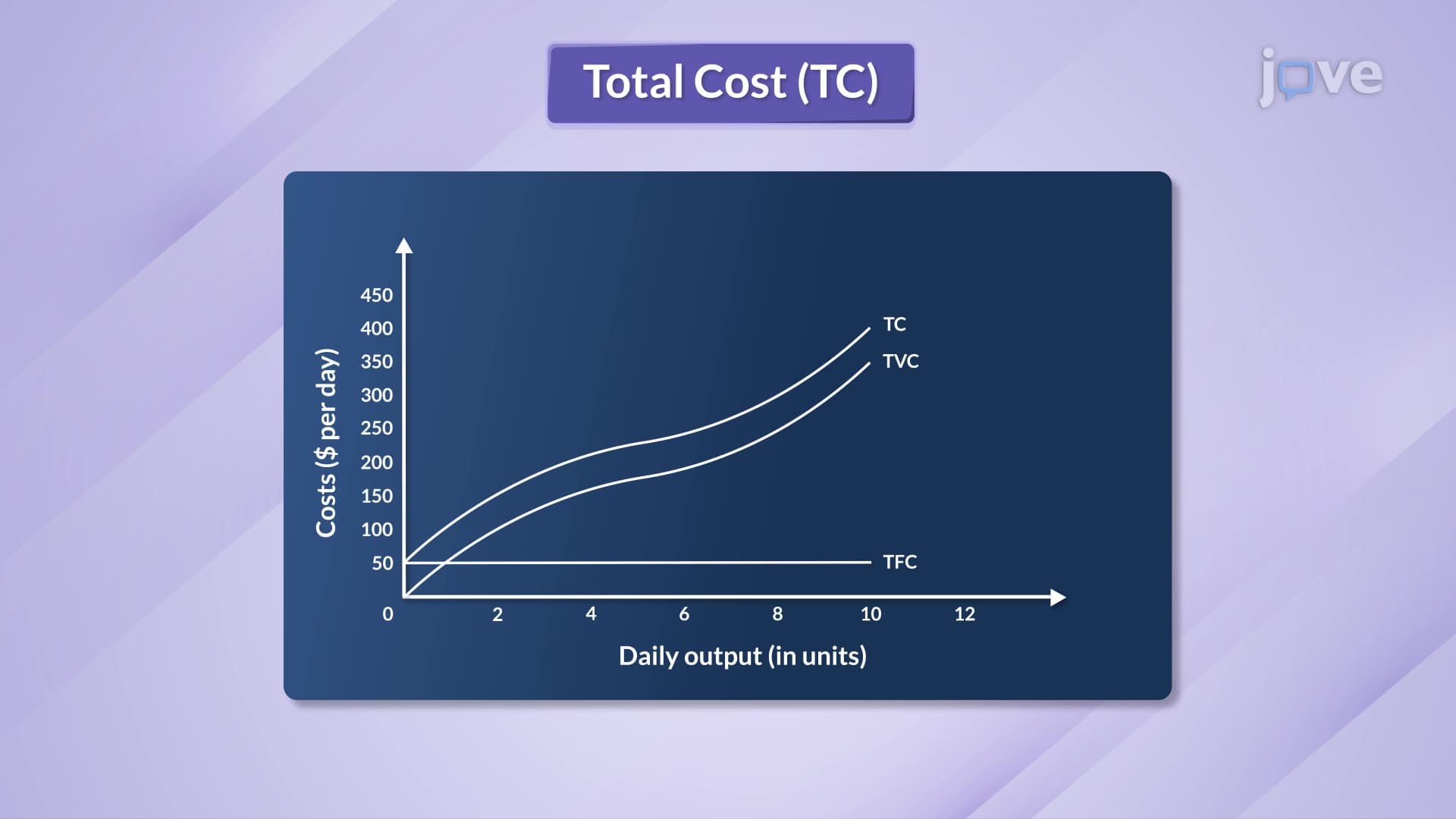

Video Summary: Graphing Total Fixed Variable and Total Cost Curves in Economics
Why does a McDonald's restaurant pay $15,000 monthly rent whether it serves 100 or 10,000 customers? Understanding total fixed, total variable, and total cost curves reveals how businesses like this manage expenses across different production levels. Graphing total fixed, variable, and total cost curves in economics shows three distinct patterns: fixed costs remain constant (horizontal line), variable costs increase with output, and total costs combine both elements starting from the fixed cost baseline. Watch the full video on JoVE Coach to master this concept with expert-led visuals and step-by-step explanations.
Graphing total fixed, variable, and total cost curves in economics provides a visual framework for analyzing how businesses manage costs across different production levels. These three fundamental curves form the foundation of microeconomic cost analysis, appearing regularly on AP Economics exams and college microeconomics courses.
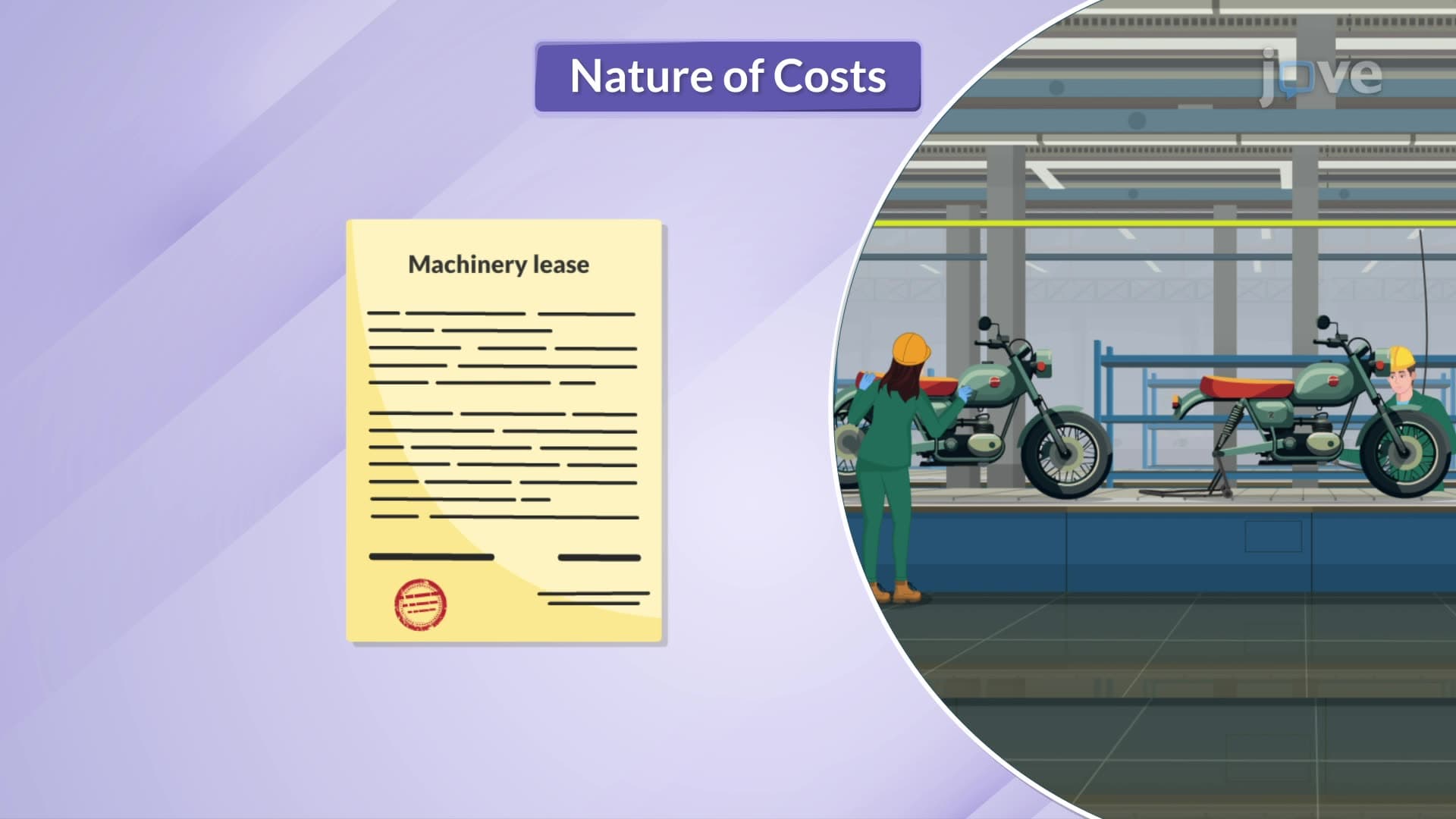
Total fixed costs represent expenses that remain unchanged regardless of production output. Think of Starbucks paying monthly rent, insurance premiums, and equipment depreciation whether they serve 50 or 500 customers daily. On a graph, the total fixed cost (TFC) curve appears as a perfectly horizontal line parallel to the quantity axis.
This horizontal pattern exists because fixed costs are "sunk" in the short run-a Tesla factory must pay property taxes and security costs even during production shutdowns. For students preparing for standardized tests like the SAT Subject Tests or college midterms, remember that TFC curves never slope upward or downward; they maintain constant height across all output levels.
Total variable costs change directly with production levels, creating the most complex curve pattern. Consider a bakery purchasing flour, sugar, and hourly labor-these expenses increase as more bread is produced. The total variable cost (TVC) curve starts at zero (no production, no variable costs) and rises with output.
Crucially, the VTC curve's shape reflects marginal productivity patterns. Initially, the curve rises slowly due to increasing returns-workers become more efficient through specialization. However, the curve eventually steepens as diminishing returns set in. In manufacturing contexts like automobile assembly, this occurs when workers must wait for limited machinery access, reducing overall productivity per additional worker.
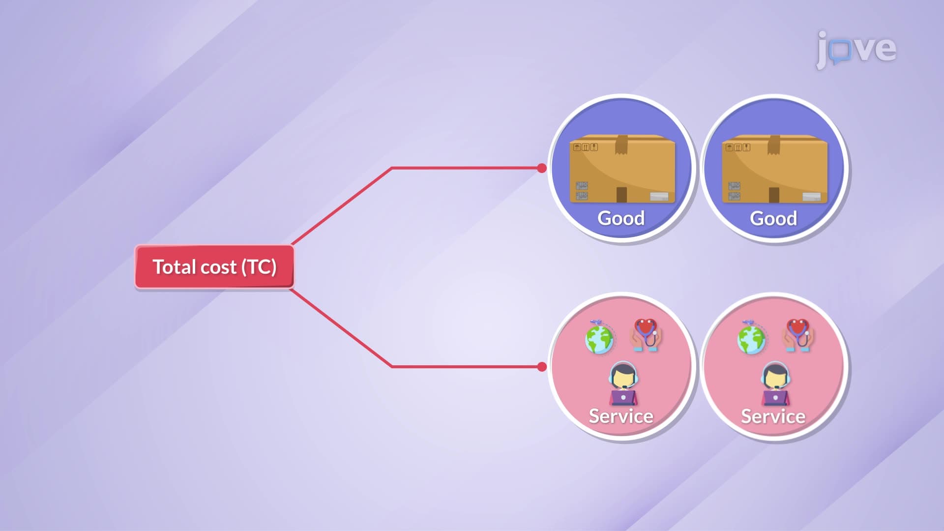
The total cost (TC) curve represents the sum of fixed and variable costs at each output level. Mathematically: TC = TFC + TVC. Graphically, the total cost curve runs parallel to the variable cost curve but starts at the fixed cost level rather than zero.
This relationship proves essential for business decision-making and appears frequently in MCAT passages involving healthcare economics. Hospital administrators, for instance, must consider both fixed costs (building maintenance, permanent staff salaries) and variable costs (medical supplies, temporary staffing) when planning capacity expansions.
Understanding these curves helps students tackle complex economic problems involving profit maximization, break-even analysis, and competitive strategy-skills valuable across business, pre-med, and social science curricula.
Related Micro-courses