Loading video…


 9 Concepts
 77.4K views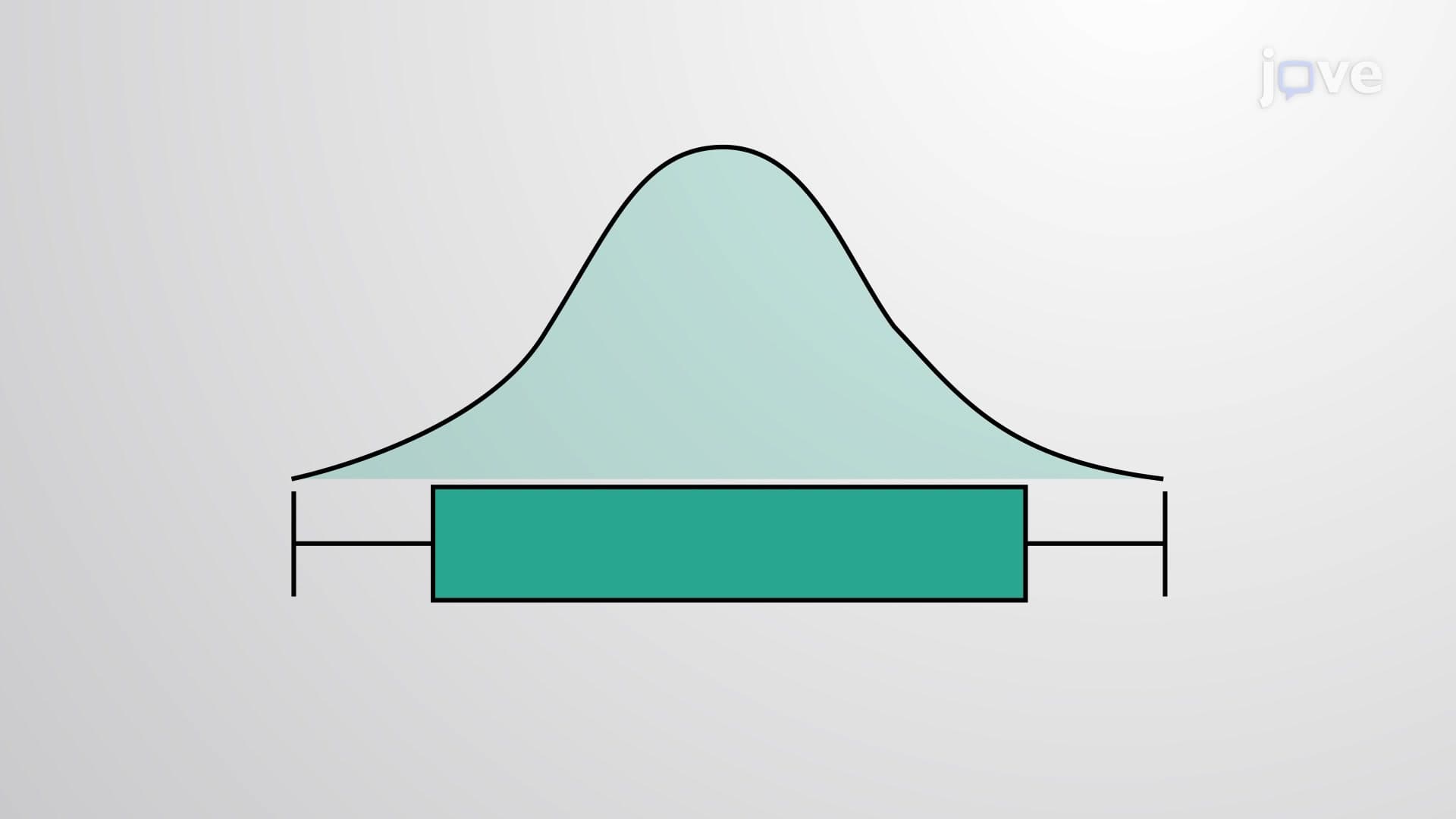

Video Summary: What Is Boxplot
Did you know that Major League Baseball scouts use the same statistical tool to evaluate player performance that helped NASA analyze Mars rover data? A boxplot transforms complex datasets into clear visual stories by displaying five key numbers that reveal data patterns instantly. For example, analyzing SAT scores across different US high schools becomes manageable when boxplot diagrams show median performance, score ranges, and unusual outliers at a glance. Watch the full video on JoVE Coach to master this concept with expert-led visuals and step-by-step explanations.
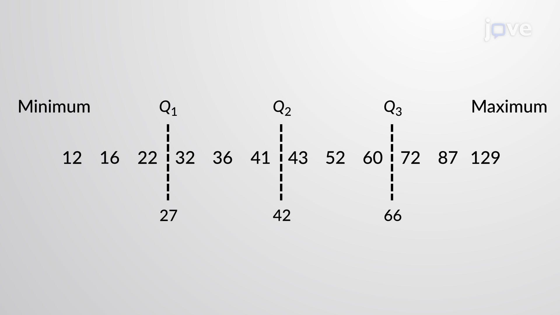
A boxplot serves as one of statistics' most powerful visualization tools, transforming numerical chaos into organized insight. This graphical representation, also known as a box-and-whisker plot, provides an immediate snapshot of data distribution through five critical values: minimum, first quartile (Q1), median (Q2), third quartile (Q3), and maximum. Unlike histograms or scatter plots that can overwhelm viewers with excessive detail, boxplots distill information into digestible visual components that reveal data stories at first glance.
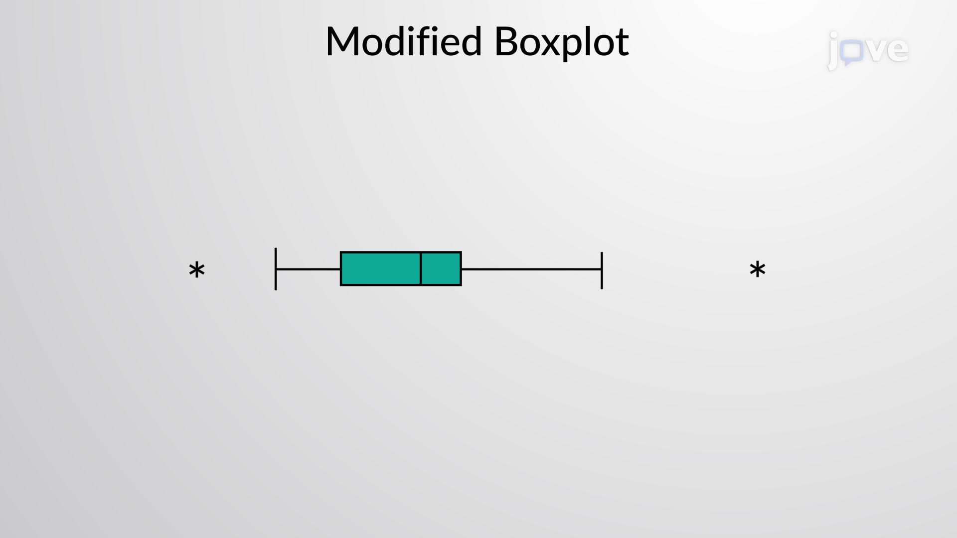
The boxplot definition centers on its systematic approach to data representation. The rectangular box spans from Q1 to Q3, containing the middle 50% of data points, while the median line divides this box to show central tendency. Whiskers extend from the box edges to the minimum and maximum values, creating the characteristic "box-and-whisker" appearance. This design makes boxplots invaluable for AP Statistics students who need to quickly assess data spread, identify outliers, and compare group performances.
What is boxplot in detail becomes clearer through construction practice. Start by arranging data in ascending order, then calculate the five-number summary. For instance, when analyzing ACT scores from a typical US high school class of 200 students, you'd identify Q1 (25th percentile), median (50th percentile), and Q3 (75th percentile). The resulting boxplot immediately reveals whether scores cluster around the median or spread widely, helping counselors identify students needing additional support.
Boxplot concepts extend far beyond classroom exercises into professional applications. Medical researchers use boxplots to compare treatment effectiveness across patient groups, while business analysts employ them to evaluate sales performance across different regions. College admissions offices frequently use boxplot visualizations to compare GPA distributions among applicant pools. The shape of boxplot diagrams tells critical stories: symmetric boxes suggest normal distributions, while asymmetric boxes indicate skewed data requiring different analytical approaches. This versatility makes boxplots essential tools for students preparing for standardized tests like the SAT, where data interpretation questions regularly appear in the mathematics sections.
Related Micro-courses