Loading video…


 9 Concepts
 77.4K views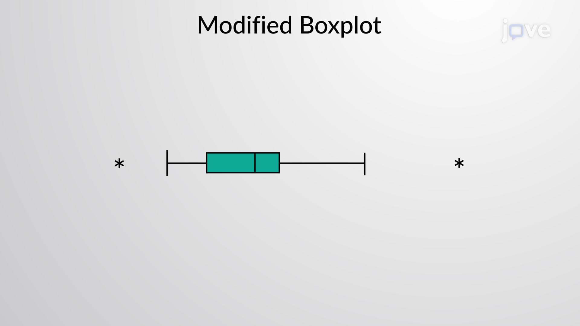

Video Summary: What Is Modified Boxplots
Did you know that standard boxplots can hide crucial outliers that might represent data entry errors or breakthrough discoveries in research? Modified boxplots solve this problem by clearly marking extreme values that fall outside normal data ranges. For instance, when analyzing SAT scores across different high schools in California, a modified boxplot would highlight unusually high or low performing schools as distinct outlier points. This enhanced visualization technique transforms the traditional five-number summary into a more informative display that separates normal variation from true statistical outliers. Watch the full video on JoVE Coach to master this concept with expert-led visuals and step-by-step explanations.
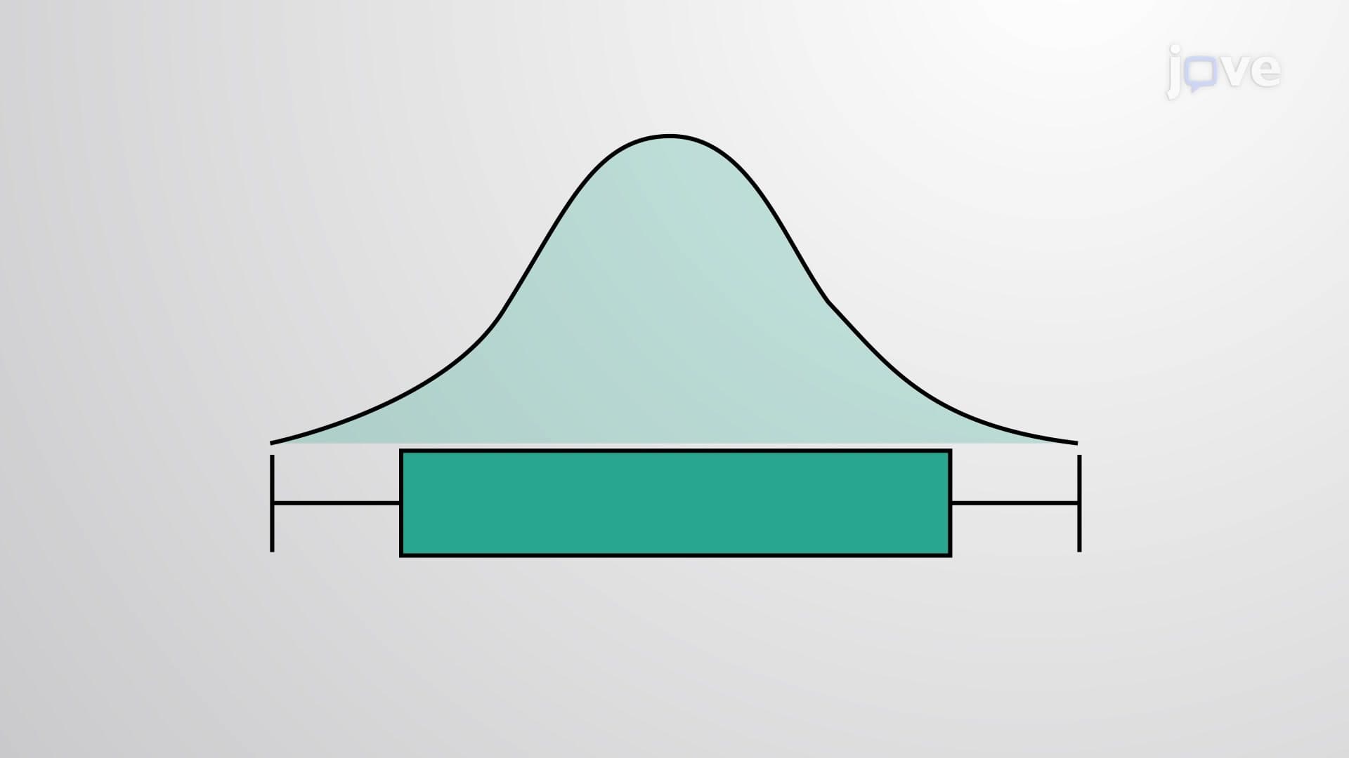
Modified boxplots represent an enhanced version of traditional box-and-whisker plots that provide superior outlier detection and data visualization capabilities. While standard boxplots extend whiskers to the absolute minimum and maximum values, modified boxplots use a mathematical rule to identify and separate outliers from the main data distribution. This approach follows the widely accepted 1.5 × IQR (Interquartile Range) criterion established by statistician John Tukey.
The modified boxplots definition centers on creating boundaries at Q1 - 1.5(IQR) and Q3 + 1.5(IQR). Any data points falling outside these calculated limits are marked as individual outlier points, typically represented by asterisks or dots. The whiskers then extend only to the most extreme values that still fall within these acceptable boundaries, creating a cleaner separation between normal variation and true statistical anomalies.
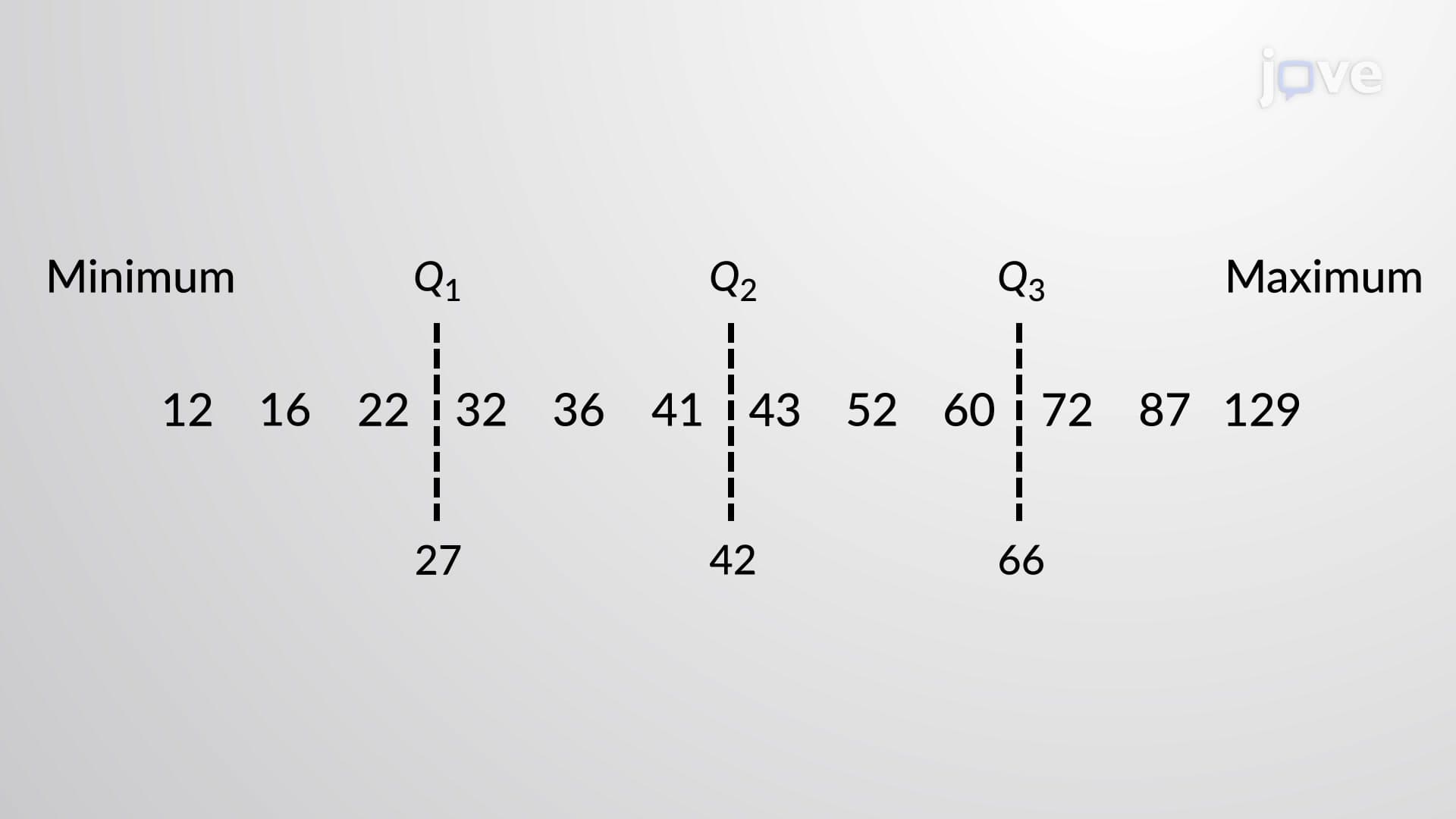
Understanding modified boxplots requires mastering the step-by-step calculation process. First, determine the five-number summary: minimum, Q1 (first quartile), Q2 (median), Q3 (third quartile), and maximum. Next, calculate the IQR by subtracting Q1 from Q3. The critical step involves computing the outlier boundaries: lower boundary = Q1 - 1.5(IQR) and upper boundary = Q3 + 1.5(IQR).
For example, consider ACT scores from a Texas high school where Q1 = 20, Q3 = 28, making IQR = 8. The outlier boundaries become 20 - 1.5(8) = 8 and 28 + 1.5(8) = 40. Any student scoring below 8 or above 40 would appear as individual outlier points, while whiskers extend to the extreme values within this range.
Modified boxplots overview demonstrates their practical importance across multiple fields. In healthcare, modified boxplots help identify patients with unusually high or low biomarker levels that might indicate rare diseases or measurement errors. The FDA uses similar techniques when analyzing clinical trial data to spot potential safety signals. Educational researchers employ modified boxplots when studying standardized test score distributions across different demographic groups.
Students preparing for AP Statistics, college statistics courses, or standardized tests like the SAT frequently encounter modified boxplot interpretation questions. These assessments often require identifying outliers, comparing data distributions, or explaining why certain values appear as separate points rather than within the whiskers.
The modified boxplots concept extends beyond basic construction to sophisticated data analysis. When multiple outliers appear on one side, this suggests data skewness that might require transformation or alternative analytical approaches. Outliers clustered at specific values might indicate measurement limitations or categorical effects within continuous data.
For exam success, practice identifying outliers in various contexts and explaining their potential causes. Focus on connecting mathematical calculations to real-world interpretations, as this demonstrates deeper understanding valued in college-level assessments and professional applications.
Related Micro-courses