Loading concepts…


15 Concepts
15 Concepts
13 Concepts
11 Concepts
9 Concepts
14 Concepts
11 Concepts
15 Concepts
13 Concepts
7 Concepts
10 Concepts
10 Concepts
22 Concepts
19 Concepts
16 Concepts
16 Concepts
7 Concepts
 9 Concepts
 77.4K Views
 Popular topics



Measures of relative standing are statistical tools that help interpret individual data values by comparing them to the entire dataset. These methods include z-scores for standardization, percentiles for ranking positions, and quartiles for data grouping. Understanding relative position in data is essential for analyzing test scores, comparing student performance across different US standardized exams, and identifying unusual values in datasets. JoVE Coach provides comprehensive coverage of these fundamental statistical concepts.
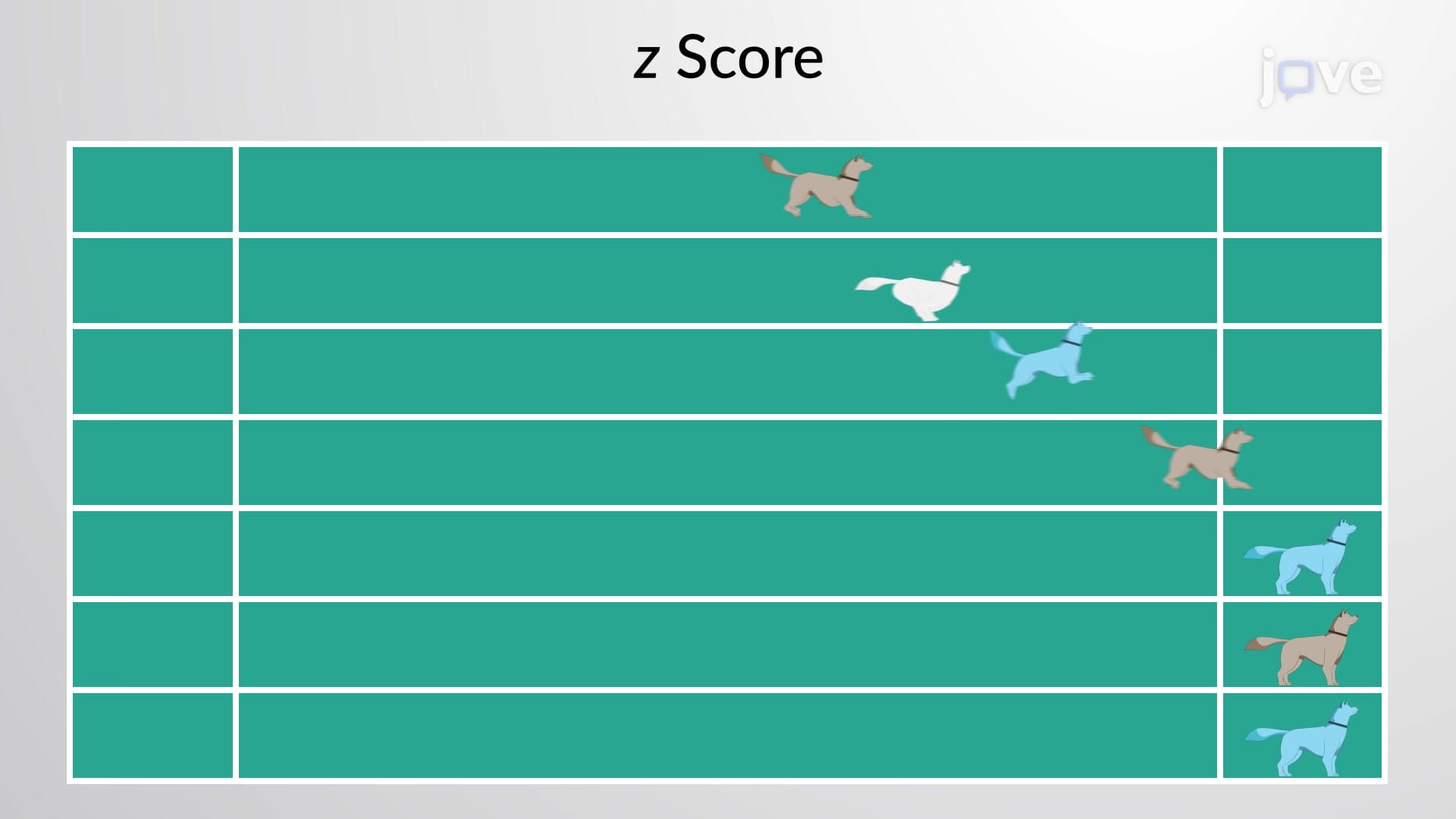
1. Z-Scores and Standardization: Z-scores transform raw data into standardized units, expressing how many standard deviations a value lies from the mean. The formula z = (X - μ) / σ enables comparison across different datasets. For example, comparing SAT and ACT scores requires standardization since they use different scales. Z-scores help identify unusual values, with scores beyond ±2 considered uncommon and beyond ±3 considered rare. This concept is fundamental for understanding normal distributions and statistical inference in US educational assessments.
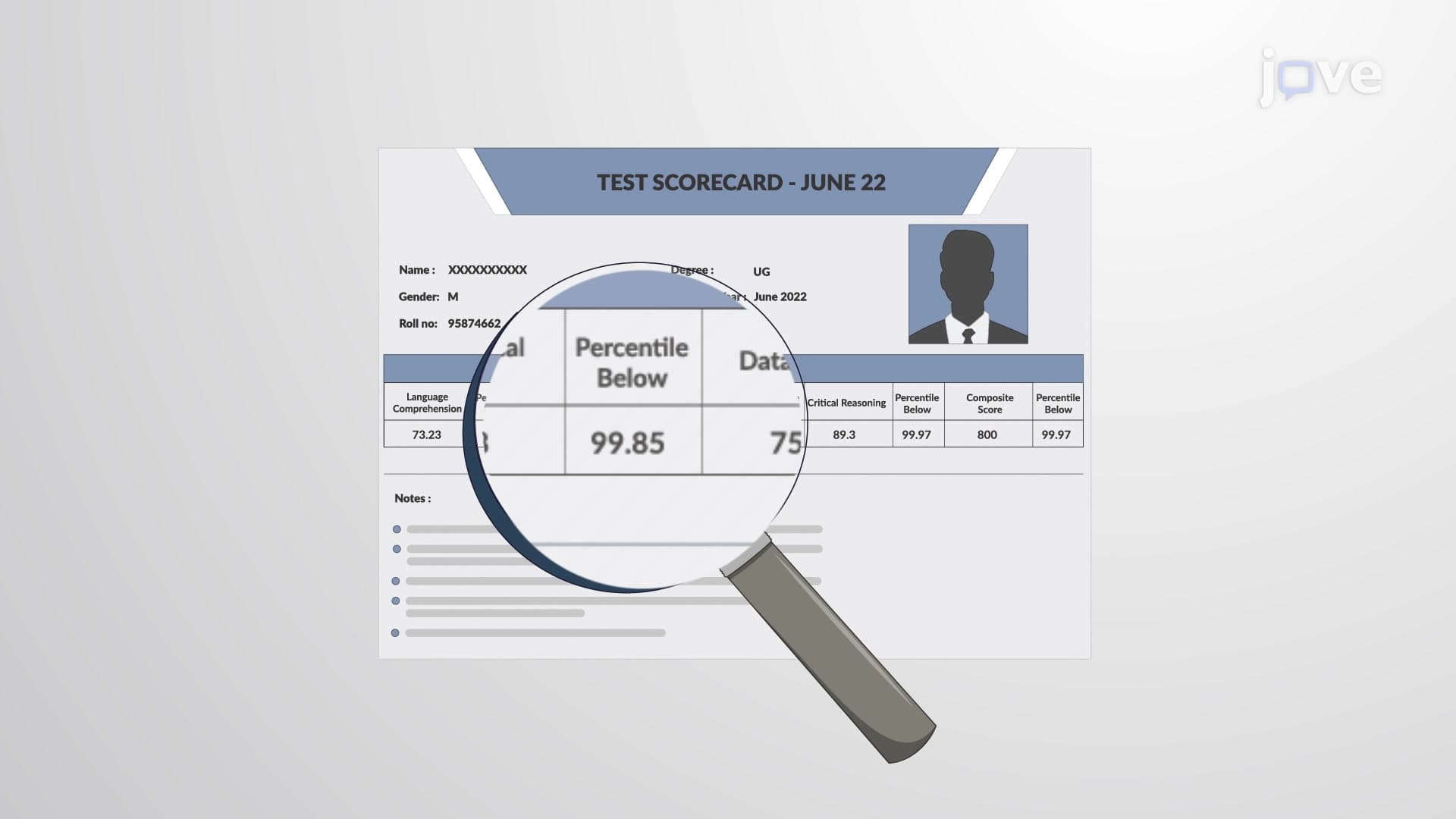
2. Percentiles and Ranking Systems: Percentiles divide data into 100 equal parts, indicating the percentage of values falling at or below a specific point. US universities extensively use percentile rankings for admissions decisions and standardized test interpretations. The 90th percentile means 90% of scores fall below that value, not that the student scored 90%. This distinction is crucial for interpreting GRE, GMAT, or state assessment results where percentile ranks determine competitive standing among test-takers.
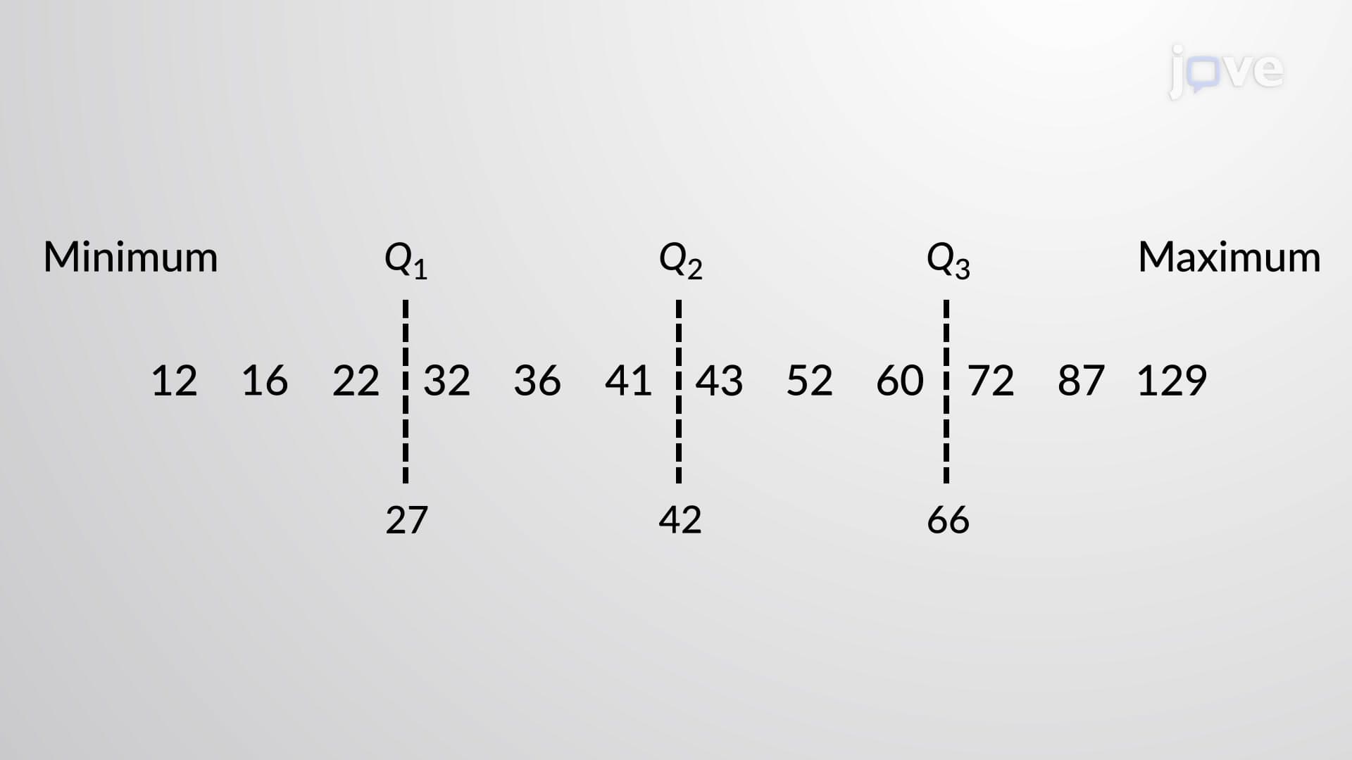
3. Quartiles and Data Distribution: Quartiles split datasets into four equal groups of 25% each, providing insights into data spread and central tendency. The first quartile (Q1) marks the 25th percentile, the second quartile (Q2) represents the median, and the third quartile (Q3) indicates the 75th percentile. The interquartile range (IQR = Q3 - Q1) measures the spread of the middle 50% of data, commonly used in analyzing student performance distributions across US school districts and standardized test score analysis.
4. Five-Number Summary and Data Visualization: The five-number summary includes minimum, Q1, median, Q3, and maximum values, providing a comprehensive dataset overview. This summary forms the foundation for boxplot construction, enabling visual comparison of multiple datasets. US educators use five-number summaries to analyze classroom performance, compare test results across different schools, and identify students needing additional support. The summary efficiently communicates data distribution characteristics without complex calculations.
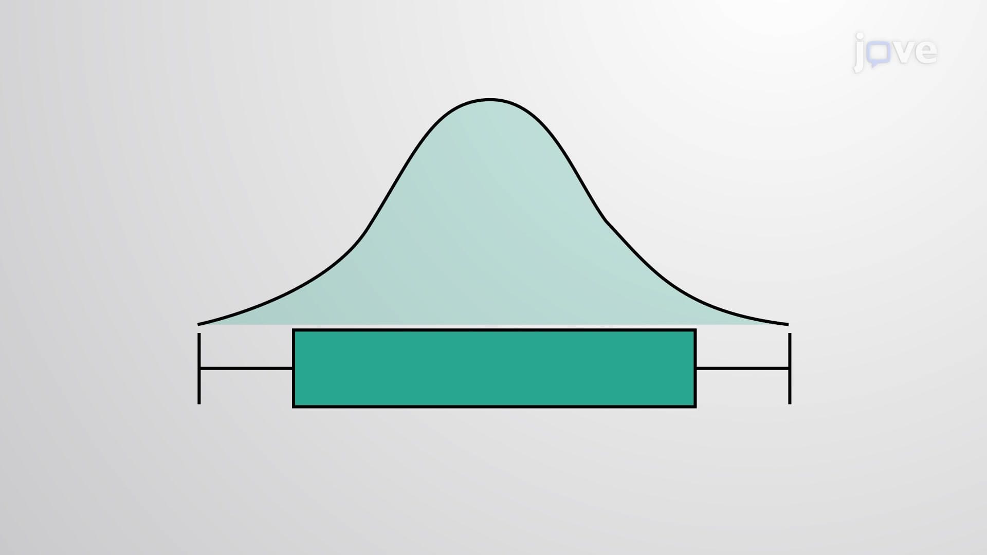
5. Boxplots and Visual Analysis: Boxplots graphically represent five-number summaries through rectangular boxes and extending whiskers. The box spans from Q1 to Q3 with a line at the median, while whiskers extend to minimum and maximum values. These plots reveal data symmetry, skewness, and spread patterns. US statistical software packages commonly generate boxplots for comparing state test scores, analyzing demographic data, and presenting research findings in educational and scientific publications.
6. Outlier Detection Methods: Outliers are extreme values that deviate significantly from typical data patterns. Three primary detection methods include: IQR method (values beyond 1.5 × IQR from quartiles), z-score method (values beyond ±2 or ±3 standard deviations), and boxplot visualization (points outside whiskers). Understanding outlier identification is essential for data quality assessment in US research studies, standardized testing validity, and academic performance analysis where extreme scores may indicate measurement errors or exceptional cases.
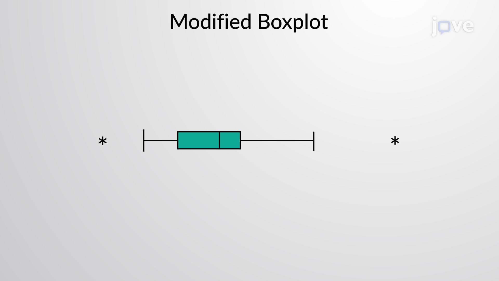
7. Modified Boxplots for Enhanced Analysis: Modified boxplots improve upon standard boxplots by clearly distinguishing outliers from the main data distribution. Whiskers extend only to values within 1.5 × IQR from quartiles, while outliers beyond this range appear as individual points or asterisks. This modification provides clearer visualization of data spread and unusual values, making it easier to identify students with exceptional performance or potential data collection errors in US educational assessments and research studies.