Loading concepts…


15 Concepts
15 Concepts
13 Concepts
11 Concepts
9 Concepts
14 Concepts
11 Concepts
15 Concepts
13 Concepts
7 Concepts
10 Concepts
10 Concepts
22 Concepts
19 Concepts
16 Concepts
16 Concepts
7 Concepts
 15 Concepts
 220.3K Views
 Popular topics

Summarizing data effectively is fundamental to statistical analysis and decision-making across fields like healthcare, business, and research. This comprehensive course covers essential methods for summarizing and visualizing data, from frequency distributions and histograms to scatter plots and pie charts. Students will master the tools statisticians use to transform raw data into meaningful insights through JoVE Coach's interactive learning approach, preparing them for success in statistics courses and standardized exams.
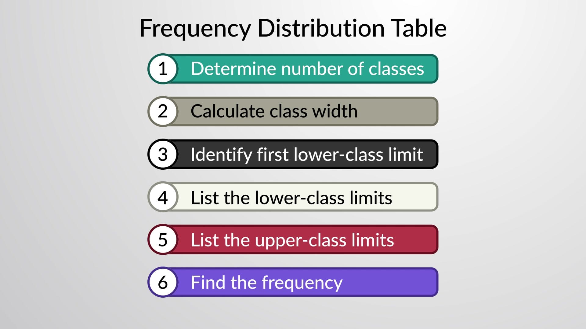
1. Frequency Distribution Construction and Analysis Understanding how to organize raw data into meaningful categories forms the foundation of statistical analysis. Students learn the six-step process for creating frequency tables, including selecting appropriate class numbers (5-20 classes), calculating class width through range division, and establishing class boundaries. Using examples like marathon participant ages or student height measurements, learners master techniques for handling continuous data. The process involves determining lower and upper class limits, using tally marks for data counting, and ensuring proper class intervals without gaps or overlaps.
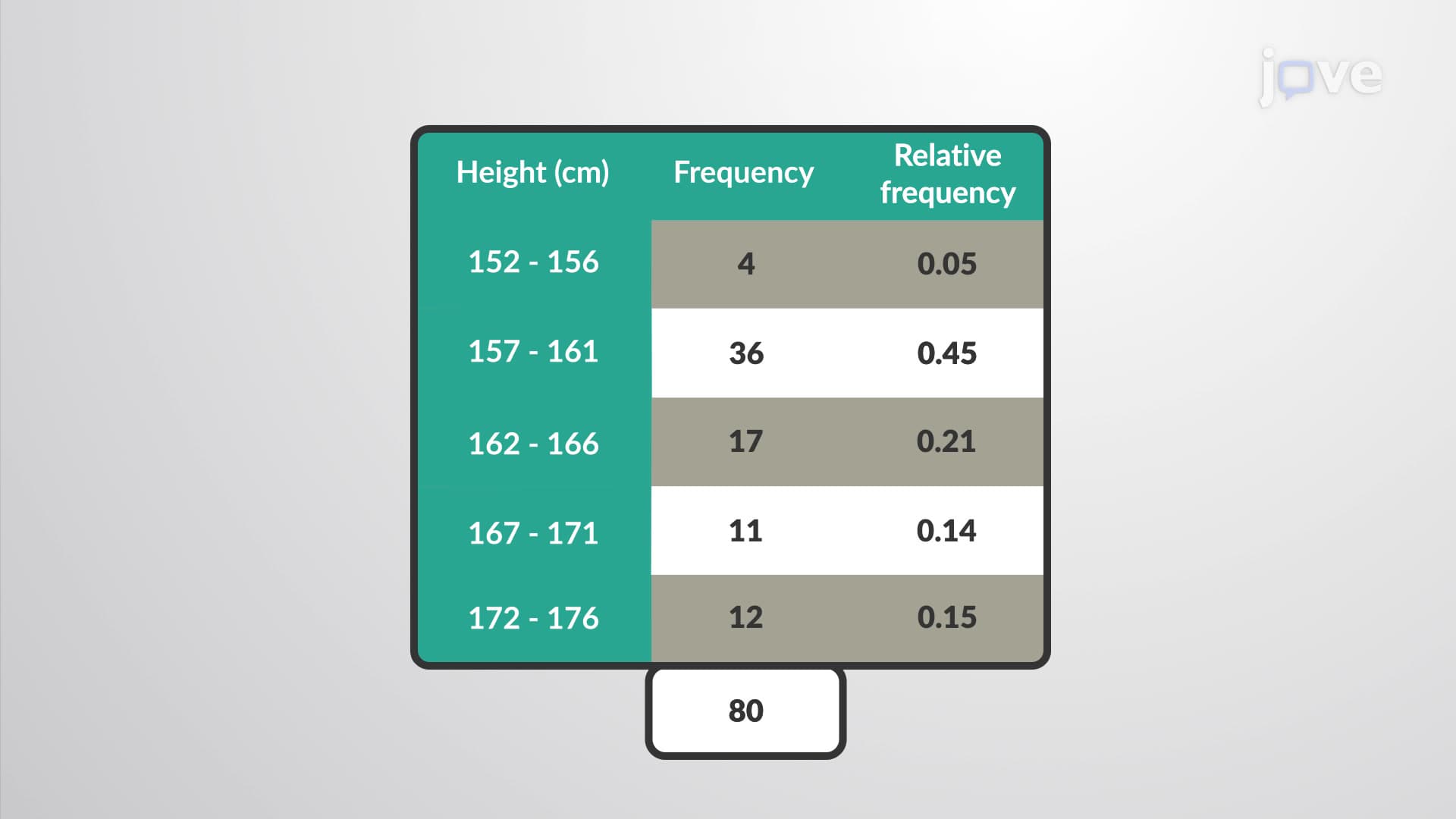
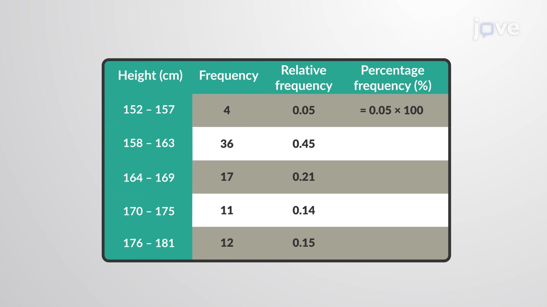
2. Relative and Percentage Frequency Distributions Beyond simple frequency counts, statisticians need proportional representations of data. Relative frequency distributions express each class frequency as a fraction of the total sample size, providing insight into data distribution patterns. For instance, analyzing hockey player heights reveals that 0.05 (or 5%) of players fall within the 152-157 cm range. Converting relative frequencies to percentages creates percentage frequency distributions, where all percentages sum to 100%. These methods enable meaningful comparisons across different sample sizes and facilitate standardized data interpretation in fields like market research and quality control.
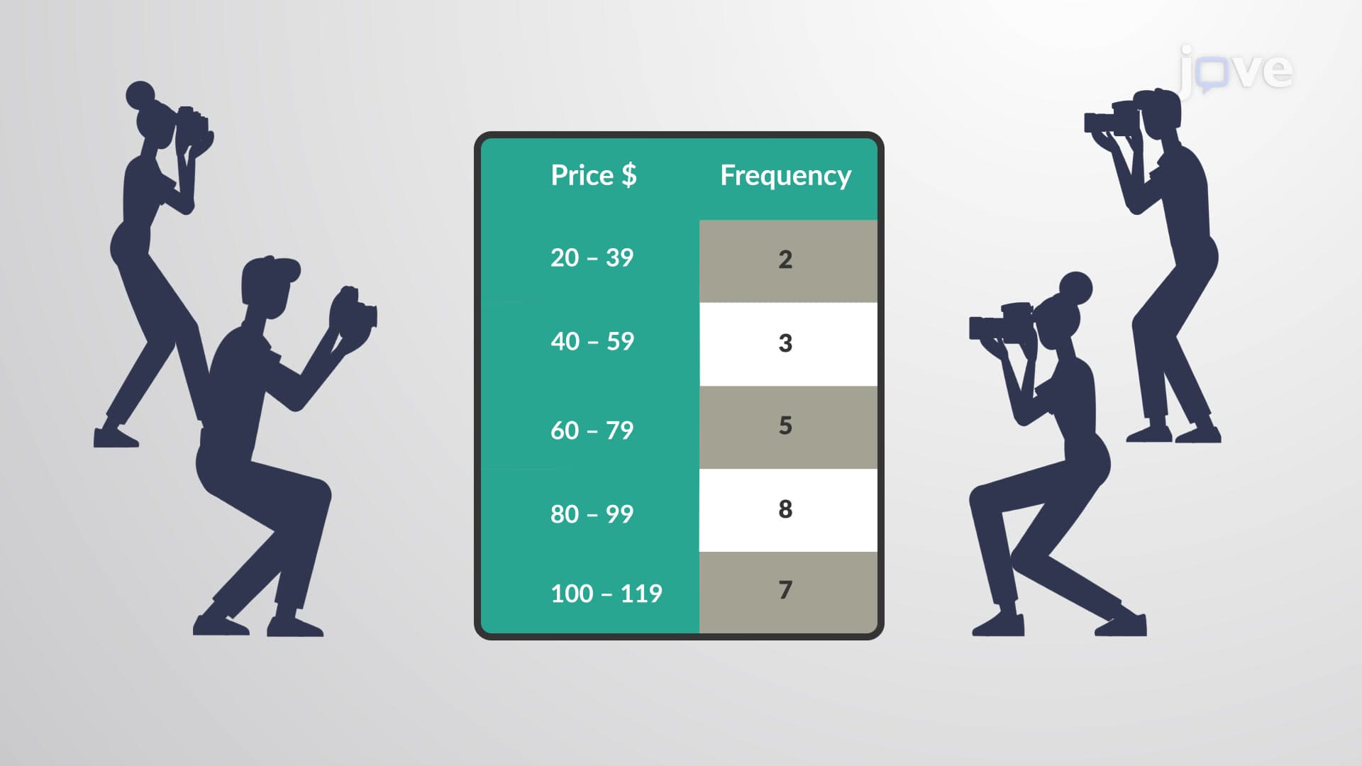
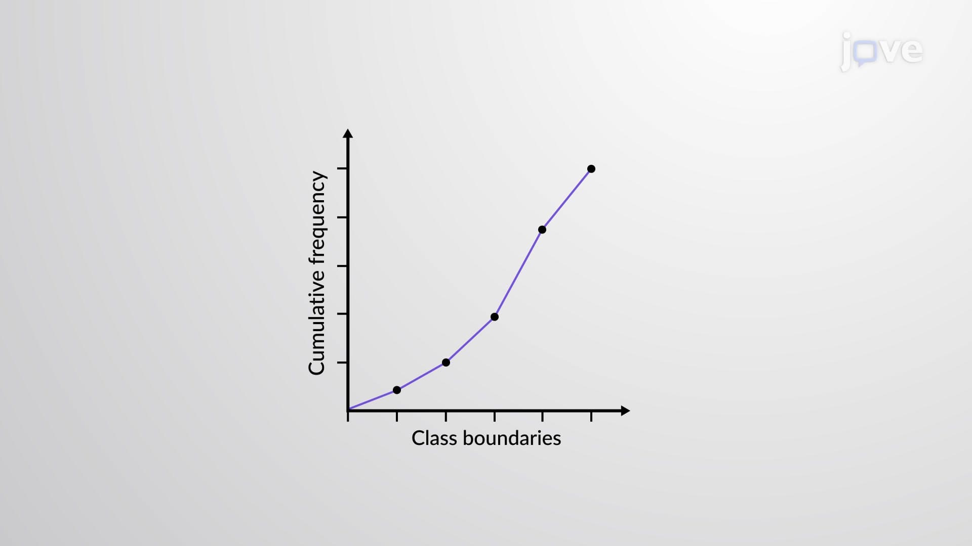
3. Cumulative Frequency and Ogive Graphs Cumulative frequency analysis answers questions about data below certain thresholds, such as "How many customers bought cameras costing less than $80?" Each cumulative frequency represents the sum of current and all preceding class frequencies. Ogive graphs provide visual representation of cumulative data, plotting class boundaries on the x-axis against cumulative frequencies on the y-axis. Connected points create smooth curves showing data accumulation patterns. These tools prove invaluable for percentile calculations, quality control monitoring, and understanding data distribution characteristics in manufacturing and service industries.
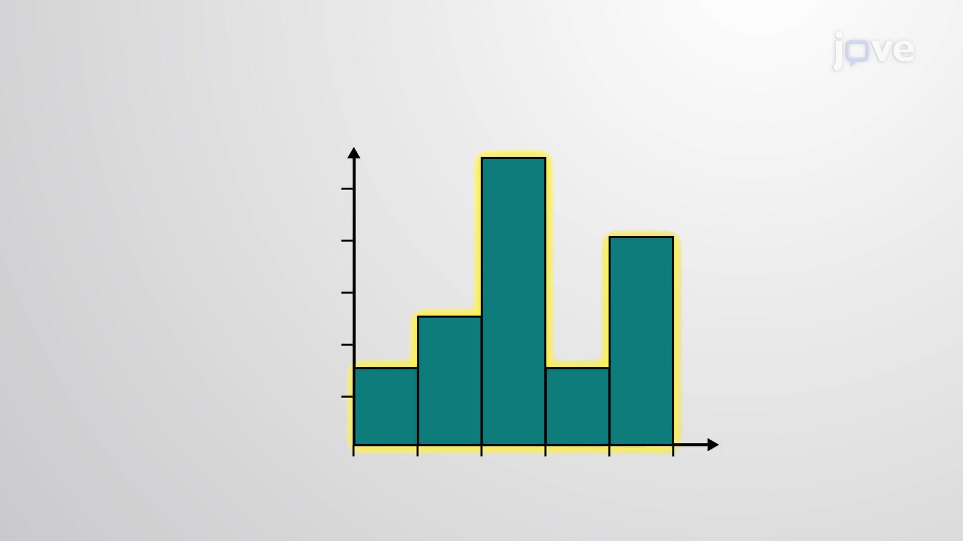
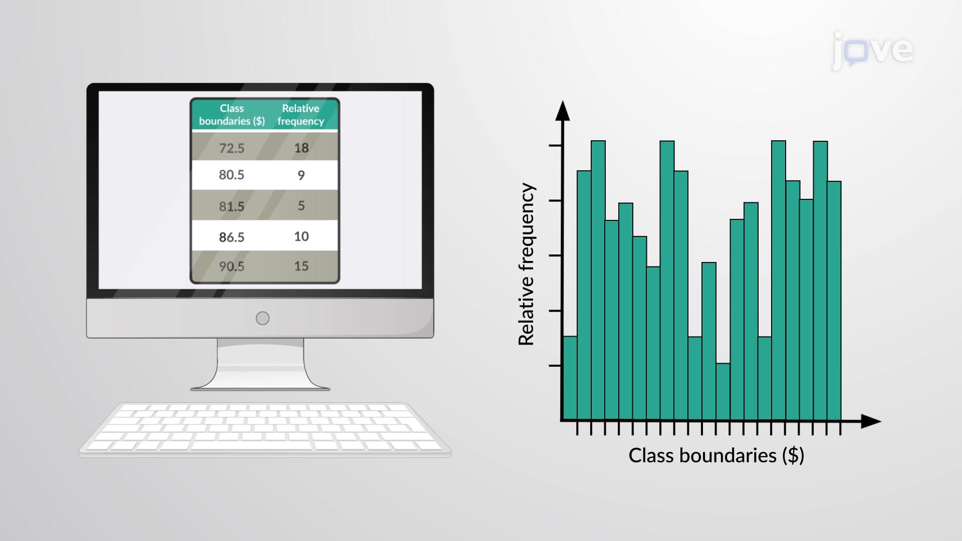
4. Histogram Construction and Interpretation Histograms transform frequency tables into powerful visual tools using bars of equal width without gaps between them. Class boundaries eliminate gaps between adjacent intervals, creating continuous horizontal scales. For example, book price ranges from $5-10 and $11-16 use boundaries of 4.5-10.5 and 10.5-16.5 to ensure continuity. Relative frequency histograms display proportions rather than raw counts, enabling comparison across different sample sizes. These visualizations help identify data distribution shapes, central tendencies, and variability patterns essential for statistical inference and decision-making in business and research contexts.
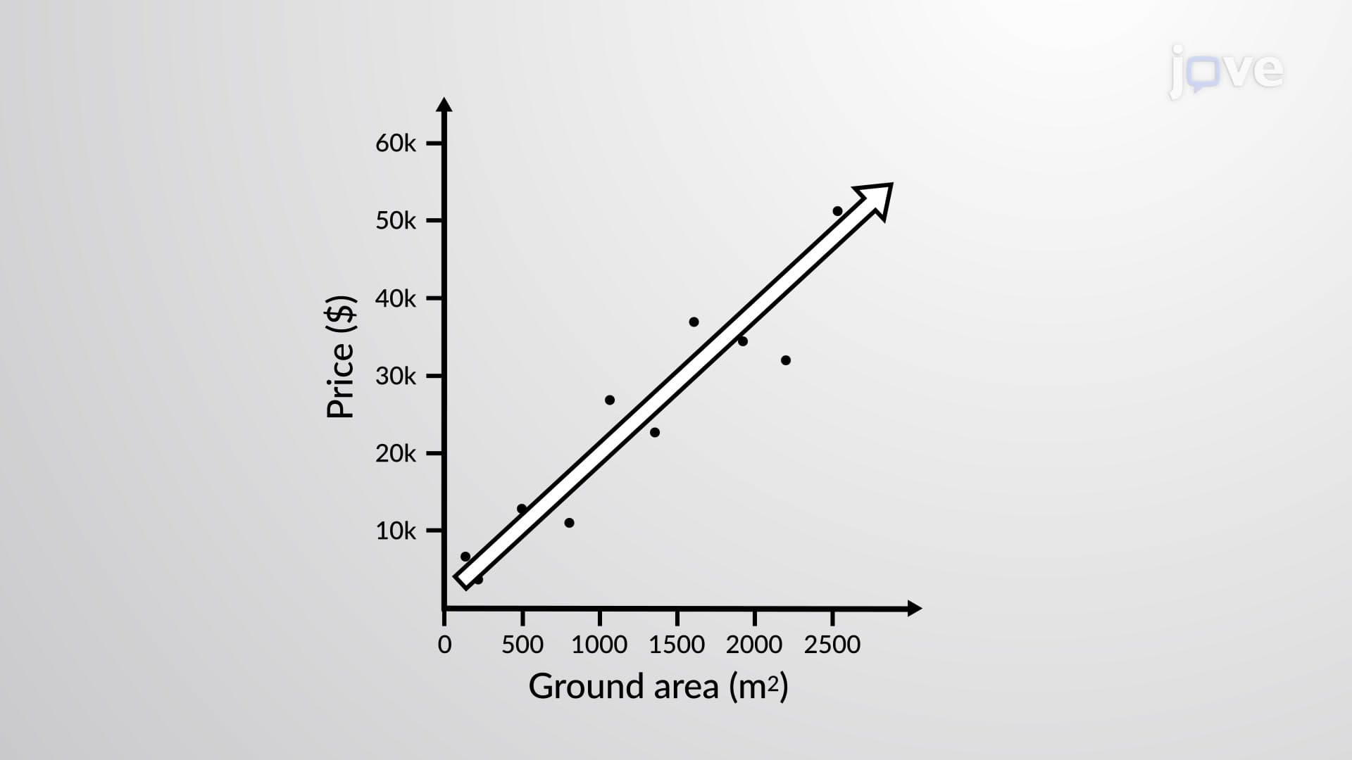
5. Scatter Plots and Correlation Analysis Bivariate data relationships require specialized visualization techniques to reveal patterns between variables. Scatter plots display independent variables (like house ground area) on the x-axis and dependent variables (like house prices) on the y-axis. Each data point represents one observation, and the overall pattern indicates correlation strength and direction. Positive correlation shows increasing trends, negative correlation reveals decreasing patterns, and no correlation displays random scatter. Best-fit lines help visualize relationships, with equal points above and below indicating good fit. These tools are crucial for regression analysis and predictive modeling in economics and social sciences.
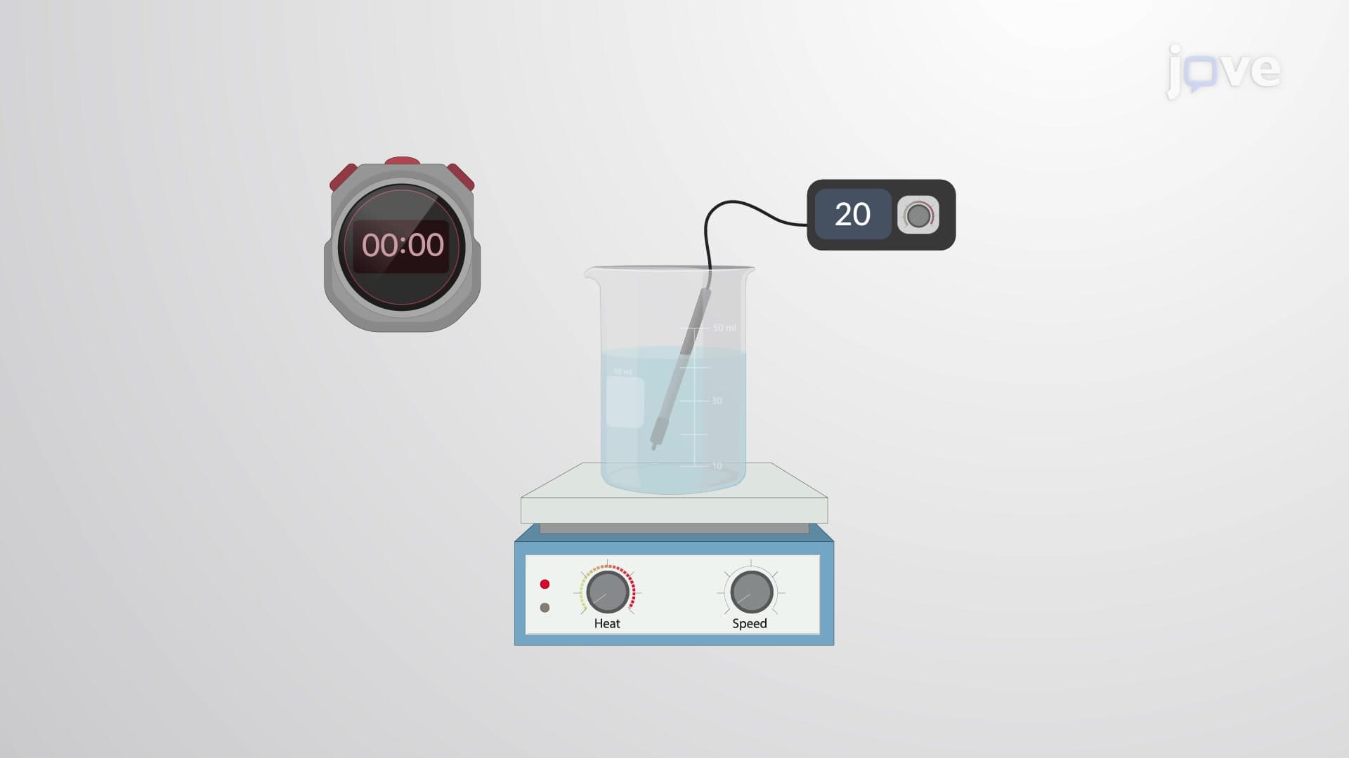
6. Time-Series Graphs and Temporal Data Analysis Data collected over time requires specialized visualization to reveal trends, patterns, and seasonal variations. Time-series graphs plot time intervals on the x-axis against measured values on the y-axis, connecting points with continuous lines. Examples include water temperature changes during heating, stock price fluctuations, or patient vital sign monitoring. These graphs reveal important temporal patterns like growth trends, cyclical behaviors, and sudden changes. Healthcare professionals use time-series analysis for patient monitoring, while business analysts track sales performance and market trends using these powerful visualization tools.
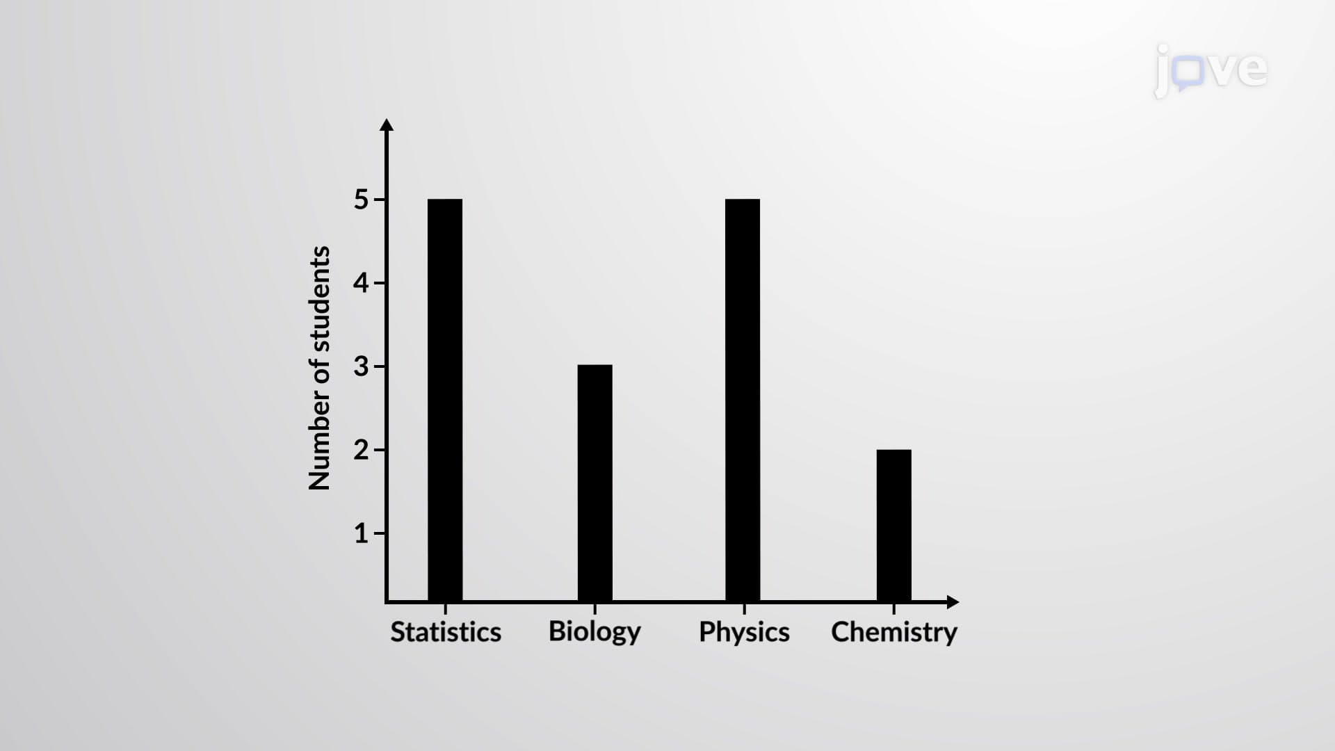
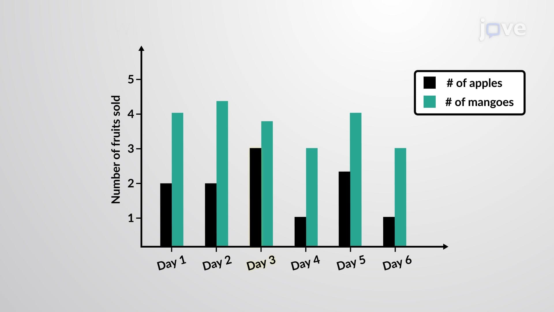
7. Bar Graphs and Multiple Bar Comparisons Qualitative data visualization requires different approaches than quantitative data analysis. Bar graphs display categorical data using bars of equal width, with bar height representing frequency or count. Categories appear on the horizontal axis while frequencies occupy the vertical axis. Multiple bar graphs enable comparison between different groups, such as male and female student enrollment across various academic programs. These visualizations can include gaps between bars and multiple colors for different data sets. Applications span from survey research and market analysis to academic performance tracking and demographic studies.
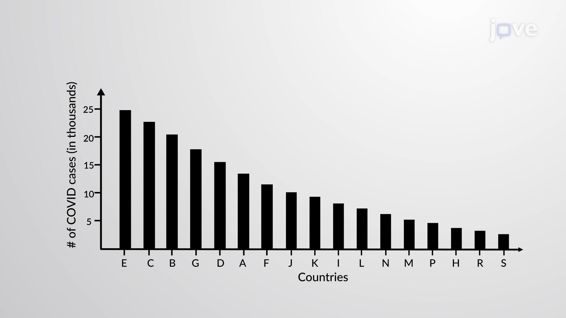
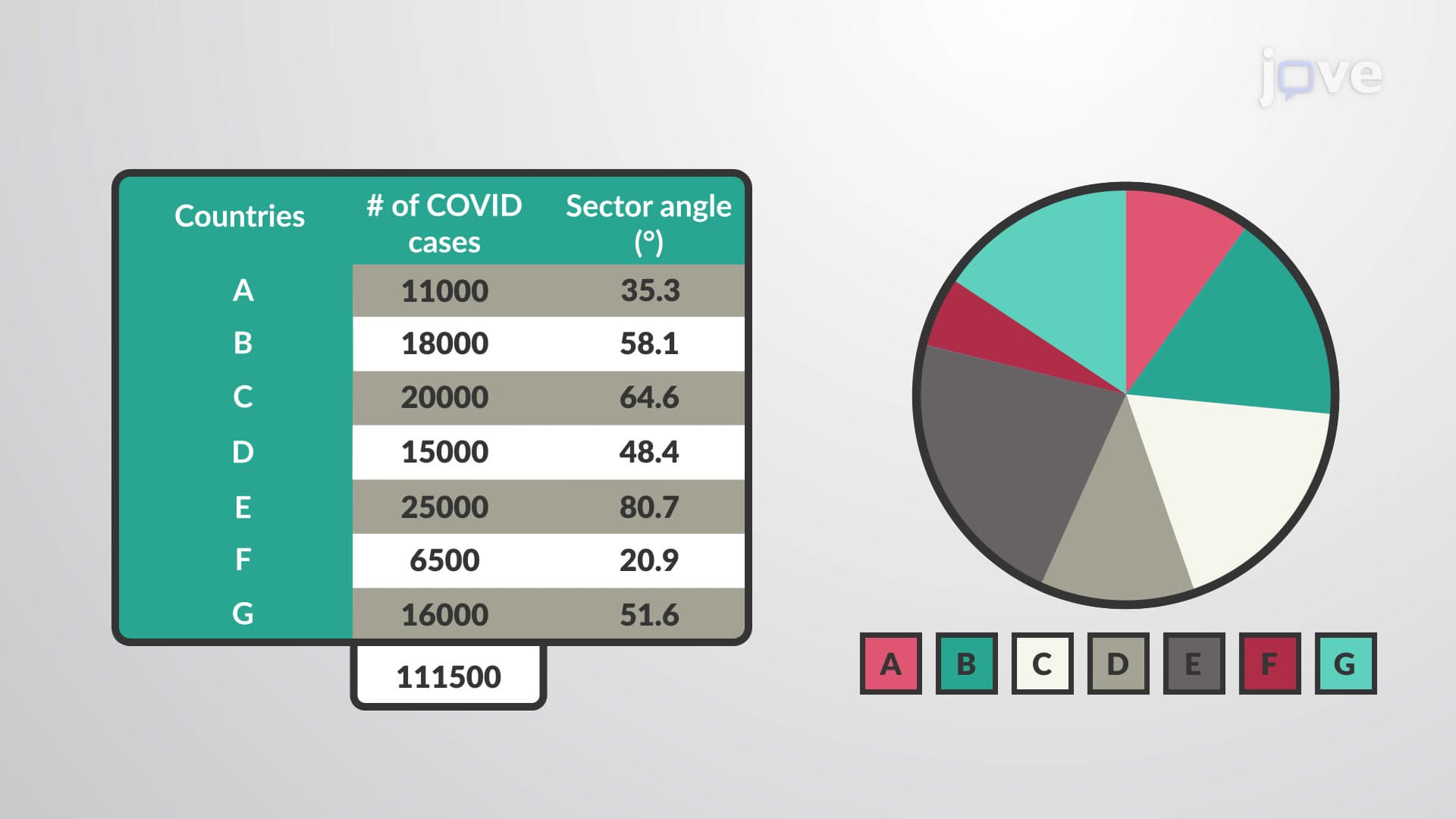
8. Specialized Charts: Pareto and Pie Charts Certain data scenarios benefit from specialized visualization approaches. Pareto charts arrange bars in descending order to identify the most significant categories, following the 80/20 principle where few categories often account for most occurrences. This proves valuable for quality control, identifying major problem sources, or prioritizing improvement efforts. Pie charts represent qualitative data as circular sectors, with each slice proportional to category frequency. Sector angles are calculated by multiplying relative frequency by 360 degrees. These charts work best with 5-7 categories and help visualize part-to-whole relationships in budget allocation, market share analysis, and demographic distribution studies.