Loading video…

 15 Concepts
 220.3K views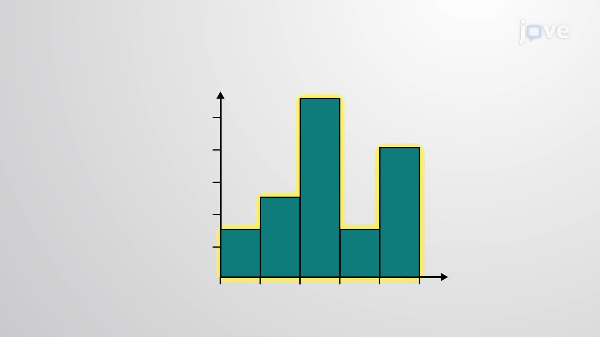

Video Summary: What Is Histogram
Ever wonder how Netflix analyzes viewer ratings across millions of users, or how the CDC tracks COVID-19 case distributions by age groups? A histogram transforms raw numerical data into clear visual patterns through connected bars that reveal data distribution at a glance. Unlike simple bar charts, histograms use class boundaries-calculated midpoints between data intervals-to create seamless visual representations of quantitative information, making complex datasets accessible for analysis in everything from standardized test scores to market research. Watch the full video on JoVE Coach to master this concept with expert-led visuals and step-by-step explanations.
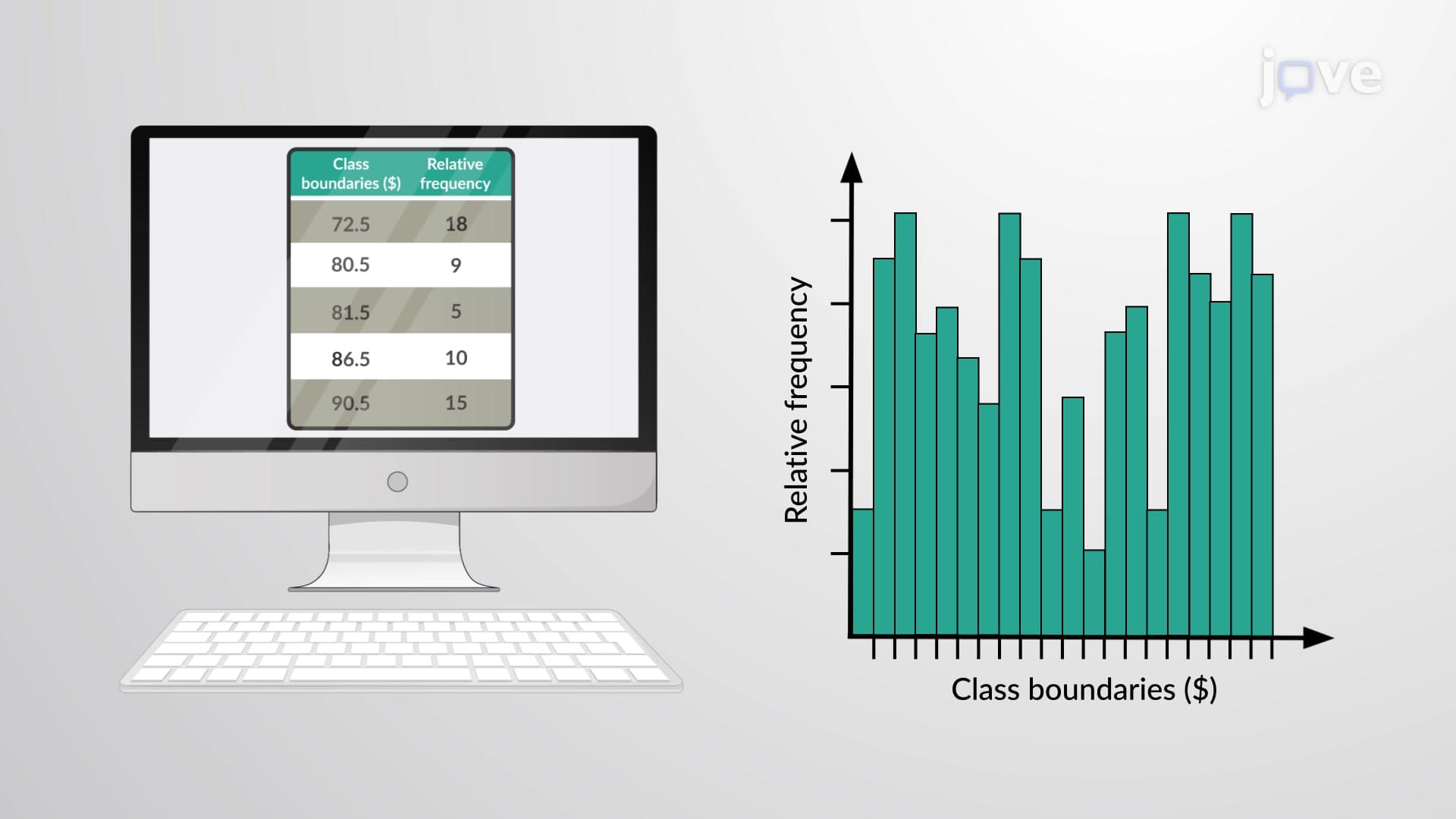
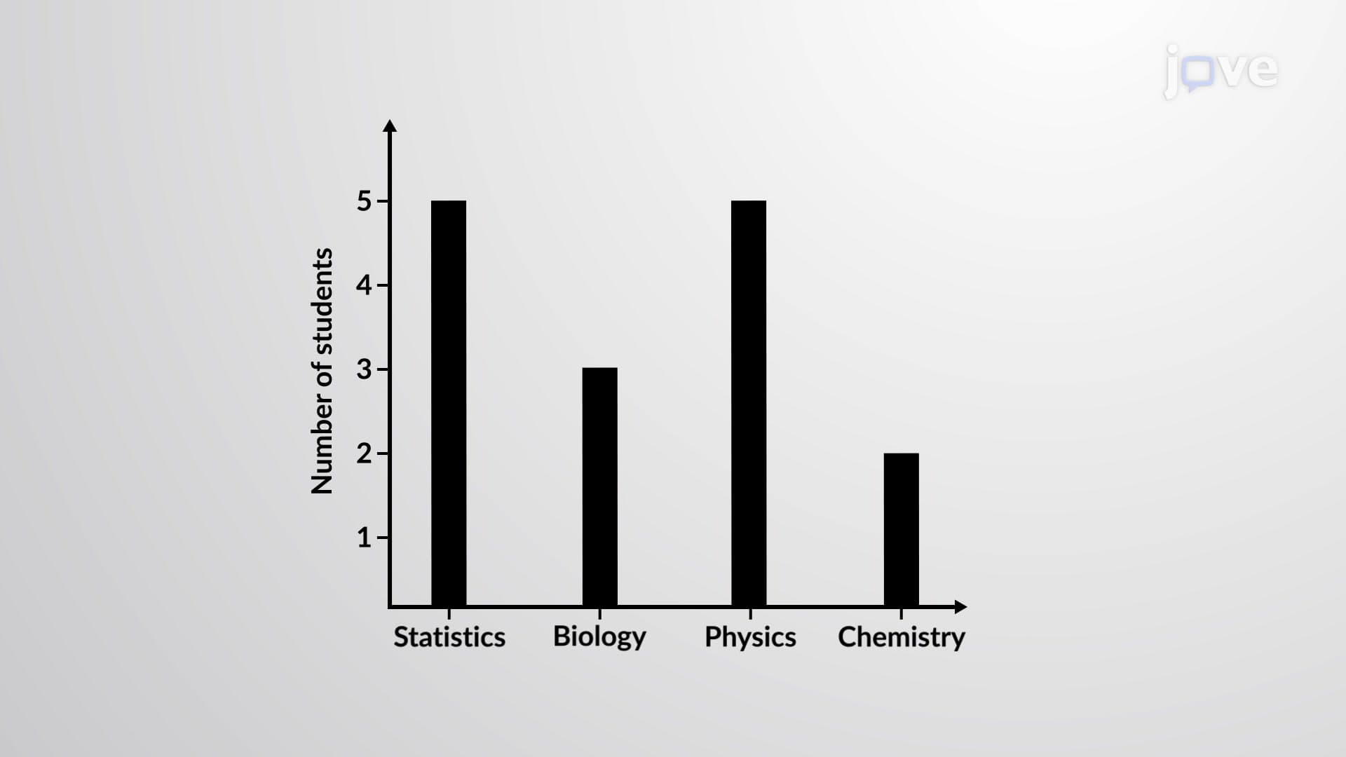
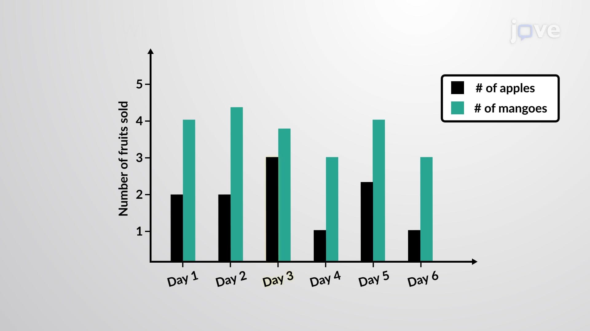
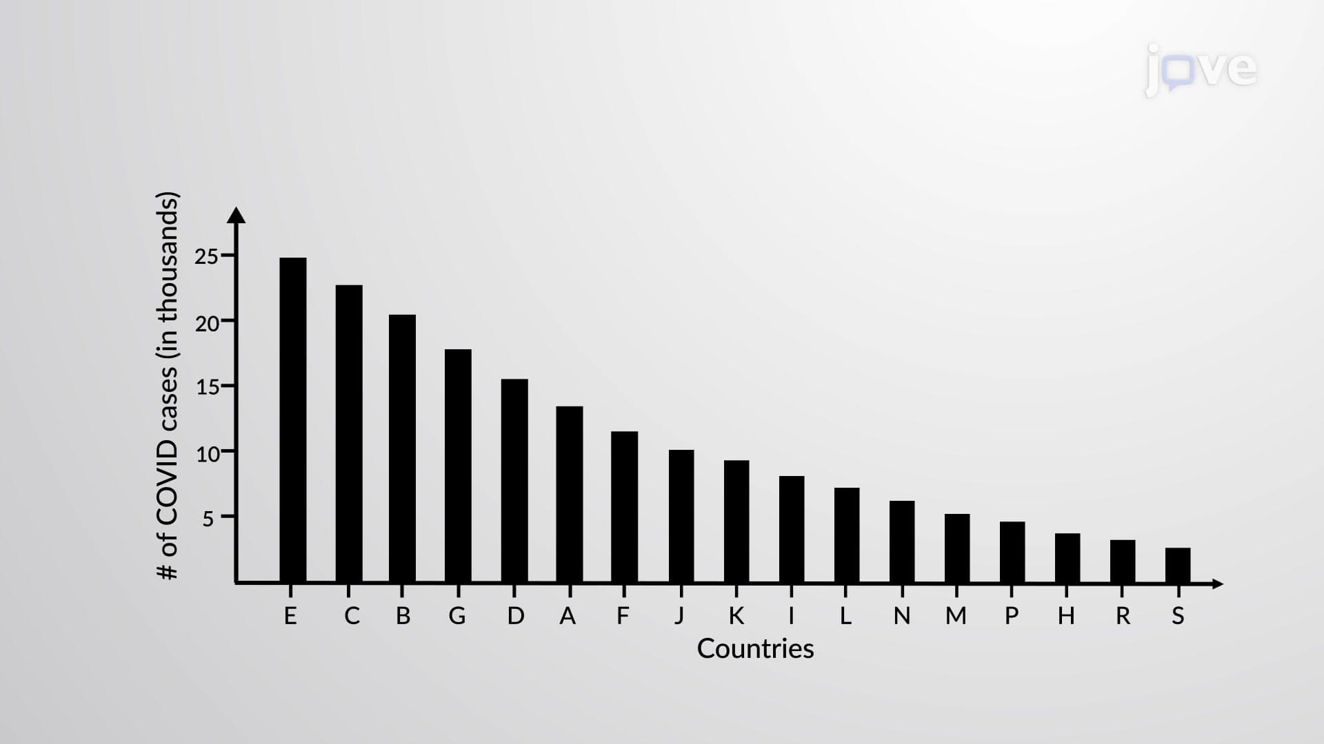
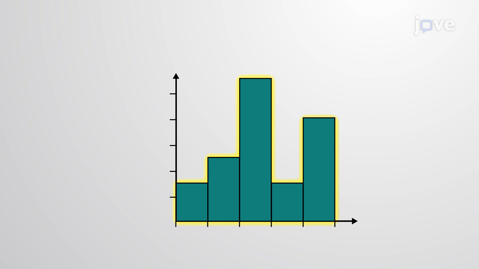
A histogram represents one of the most powerful tools in descriptive statistics, transforming numerical data into intuitive visual formats that reveal underlying patterns and distributions. Unlike traditional bar graphs that display categorical data with gaps between bars, histograms display quantitative data through connected rectangular bars of equal width, creating a continuous visual representation of data frequency across different intervals or classes.
The fundamental architecture of any histogram relies on two critical axes: the horizontal axis represents class boundaries (the range of values for each data interval), while the vertical axis displays the frequency of observations within each class. This structure enables viewers to quickly identify data concentration, outliers, and distribution shapes-essential skills for AP Statistics, college-level mathematics courses, and standardized tests like the SAT Math section.
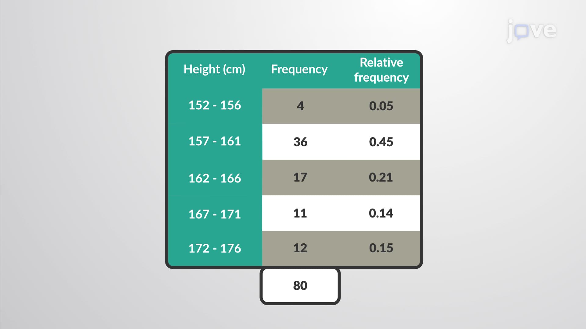
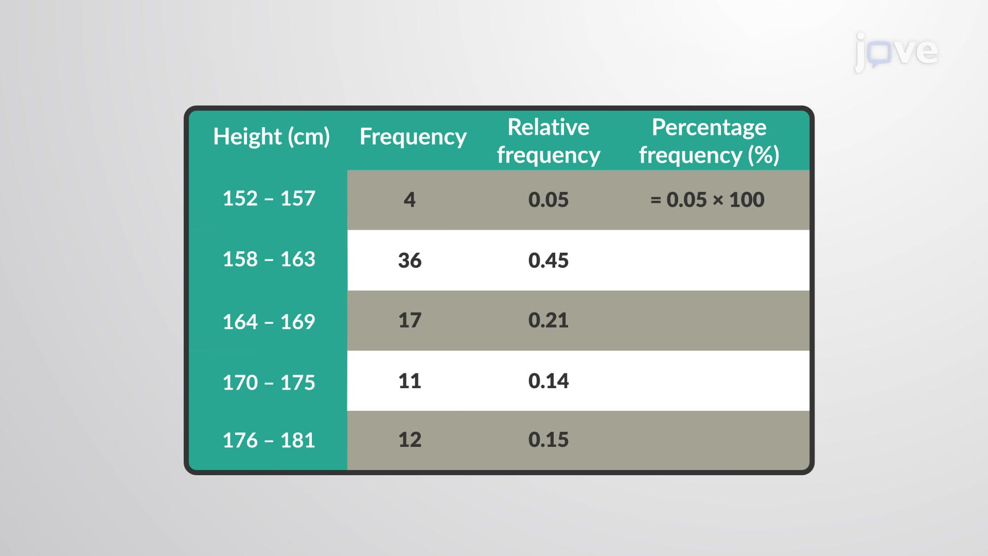
Class boundaries serve as the cornerstone of effective histogram construction, addressing a critical challenge in data visualization: eliminating gaps between consecutive data intervals. When working with grouped data-such as SAT scores ranging from 400-500, 501-600, and 601-700-natural gaps exist between these ranges. Class boundaries calculate the midpoint between the upper limit of one class and the lower limit of the next class, creating seamless continuity.
For example, consider analyzing annual household incomes in different US metropolitan areas. If your data includes ranges like $30,000-$40,000 and $41,000-$51,000, the class boundary would be calculated as ($40,000 + $41,000) ÷ 2 = $40,500. This mathematical precision ensures accurate representation and prevents misleading visual gaps that could skew interpretation.
Histograms prove invaluable across multiple academic disciplines and professional contexts. In AP Biology, students use histograms to analyze genetic trait distributions in population studies. Business students studying market research rely on histograms to visualize consumer spending patterns across demographic groups. Psychology majors examining standardized test scores use histograms to identify normal distributions and statistical outliers.
The College Board frequently includes histogram interpretation questions on Advanced Placement exams, particularly in AP Statistics and AP Psychology. Students must demonstrate proficiency in reading histogram data, calculating measures of central tendency, and identifying distribution characteristics such as skewness, modality, and spread. Mastering histogram analysis directly impacts performance on college entrance exams and university-level statistics courses, where data visualization skills are fundamental to academic success.
Related Micro-courses