Loading video…

 15 Concepts
 220.3K views

Video Summary: What Is Pie Chart
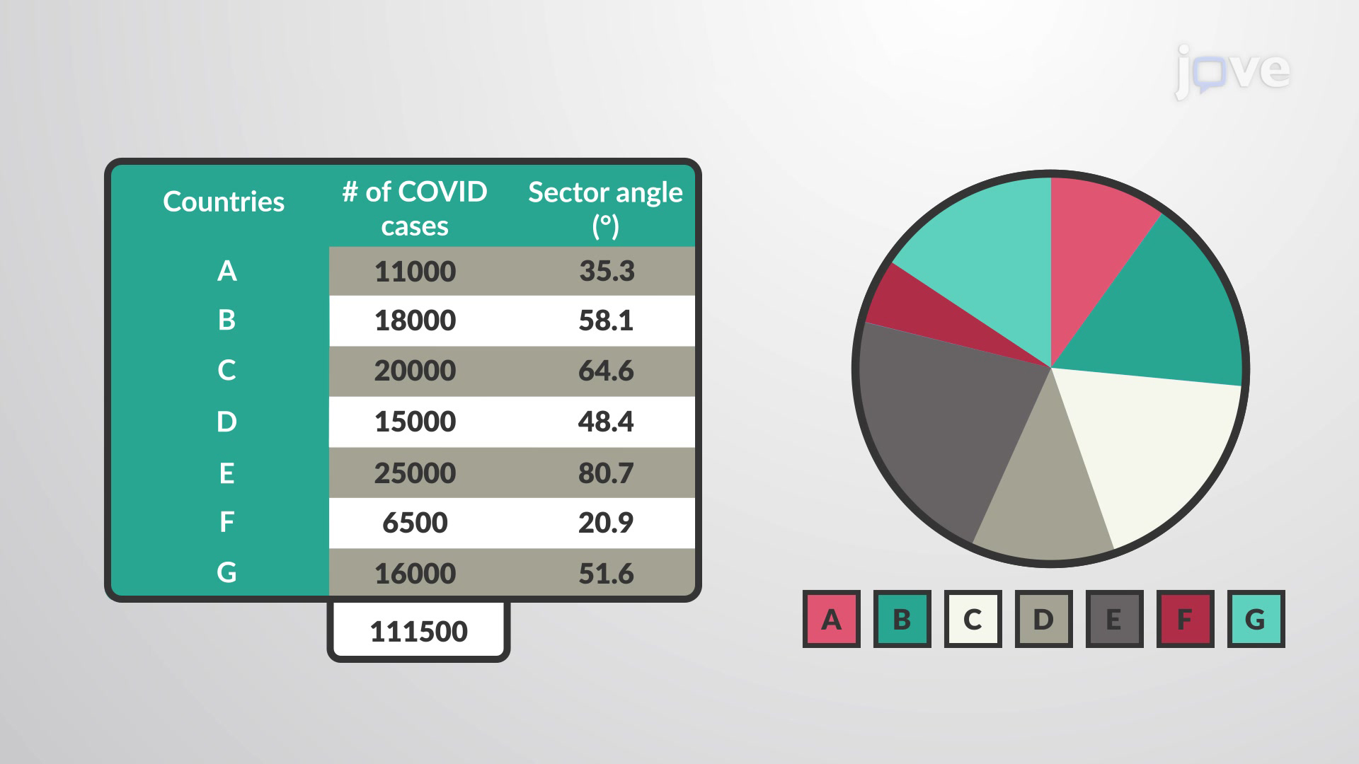
Did you know that pie charts help visualize how the 2020 US Census data breaks down America's 331 million residents by demographic categories? A pie chart transforms numerical data into circular slices, where each wedge represents a proportional part of the whole dataset. Using COVID-19 case distribution across different countries as an example, this visualization method converts frequency counts into sector angles by dividing individual values by the total sum and multiplying by 360 degrees. Watch the full video on JoVE Coach to master this concept with expert-led visuals and step-by-step explanations.
A pie chart represents a fundamental data visualization tool that transforms numerical information into an intuitive circular format. This graphical representation divides a complete circle into sectors, where each slice corresponds proportionally to specific data categories within the overall dataset. Unlike linear graphs, pie charts excel at showing part-to-whole relationships, making them invaluable for analyzing categorical data distributions.
The mathematical foundation relies on the 360-degree principle. To calculate each sector's angle, divide the individual category value by the total sum, then multiply by 360. For instance, if analyzing US state population data where California represents 39.5 million out of 331 million total Americans, California's sector would occupy (39.5/331) × 360 = approximately 43 degrees of the circle.
Creating accurate pie charts requires systematic calculation and precise angle measurement. Students frequently encounter this concept in AP Statistics courses, where they must demonstrate proficiency in data representation techniques. The construction process involves several critical steps: data collection, percentage calculation, angle conversion, and visual assembly.
Consider analyzing SAT score distributions across five performance ranges. If 15% scored 1400-1600, 25% scored 1200-1399, 35% scored 1000-1199, 20% scored 800-999, and 5% scored below 800, these percentages translate directly into sector angles: 54°, 90°, 126°, 72°, and 18° respectively. This mathematical relationship ensures visual accuracy and prevents misrepresentation.
Pie charts appear extensively throughout American academic and professional environments. The US Department of Education uses them to illustrate federal budget allocations across different educational programs. Healthcare organizations employ pie charts to display disease prevalence rates, insurance coverage distributions, and treatment outcome percentages.
In college-level statistics courses, students analyze complex datasets like Census Bureau reports, election results, and economic indicators using pie chart methodology. These practical applications prepare students for standardized exams including AP Statistics, where pie chart interpretation questions commonly appear alongside other descriptive statistics concepts.
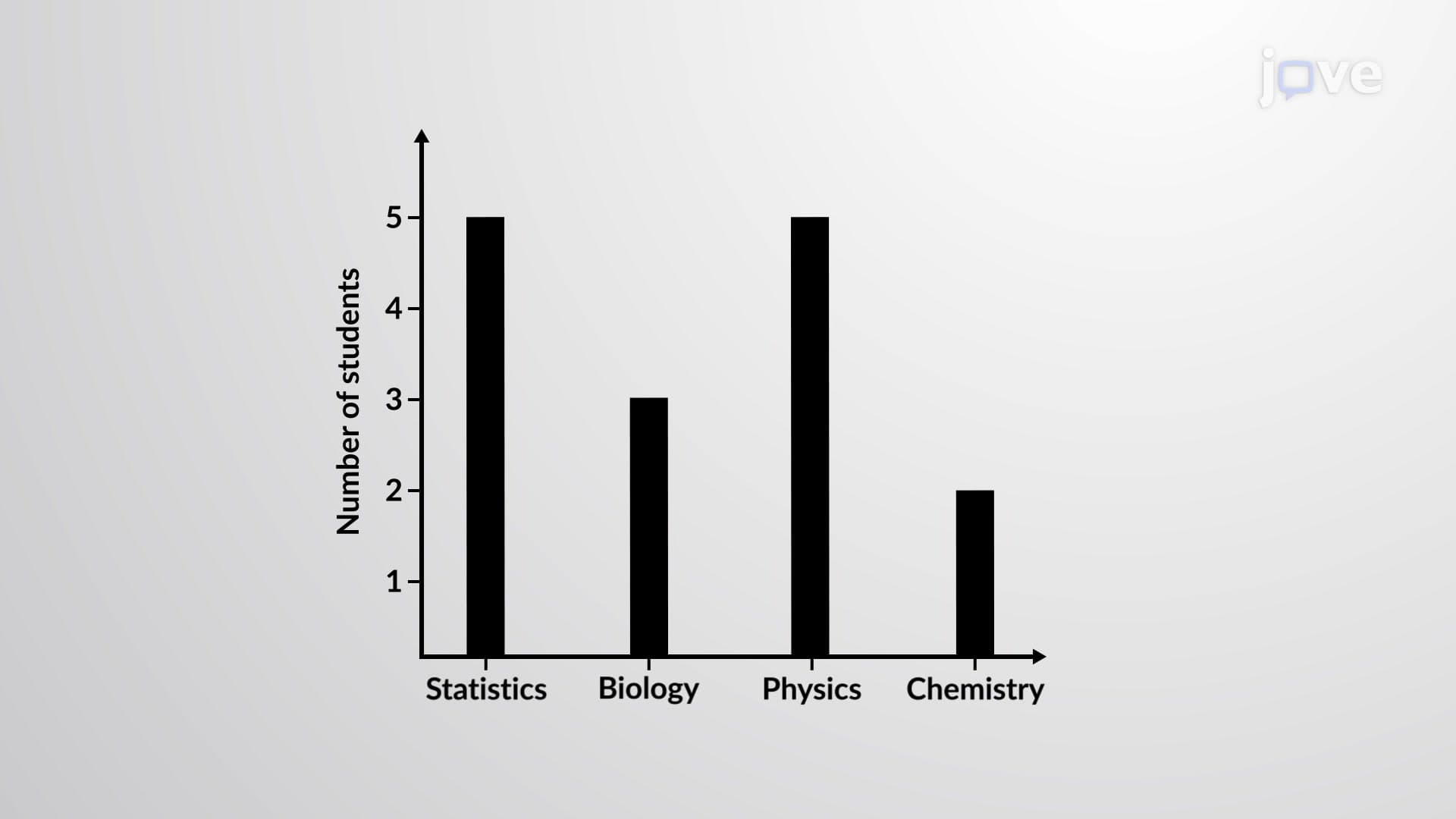
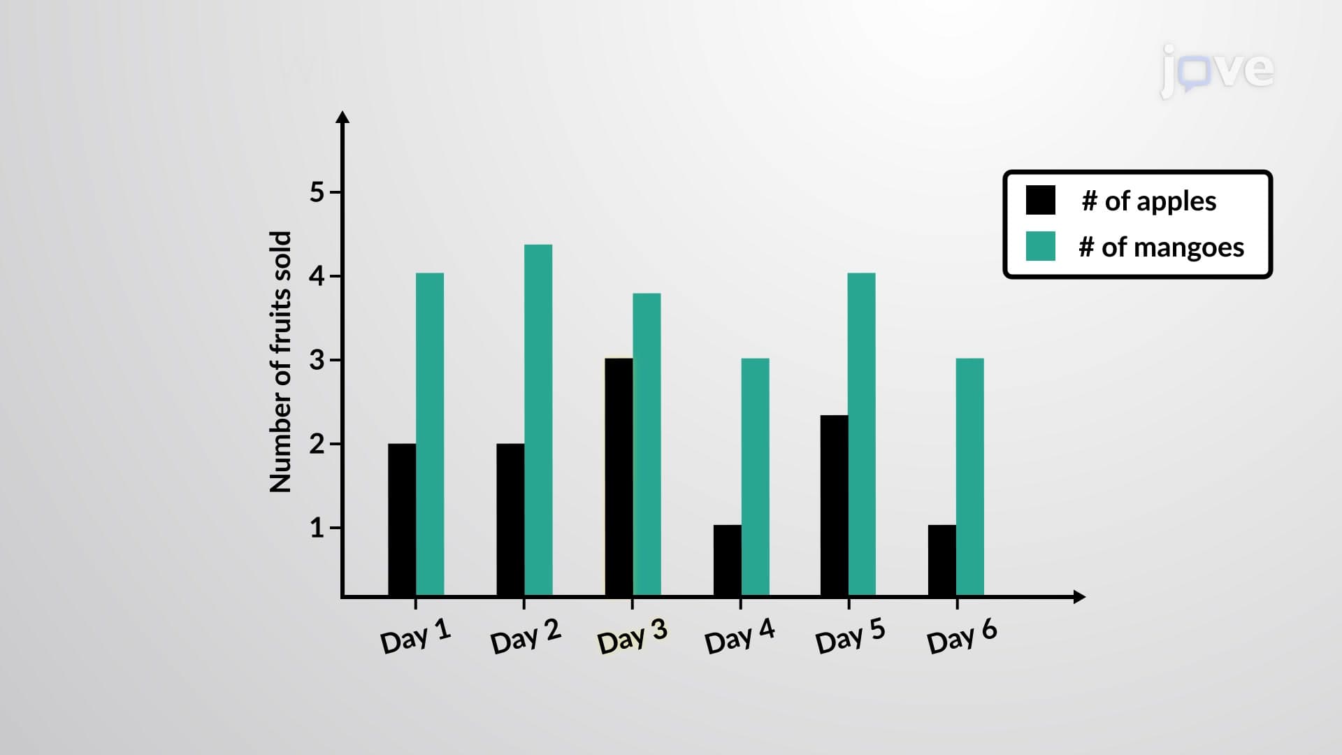
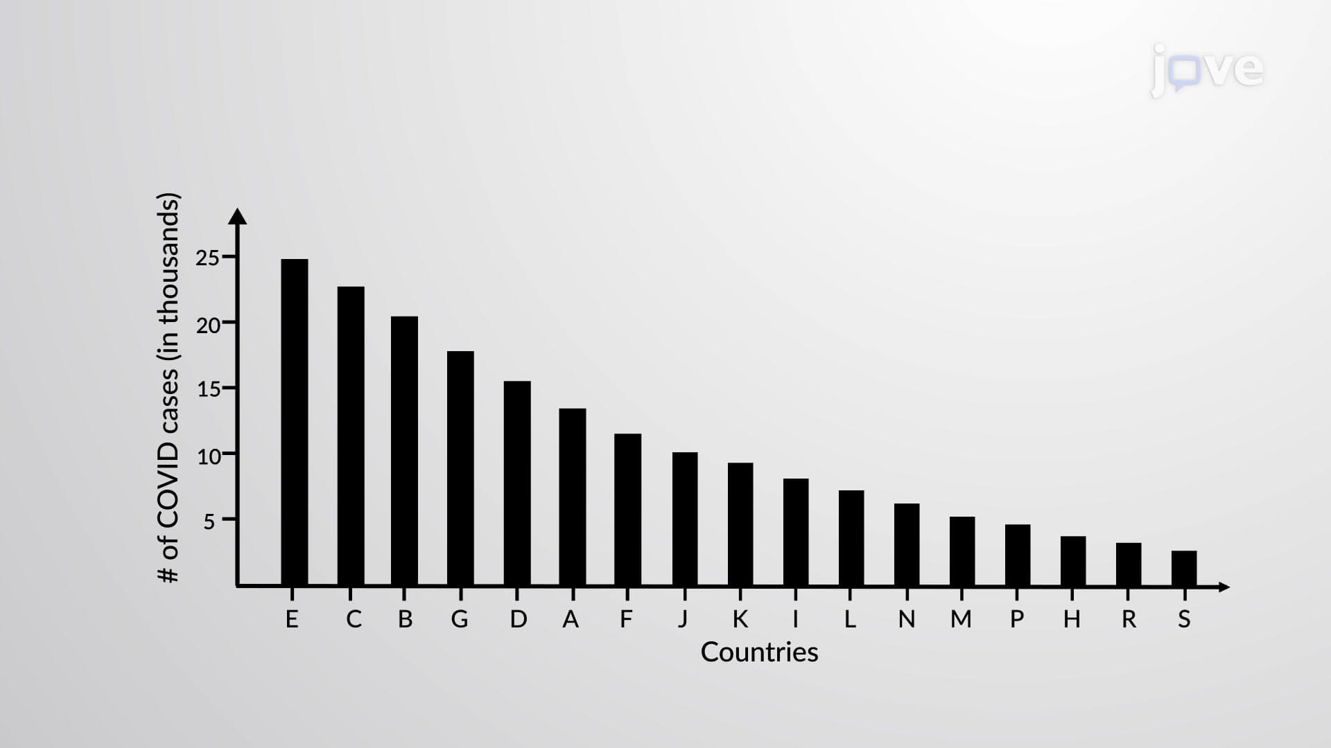
While pie charts offer intuitive visual appeal, they work best with limited categories (typically 5-7 maximum) and when precise comparisons aren't essential. They excel at highlighting dominant categories and showing clear majority-minority relationships within datasets. However, bar charts often prove superior for detailed numerical comparisons or when dealing with numerous categories.
Understanding these strengths and limitations helps students choose appropriate visualization methods for different analytical scenarios, a skill frequently tested in college statistics examinations and research methodology courses.
Related Micro-courses