Loading video…

 15 Concepts
 220.3K views

Video Summary: What Is Multiple Bar Graph
Did you know that comparing enrollment trends across different majors at US universities becomes crystal clear with a multiple bar graph? This powerful visualization tool displays two or more data sets side by side using grouped bars, making it easy to spot patterns and differences. For example, admissions offices at schools like UCLA use multiple bar graphs to compare male versus female enrollment across departments like engineering, biology, and business. What is multiple bar graph techniques help students and professionals analyze complex categorical data with remarkable clarity. Watch the full video on JoVE Coach to master this concept with expert-led visuals and step-by-step explanations.
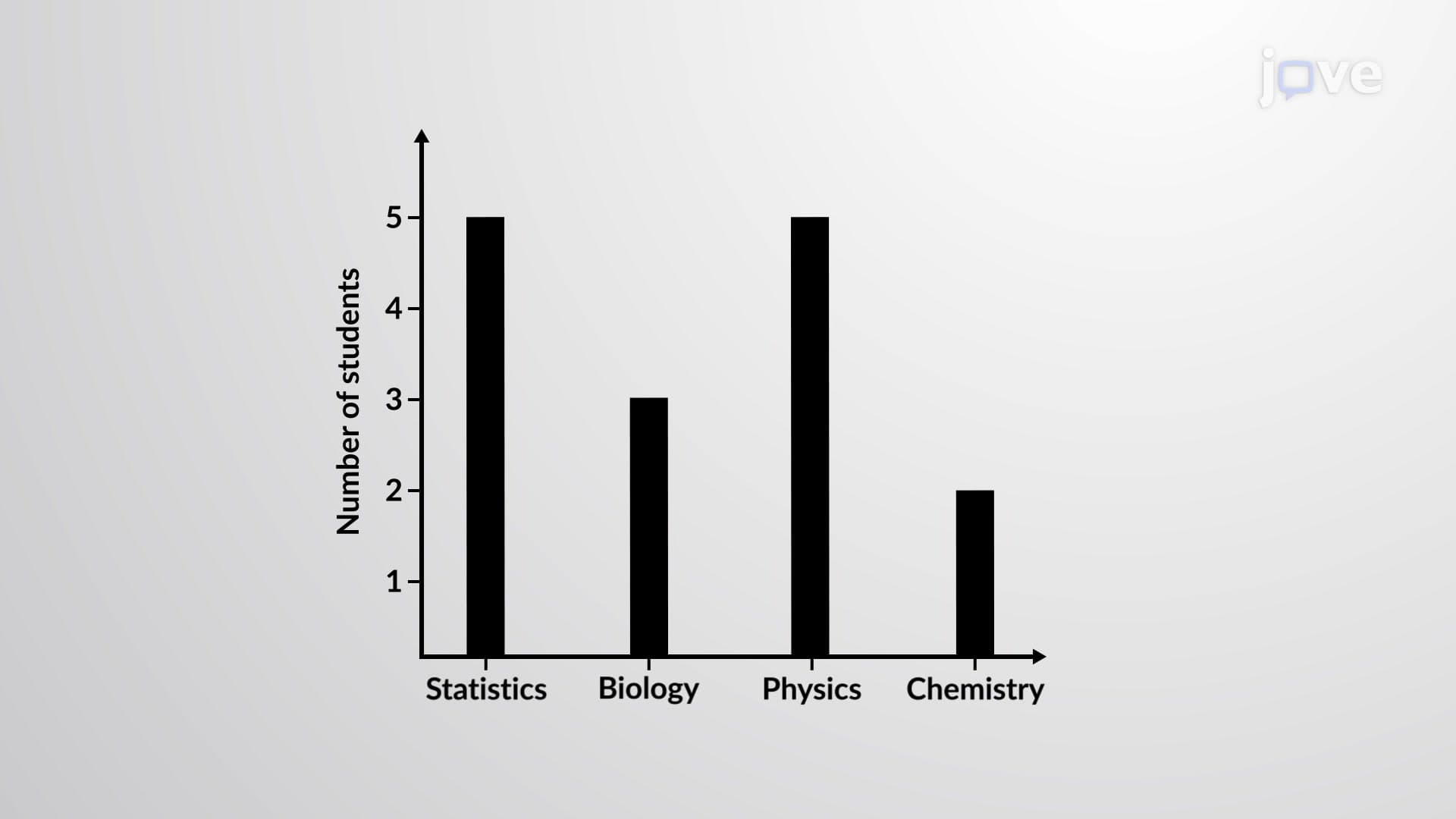
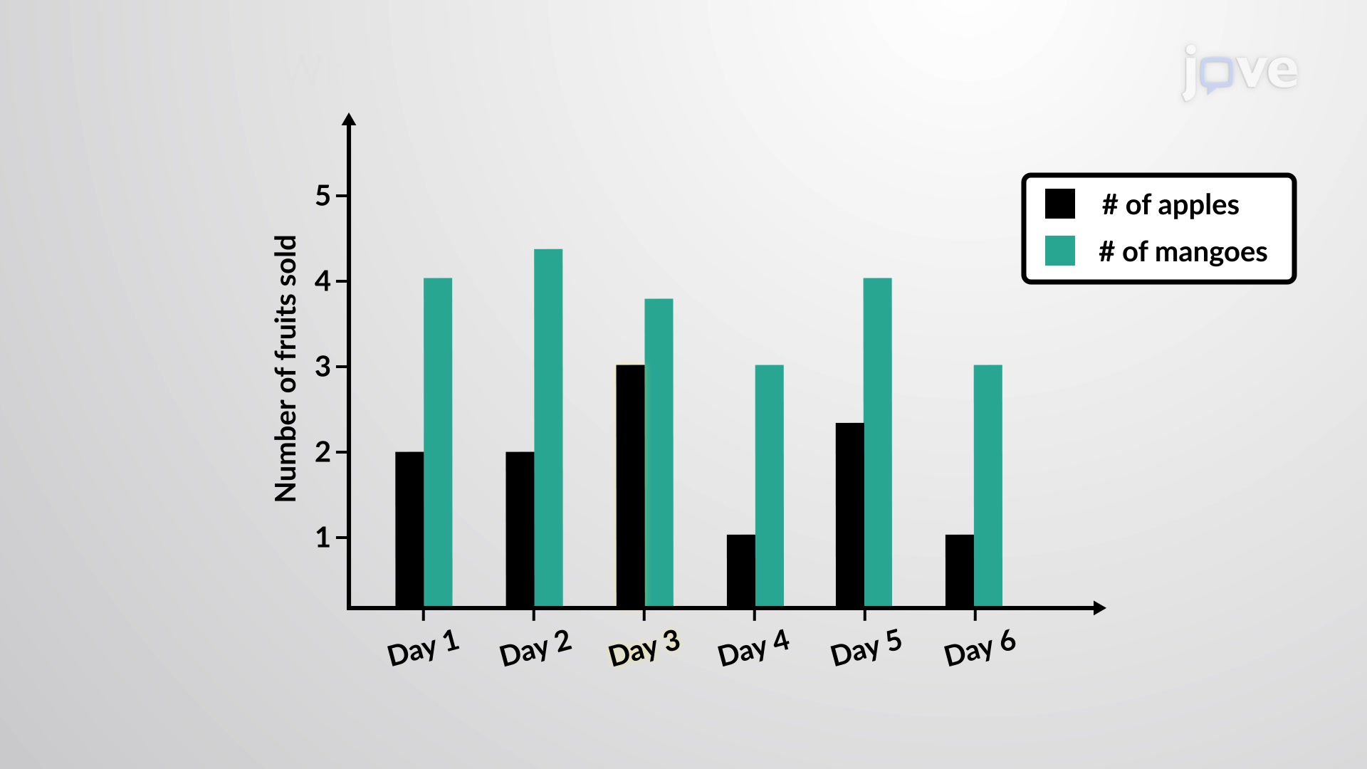
A multiple bar graph represents a sophisticated data visualization technique that displays two or more related data sets using grouped bars positioned side by side. Unlike simple bar graphs that show single data series, multiple bar graphs excel at revealing comparative relationships between categories. The multiple bar graph definition encompasses charts where each category contains multiple bars representing different data groups, separated by small gaps to maintain visual clarity.
The fundamental structure includes several key elements: categorical labels along the horizontal axis, numerical scales on the vertical axis, grouped bars of different colors or patterns, and a comprehensive legend identifying each data series. This arrangement allows viewers to make direct comparisons both within categories and across different data sets simultaneously.
Understanding the multiple bar graph concept proves essential for students tackling AP Statistics, college-level data analysis courses, and standardized tests like the SAT Math section. High school students frequently encounter these graphs when analyzing survey results, comparing academic performance across different demographic groups, or examining scientific experimental data with multiple variables.
In academic settings, the multiple bar graph study guide typically emphasizes proper scale selection, appropriate color coding, and clear labeling practices. Students learn to identify misleading representations, such as truncated scales or inappropriate bar spacing, which can distort data interpretation. College admissions tests often feature multiple bar graph questions requiring students to extract specific information, calculate percentages, or identify trends across compared groups.
The multiple bar graph basics extend far beyond classroom exercises into professional data analysis. Market researchers use these visualizations to compare product sales across different regions or demographic segments. For instance, a pharmaceutical company might use multiple bar graphs to display medication effectiveness across age groups, with separate bars representing different treatment protocols.
Healthcare professionals regularly encounter multiple bar graphs in medical journals and research publications. The MCAT frequently includes data interpretation questions featuring these visualizations, particularly in passages discussing clinical trial results or epidemiological studies. Understanding what is multiple bar graph in detail helps pre-med students analyze treatment outcomes, patient demographics, and disease prevalence patterns effectively.
Mastering understanding multiple bar graph interpretation involves recognizing subtle patterns and making accurate quantitative comparisons. Students learn to calculate percentage differences, identify statistical significance, and draw evidence-based conclusions. Advanced applications include creating multiple bar graphs using software like Excel or Google Sheets, selecting appropriate color schemes for accessibility, and presenting findings to diverse audiences clearly and persuasively.
Related Micro-courses