Loading video…

 15 Concepts
 220.3K views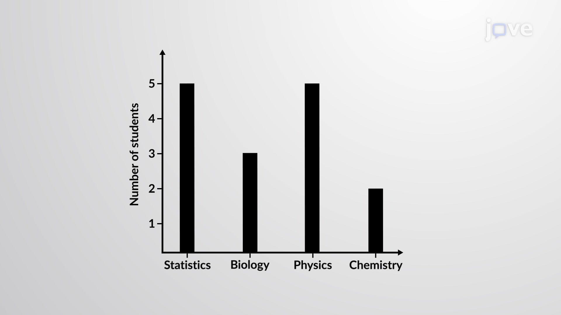

Video Summary: What Is Bar Graph
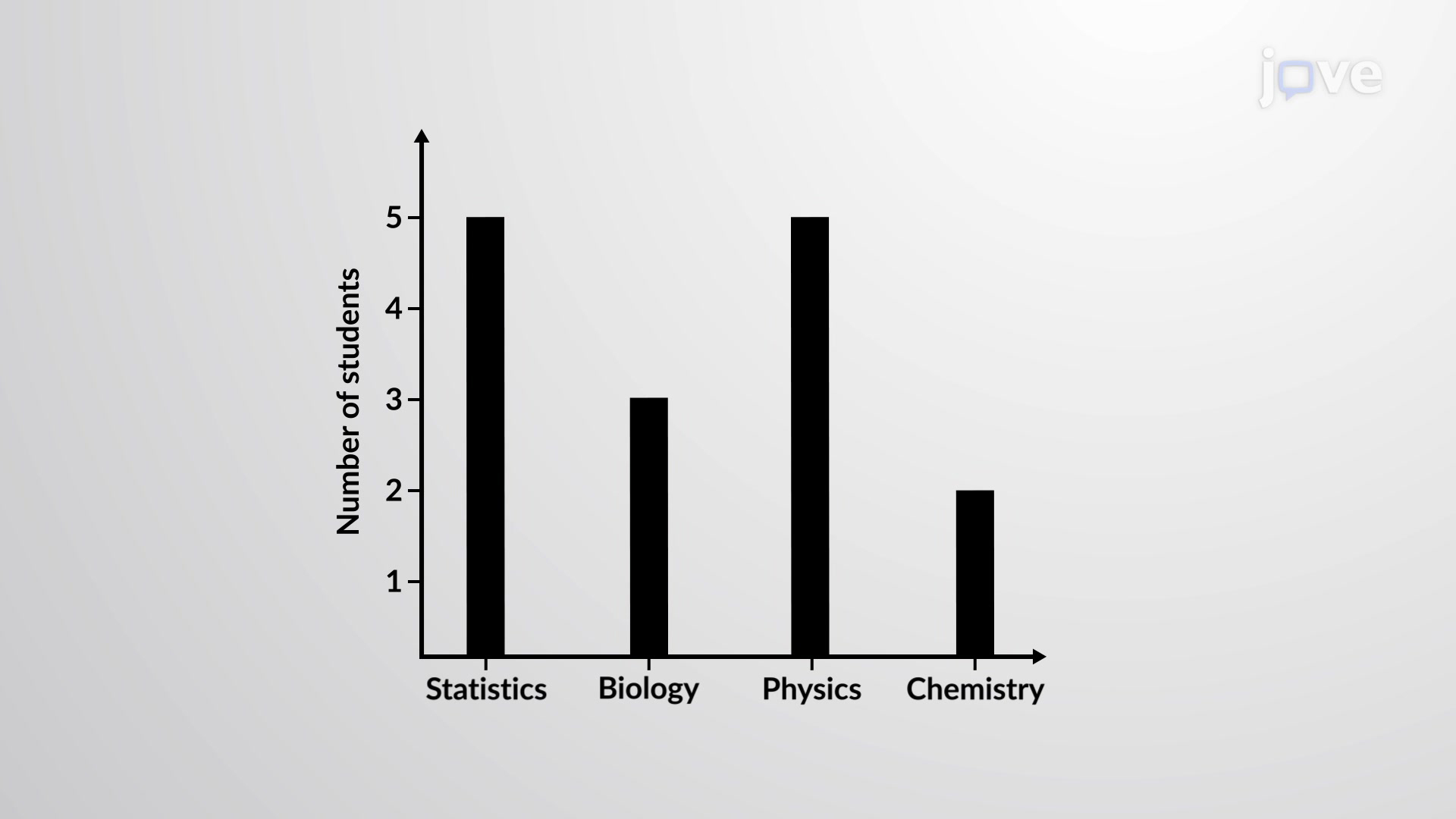
Did you know that the 2020 US Census data showing population distribution across states was primarily visualized using bar graphs? A bar graph is a visual representation tool that displays qualitative data through rectangular bars, where the height of each bar corresponds to the frequency or value of different categories. For example, a high school might use a bar graph to show the number of students enrolled in different AP courses like Statistics, Biology, Physics, and Chemistry. Watch the full video on JoVE Coach to master this concept with expert-led visuals and step-by-step explanations.
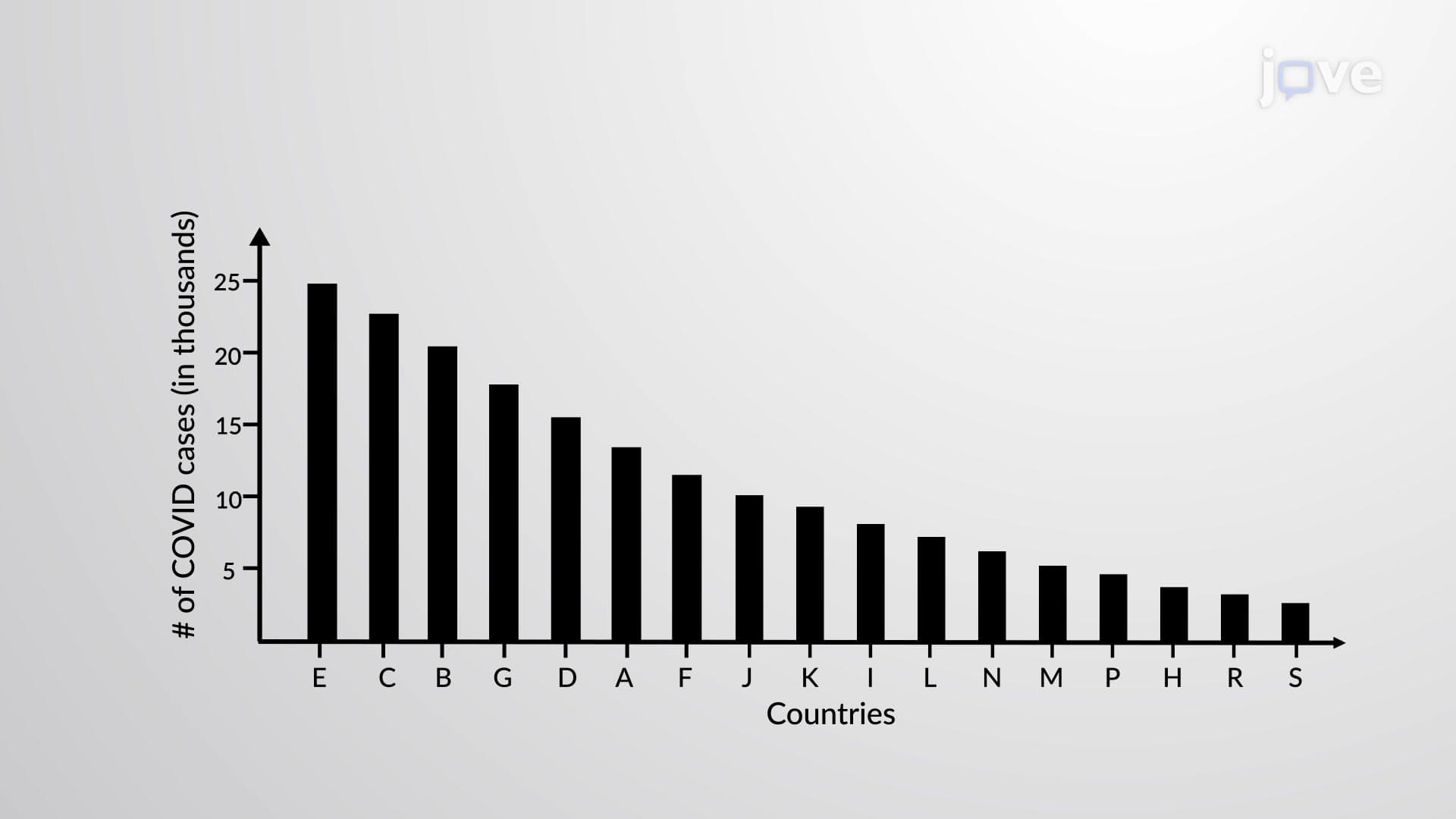
A bar graph is a fundamental statistical visualization tool that transforms categorical data into an easily interpretable visual format. Unlike numerical data that flows continuously, categorical data represents distinct groups or categories such as college majors, car brands, or survey responses. The bar graph's power lies in its ability to make these categories comparable through visual representation.
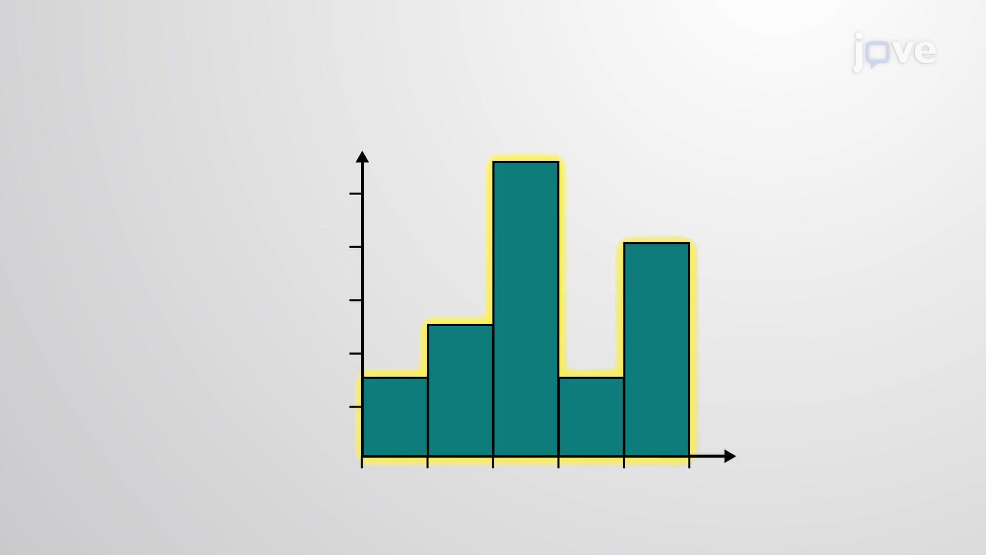
The structure consists of two perpendicular axes: the horizontal axis (x-axis) displays the categories being measured, while the vertical axis (y-axis) shows the frequency, count, or value associated with each category. Each category is represented by a rectangular bar whose height directly corresponds to its measured value, creating an immediate visual hierarchy that reveals patterns and relationships.
Constructing an effective bar graph requires attention to several critical elements. First, bars must maintain equal width to ensure visual consistency and prevent misinterpretation. The spacing between bars can vary - they may touch each other or have gaps, but this spacing should remain consistent throughout the graph. The baseline typically starts at zero to provide accurate proportional representation.
Consider a practical example: Stanford University's admissions office might create a bar graph showing applications by intended major. Computer Science might show 2,400 applications, Engineering 1,800, Business 1,500, and Liberal Arts 1,200. Each bar's height would proportionally represent these numbers, instantly revealing which programs attract the most interest.
Bar graphs appear extensively in standardized testing, particularly on the SAT Math section and AP Statistics exam. Students encounter them in data analysis questions where they must interpret trends, compare categories, or calculate percentages from visual data. College-level statistics courses use bar graphs as foundational tools before progressing to more complex visualizations.
In professional contexts, bar graphs serve crucial roles across industries. Marketing departments use them to display consumer preferences, medical researchers present patient demographics, and educational institutions track enrollment trends. The CDC frequently employs bar graphs in public health reports, such as vaccination rates by state or disease prevalence across age groups.
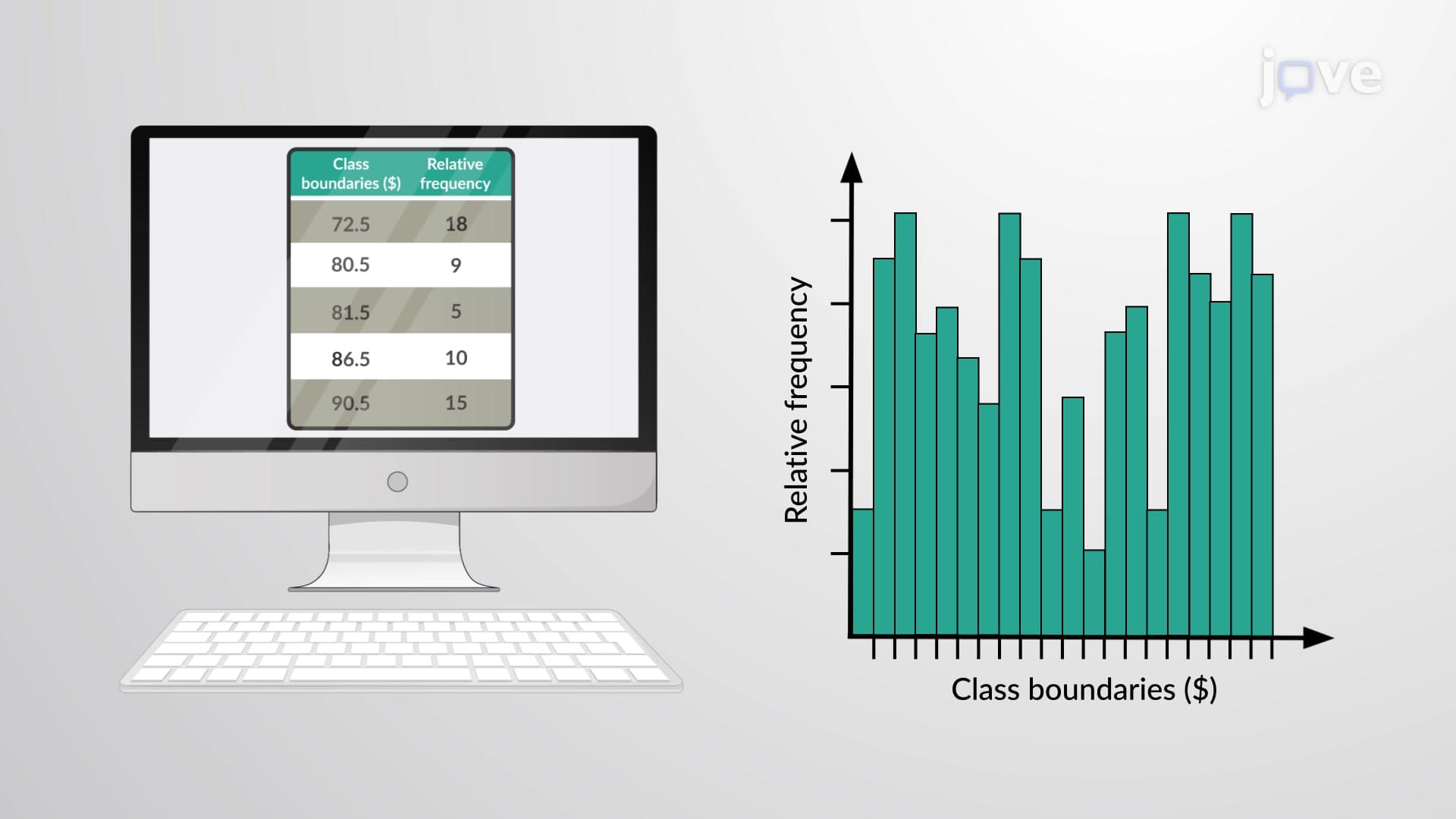
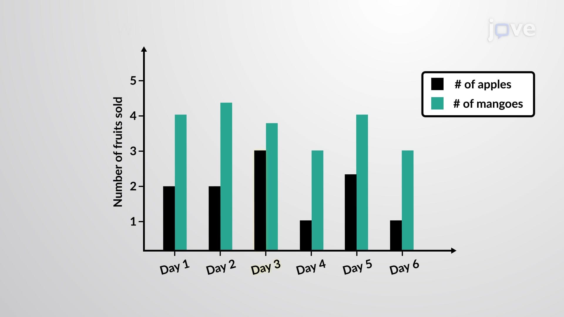
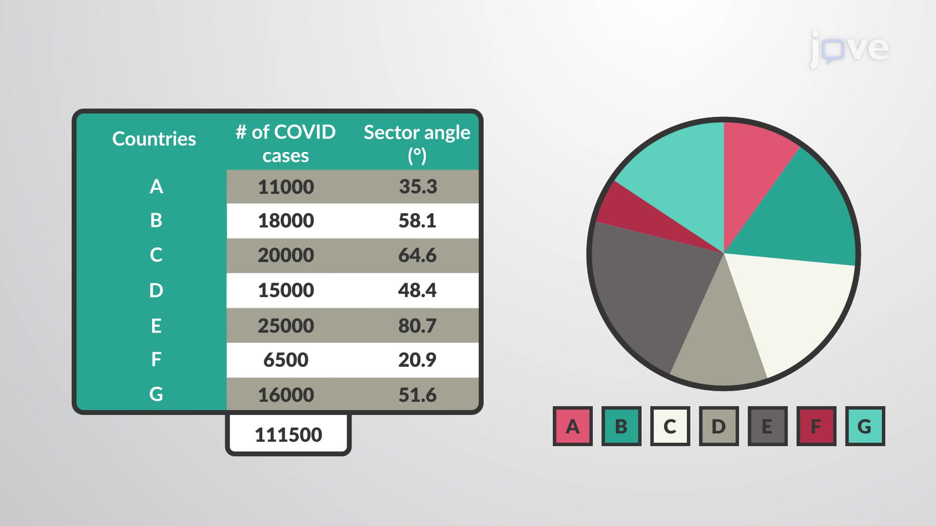
Beyond basic bar graphs, several variations serve specialized purposes. Grouped bar graphs compare multiple data series simultaneously - for example, showing both male and female enrollment across different academic departments. Stacked bar graphs display component parts of a whole, useful for budget breakdowns or demographic compositions. Horizontal bar graphs work better when category names are lengthy, preventing text overlap issues.
Effective bar graph design follows key principles: clear, descriptive titles; properly labeled axes with appropriate units; consistent color schemes; and appropriate scaling that neither compresses nor exaggerates differences. These elements ensure accurate data communication and support evidence-based decision-making across academic and professional settings.
Related Micro-courses