Loading video…

 15 Concepts
 220.3K views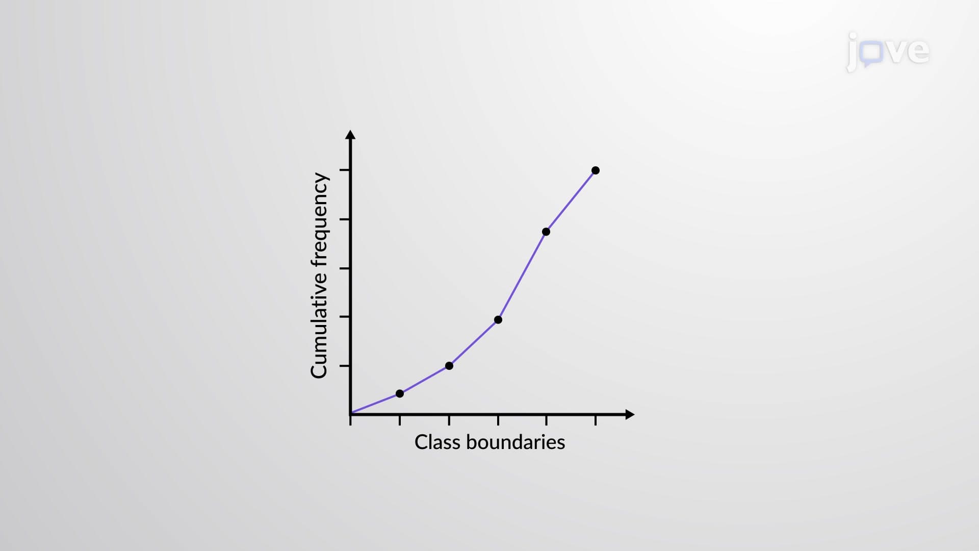

Video Summary: What Is Ogive Graph
Ever wondered how Netflix tracks viewing patterns across millions of users, or how the CDC monitors disease progression rates? An ogive graph provides the perfect visual tool for understanding cumulative data trends. This statistical visualization displays cumulative frequencies along continuous class boundaries, making it invaluable for analyzing data like SAT score distributions across US high schools. For instance, an ogive graph can instantly show how many students scored below 1200 on the SAT nationwide. Watch the full video on JoVE Coach to master this concept with expert-led visuals and step-by-step explanations.
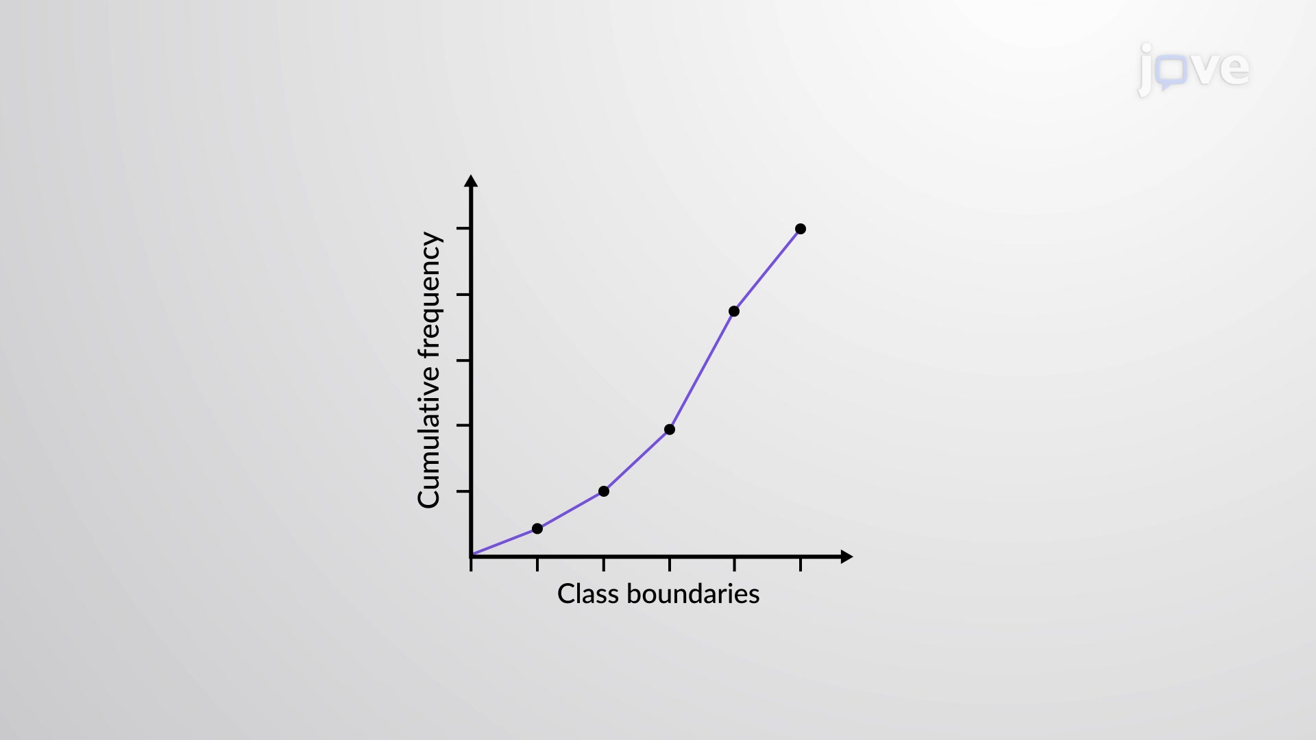
An ogive graph (pronounced "OH-jive") serves as a powerful statistical visualization tool that displays cumulative frequency data across continuous class intervals. Unlike traditional histograms that show individual class frequencies, ogive graphs reveal how data accumulates progressively, making them essential for understanding percentile rankings, quartile distributions, and threshold analyses commonly encountered in AP Statistics and college-level data science courses.
The ogive graph structure follows specific conventions that ensure accurate data interpretation. The X-axis represents class boundaries (not class midpoints), which eliminate gaps between adjacent classes and provide continuous data representation. The Y-axis displays cumulative frequencies, starting from zero and increasing to the total sample size. Each plotted point represents the total count of observations below that particular class boundary, connected by straight line segments to form the characteristic S-shaped curve.
Consider analyzing ACT scores from a sample of 1,000 US high school graduates. If 150 students scored below 20, 380 scored below 24, and 720 scored below 28, these cumulative totals become the Y-coordinates plotted against their respective score boundaries on the X-axis.
Ogive graphs prove invaluable across multiple disciplines and standardized testing scenarios. In educational assessment, College Board uses ogive-style representations to show SAT score distributions, helping students understand their percentile rankings. Healthcare researchers employ ogive graphs to track disease progression rates, while economists analyze income distribution patterns across different demographic groups.
For college admissions counselors, ogive graphs help visualize how many applicants fall below specific GPA or test score thresholds, enabling data-driven decision-making. Similarly, quality control managers in manufacturing use ogive graphs to monitor defect rates and ensure products meet specified standards.
The slope of an ogive graph reveals crucial information about data distribution. Steep slopes indicate high frequency density within specific ranges, while gentler slopes suggest more evenly distributed data. The classic S-curve shape typically emerges from normally distributed data, with slower accumulation at the extremes and rapid increases near the mean values.
Students preparing for AP Statistics exams should recognize that ogive graphs enable quick percentile calculations and quartile identification without complex computations, making them powerful tools for both exam success and real-world statistical analysis.
Related Micro-courses