Loading video…

 15 Concepts
 220.3K views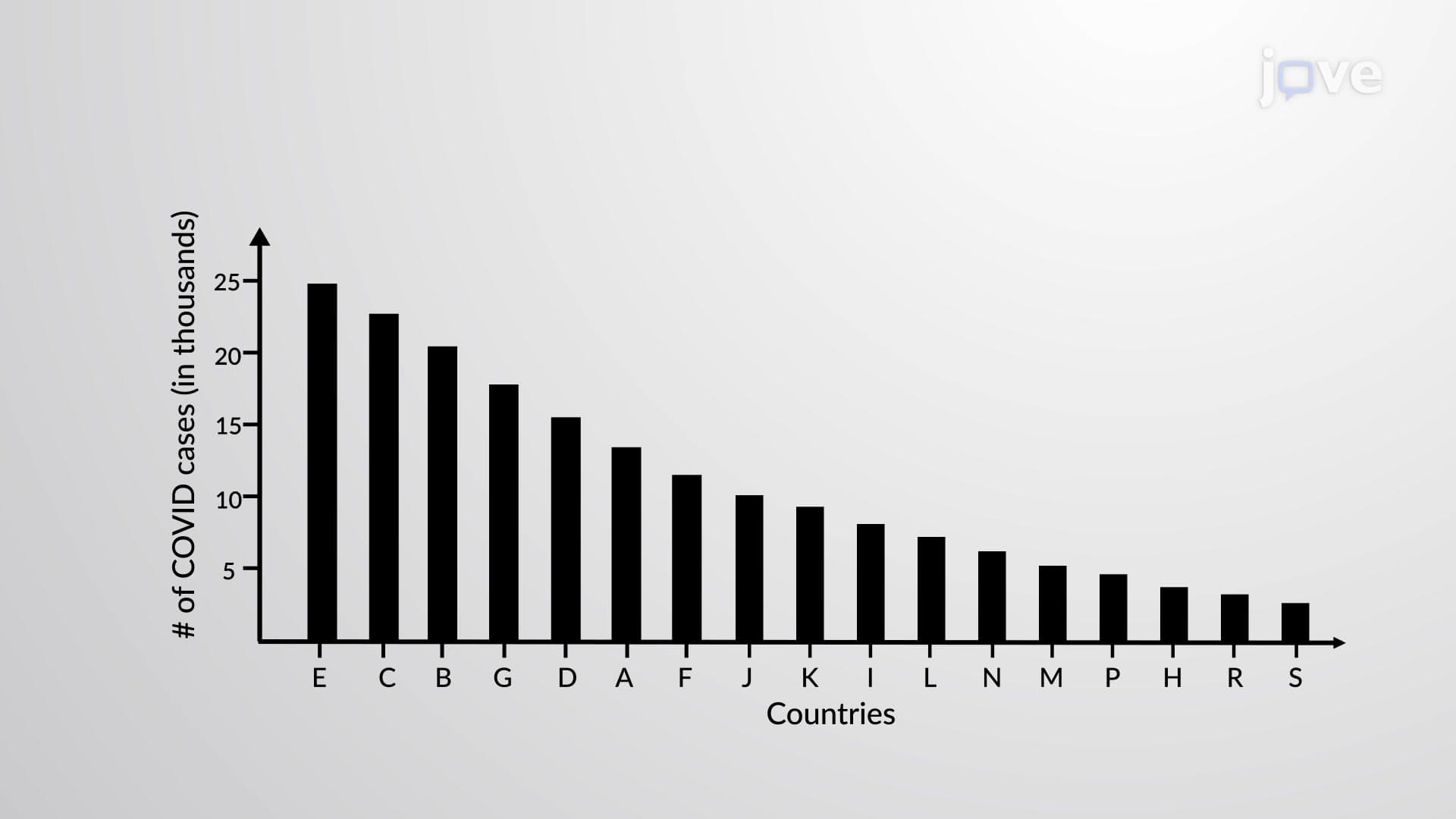

Video Summary: What Is Pareto Chart
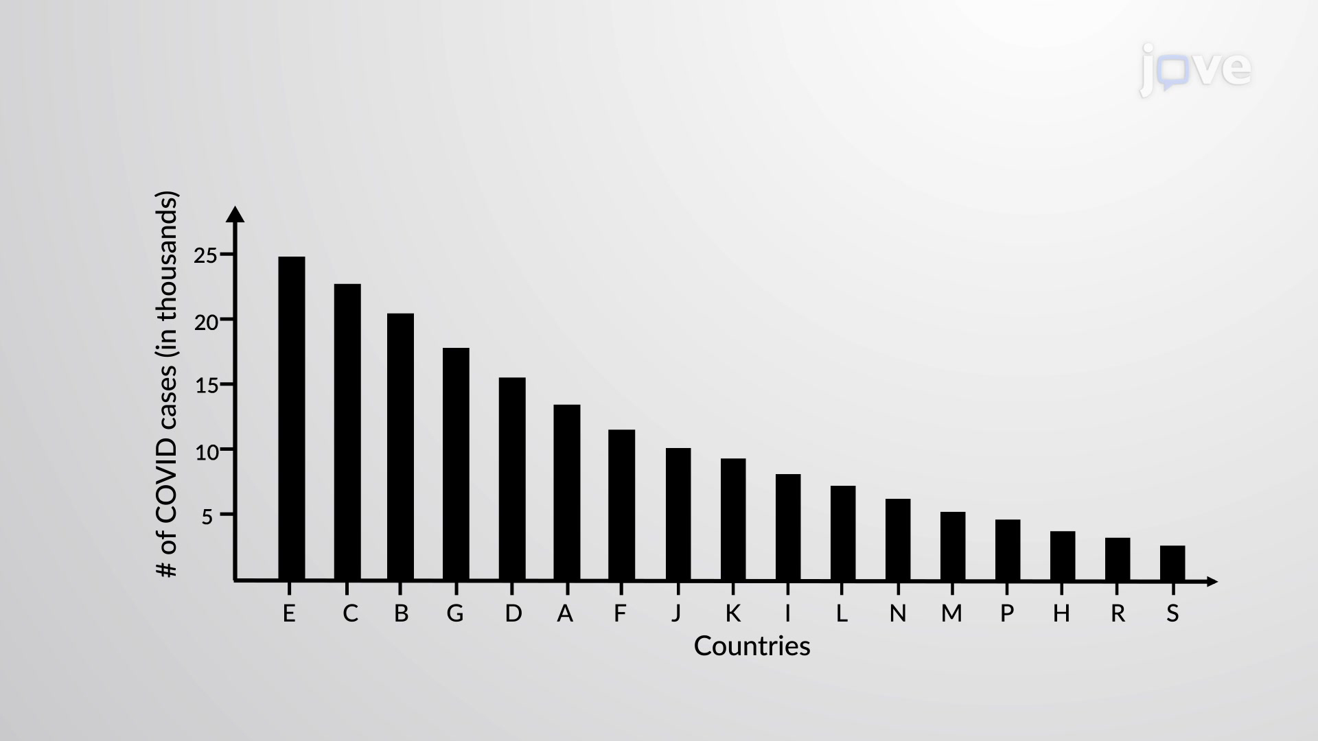
When analyzing COVID-19 case data across US states, how do you instantly identify which states had the highest infection rates? A pareto chart transforms overwhelming datasets into clear visual insights by arranging categories in descending order of frequency or importance. This modified bar graph places categories like states on the horizontal axis and frequencies on the vertical axis, making patterns immediately visible. For example, California's high case numbers would appear as the tallest bar on the left, while smaller states occupy the right side. Watch the full video on JoVE Coach to master this concept with expert-led visuals and step-by-step explanations.
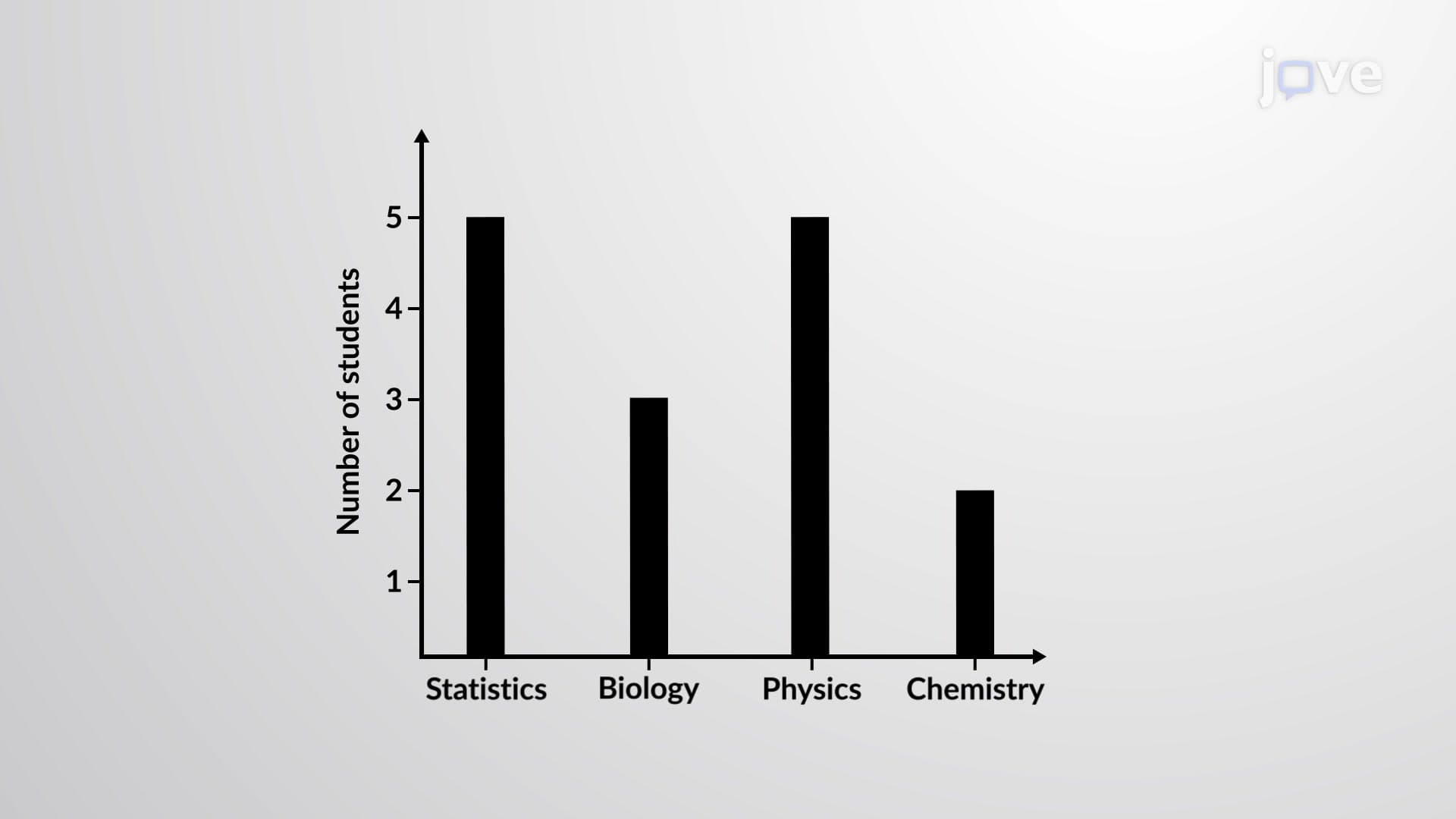
A pareto chart represents a powerful statistical visualization tool that combines bar graph elements with cumulative percentage analysis. Named after Italian economist Vilfredo Pareto, this chart type arranges data categories in descending order of frequency, magnitude, or importance. Unlike standard bar charts that may present data alphabetically or chronologically, pareto charts prioritize visual impact by highlighting the most significant contributors first.
The fundamental structure includes three essential components: categories displayed along the horizontal axis, frequencies or values on the left vertical axis, and often a cumulative percentage line with its scale on the right vertical axis. This dual-axis approach enables viewers to see both individual category contributions and their cumulative impact simultaneously.
Healthcare organizations across the United States extensively utilize pareto charts for analyzing patient data, treatment outcomes, and resource allocation. The Centers for Disease Control and Prevention (CDC) employs pareto chart principles when presenting disease surveillance data, helping public health officials identify priority areas for intervention. During the COVID-19 pandemic, state health departments used these visualizations to track case distributions across counties, enabling targeted resource deployment.
American manufacturing companies leverage pareto charts for quality control initiatives, following the principle that roughly 80% of problems stem from 20% of causes. Ford Motor Company, for instance, might use pareto analysis to identify the most common vehicle defects, prioritizing engineering resources toward addressing the most frequent issues first.
Students encounter pareto chart concepts in multiple academic contexts, particularly in AP Statistics courses where data visualization and interpretation skills are emphasized. College-level business statistics, operations management, and public health courses frequently incorporate pareto analysis as a decision-making tool. The concept appears in various standardized exams, including AP Statistics free-response questions that require students to interpret graphical displays and draw conclusions from data patterns.
Effective pareto chart analysis extends beyond simple frequency ranking. The cumulative percentage component reveals inflection points where diminishing returns begin, helping analysts determine optimal resource allocation strategies. Professional applications often incorporate cost-benefit analysis alongside frequency data, creating weighted pareto charts that reflect both occurrence rates and impact severity.
Related Micro-courses