Loading video…

 15 Concepts
 220.3K views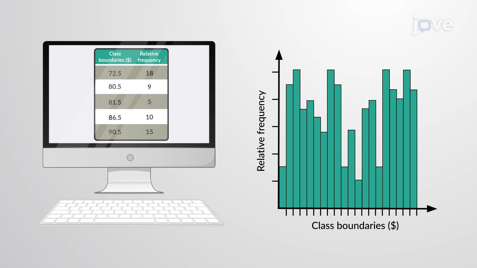

Video Summary: What Is Relative Frequency Histogram
Ever wonder how Netflix analyzes viewing patterns across millions of users, or how the CDC tracks disease prevalence across different age groups? A relative frequency histogram transforms raw data into visual proportions that reveal meaningful patterns. Unlike regular histograms that show raw counts, relative frequency histograms display what percentage or fraction each data range represents of the total dataset. For example, a relative frequency histogram of SAT scores might show that 23% of test-takers scored between 1200-1300 points. Watch the full video on JoVE Coach to master this concept with expert-led visuals and step-by-step explanations.
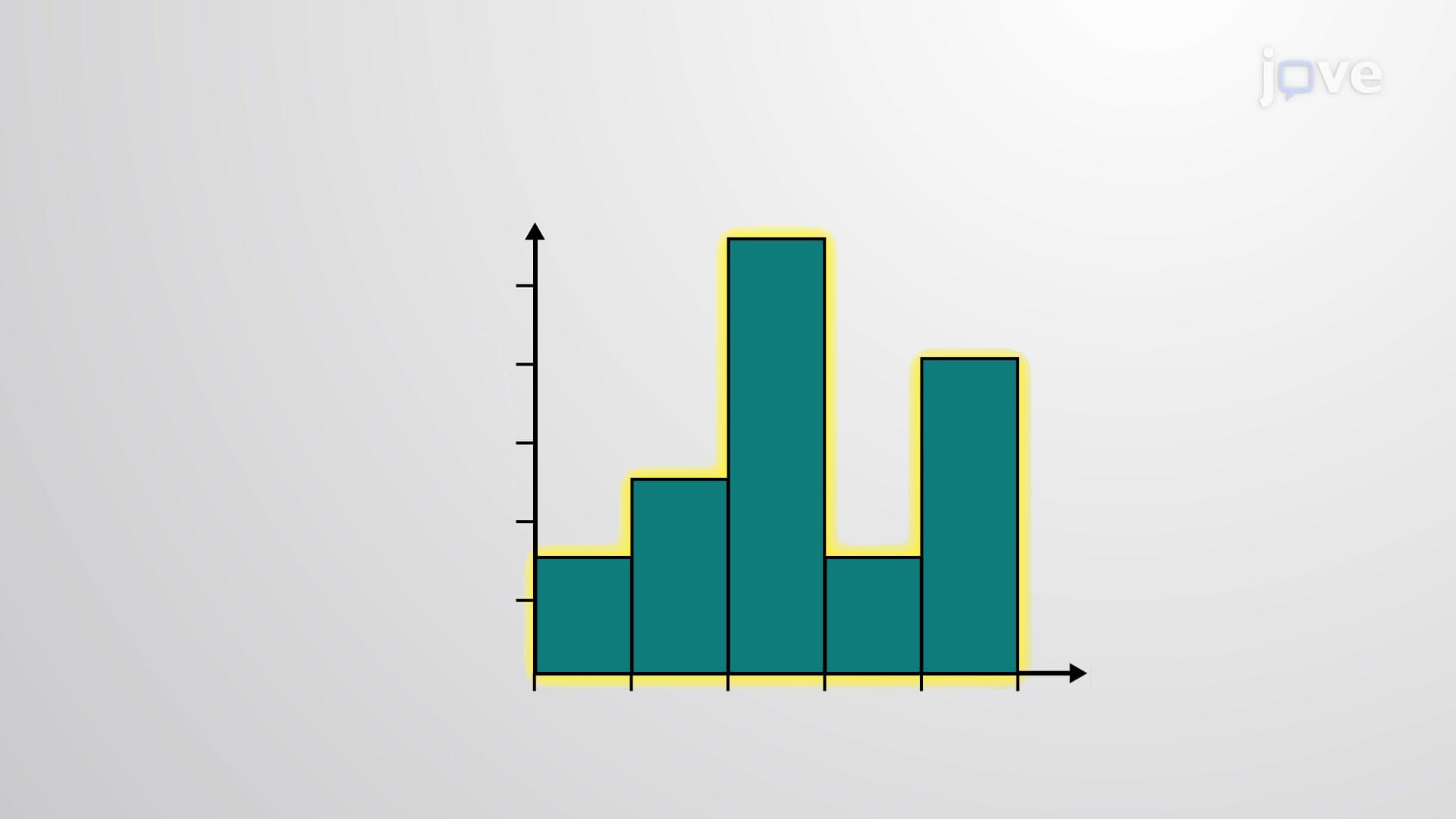
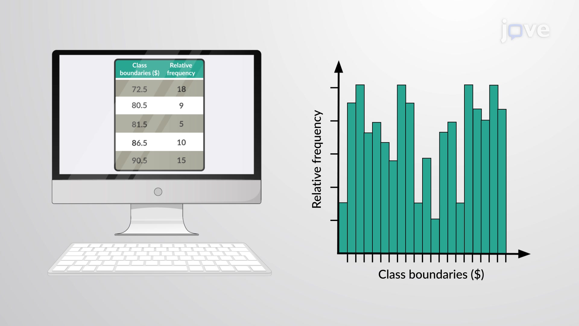
A relative frequency histogram serves as a powerful statistical visualization tool that displays data proportions rather than raw counts. While a standard histogram shows how many times each value appears, a relative frequency histogram reveals what fraction or percentage each interval represents of the entire dataset. This distinction makes relative frequency histograms invaluable when comparing datasets of different sizes or when understanding proportional relationships matters more than absolute numbers.
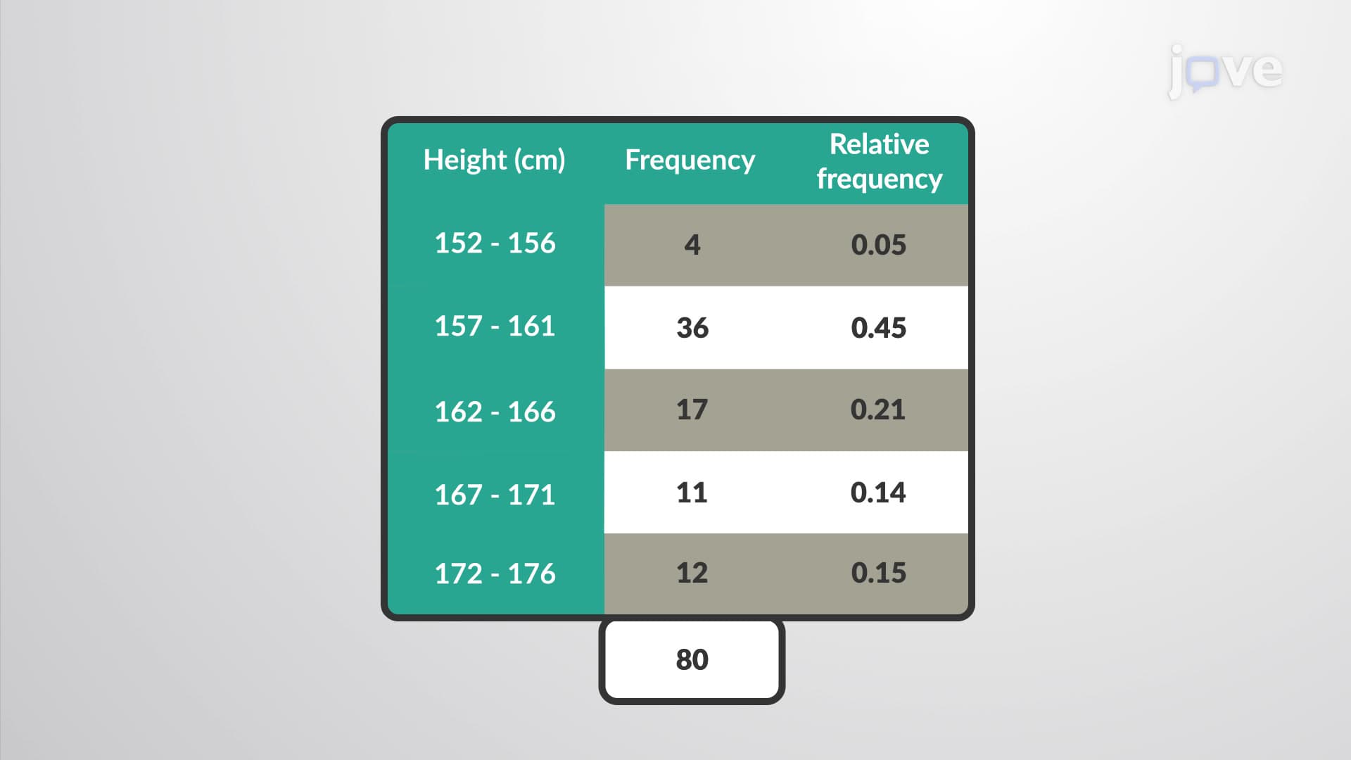
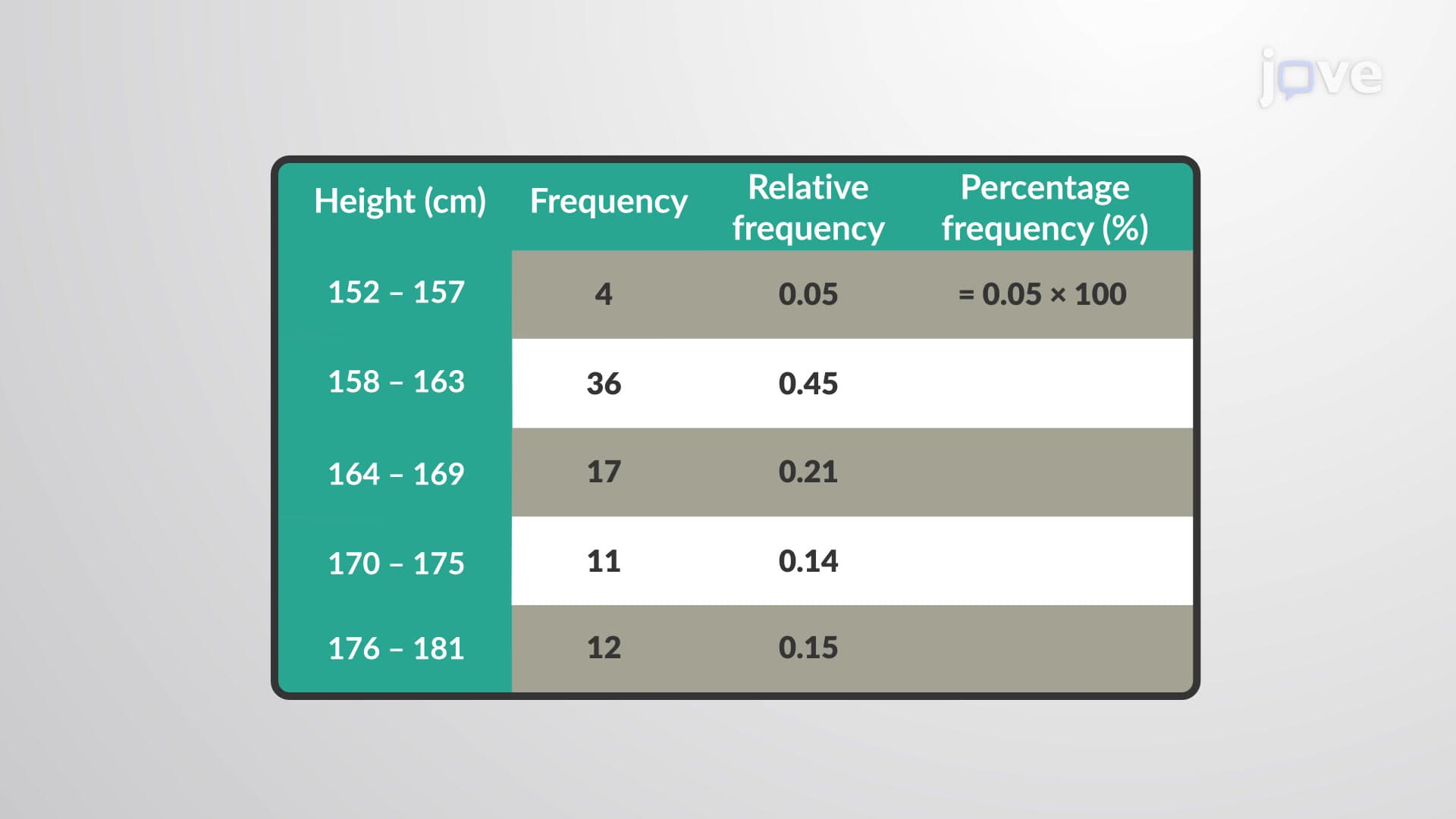
Creating a relative frequency histogram begins with calculating relative frequencies for each class interval. The relative frequency equals the class frequency divided by the total number of observations. For instance, if 85 out of 500 students scored between 80-90% on an AP Statistics exam, the relative frequency would be 85/500 = 0.17 or 17%. The horizontal axis displays class boundaries or midpoints, while the vertical axis shows these relative frequency values. Adjacent bars connect without gaps, creating a continuous visual representation of the data distribution.
Relative frequency histograms prove essential across numerous fields. Market researchers use them to analyze consumer purchasing patterns, showing what percentage of customers fall into different spending categories. Medical professionals employ these histograms to visualize patient age distributions or treatment response rates. In educational assessment, standardized test scores like the SAT or ACT are often presented using relative frequency histograms, allowing educators to understand how student performance distributes across different score ranges.
Students encounter relative frequency histograms extensively in AP Statistics, college-level introductory statistics courses, and standardized test preparation. The College Board frequently includes relative frequency histogram interpretation questions on AP exams, testing students' ability to read proportional data and make statistical inferences. Understanding these concepts also proves crucial for success in upper-level courses like biostatistics, econometrics, and research methodology, where proportional data analysis becomes increasingly sophisticated.
Related Micro-courses