Loading video…

 15 Concepts
 220.3K views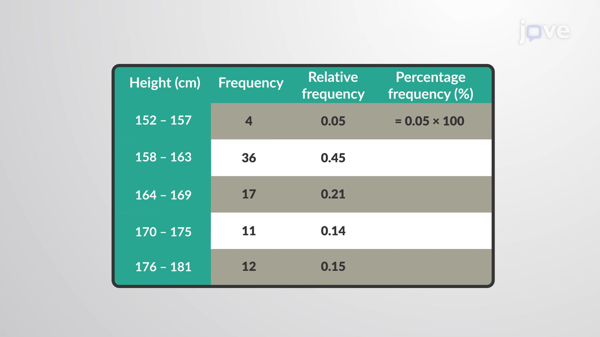

Video Summary: What Is Percentage Frequency Distribution
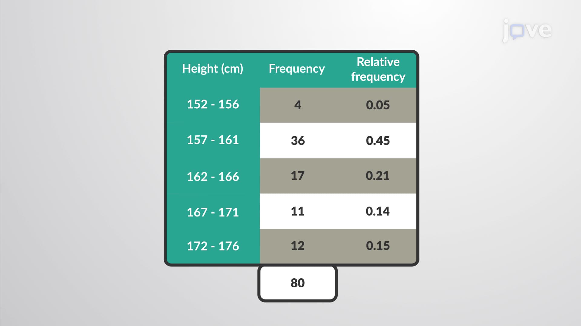
Did you know that when the NCAA analyzes basketball player heights across Division I colleges, they convert raw data into percentage frequency distribution to reveal meaningful patterns? A percentage frequency distribution transforms relative frequencies into percentages by multiplying each relative frequency by 100, making data interpretation more intuitive. For instance, if 0.15 of college basketball players fall between 6'2" and 6'4", this becomes 15% in percentage frequency format. This statistical tool is essential for analyzing everything from SAT score ranges to clinical trial outcomes across American healthcare systems. Watch the full video on JoVE Coach to master this concept with expert-led visuals and step-by-step explanations.
Percentage frequency distribution represents one of the most practical ways to present statistical data in an easily digestible format. Unlike raw frequency counts or relative frequencies expressed as decimals, percentage frequency distribution converts proportional data into familiar percentage terms that resonate with students, researchers, and decision-makers alike.
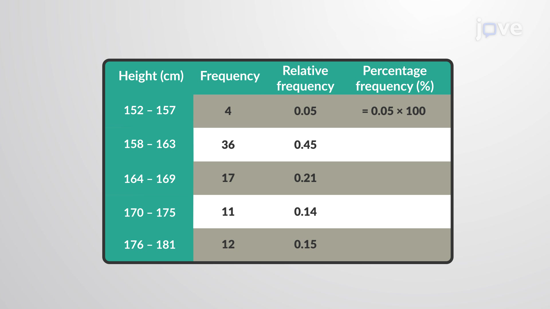
The mathematical foundation is straightforward: percentage frequency equals relative frequency multiplied by 100. If a relative frequency is 0.25, the corresponding percentage frequency becomes 25%. This simple transformation makes data interpretation significantly more intuitive, especially when communicating findings to non-statistical audiences.
Consider how the College Board analyzes SAT score distributions across the United States. Rather than presenting relative frequencies like 0.34 for students scoring between 1200-1400, they convert this to 34% for clearer public understanding. Similarly, medical schools examining MCAT score distributions use percentage frequency distribution to identify competitive score ranges-if 0.12 of test-takers score between 515-520, this translates to 12% of applicants.
Healthcare applications are equally compelling. The CDC frequently employs percentage frequency distribution when reporting vaccination rates across different age groups. If 0.78 of adults aged 65+ received flu vaccines, presenting this as 78% creates immediate impact and understanding among public health officials and media outlets.
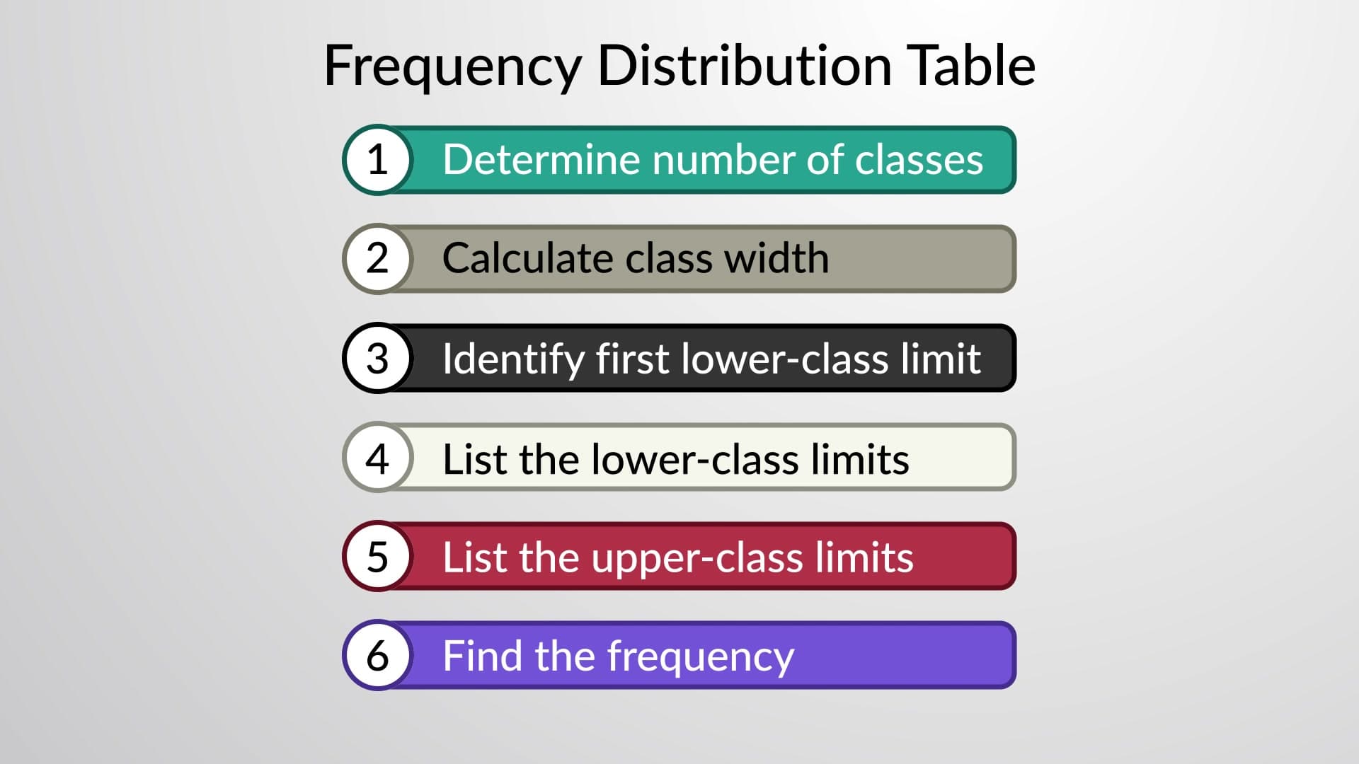
Creating an effective percentage frequency distribution requires systematic organization. Start with your class intervals (height ranges, score brackets, age groups), calculate relative frequencies for each class, then multiply each by 100. The critical validation step involves ensuring all percentage frequencies sum to exactly 100%-any deviation indicates calculation errors.
For AP Statistics students, this concept frequently appears in data analysis questions where you must interpret percentage frequency tables or construct them from raw data. College-level statistics courses extend this foundation into probability theory, where percentage frequency distribution becomes the bridge to understanding probability distributions and sampling theory.
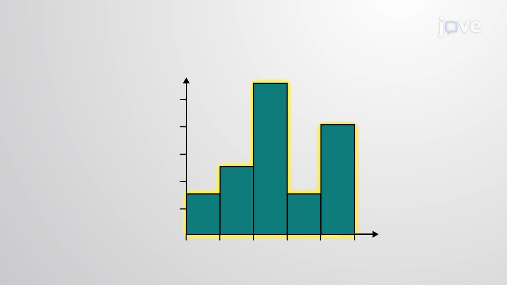
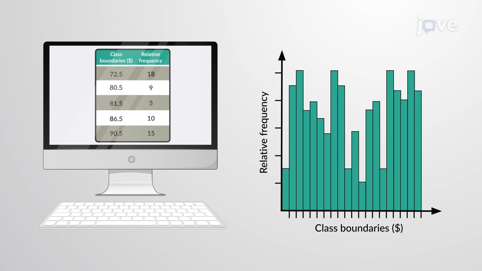
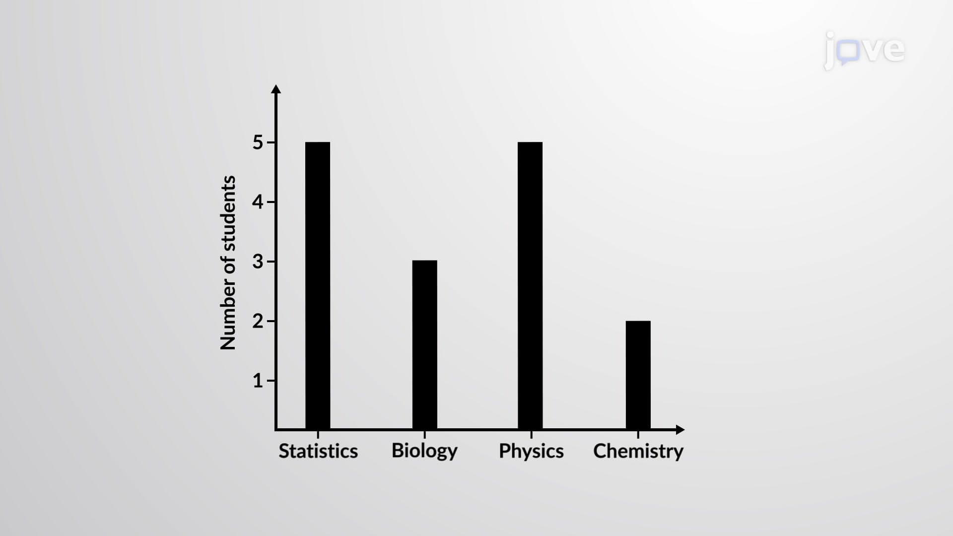
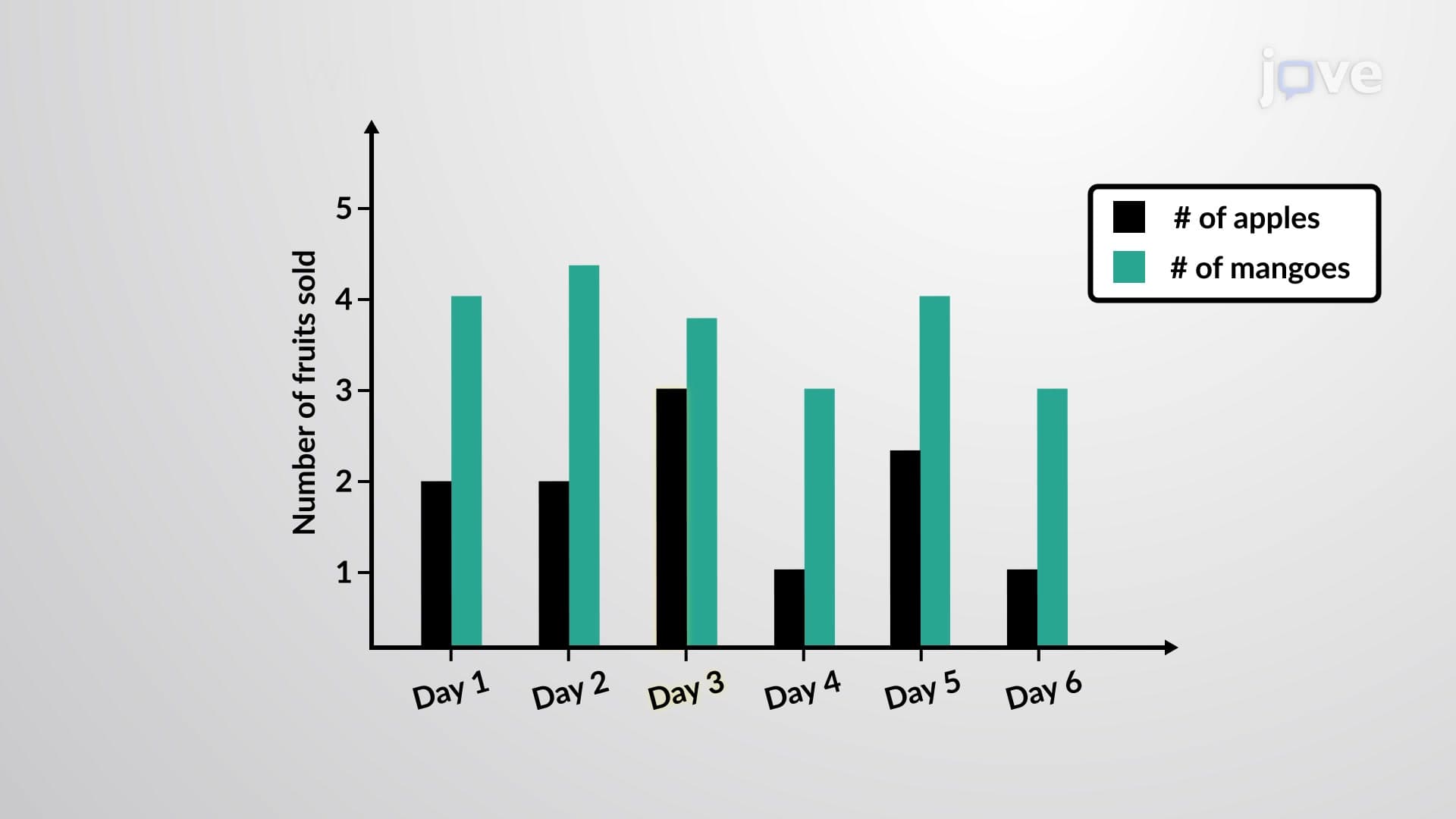
The visual presentation of percentage frequency distribution through histograms, bar charts, and pie charts enhances data comprehension significantly. When preparing for standardized exams like the MCAT or nursing entrance exams (HESI A2, TEAS), students encounter percentage frequency distribution in research methodology questions and data interpretation scenarios.
Related Micro-courses