Loading video…

 15 Concepts
 220.3K views

Video Summary: What Is Time Series Graph
Ever wonder how Netflix tracks your daily viewing hours or how meteorologists predict next week's weather? A time series graph visualizes data collected over specific time intervals, revealing patterns that static snapshots miss entirely. Consider how the Federal Reserve monitors inflation rates monthly-plotting these percentages against time creates a powerful visual story of economic trends. From tracking your heart rate during exercise to analyzing Tesla's stock performance, time series graphs transform numerical data into meaningful insights that drive decisions in healthcare, finance, and research. Watch the full video on JoVE Coach to master this concept with expert-led visuals and step-by-step explanations.
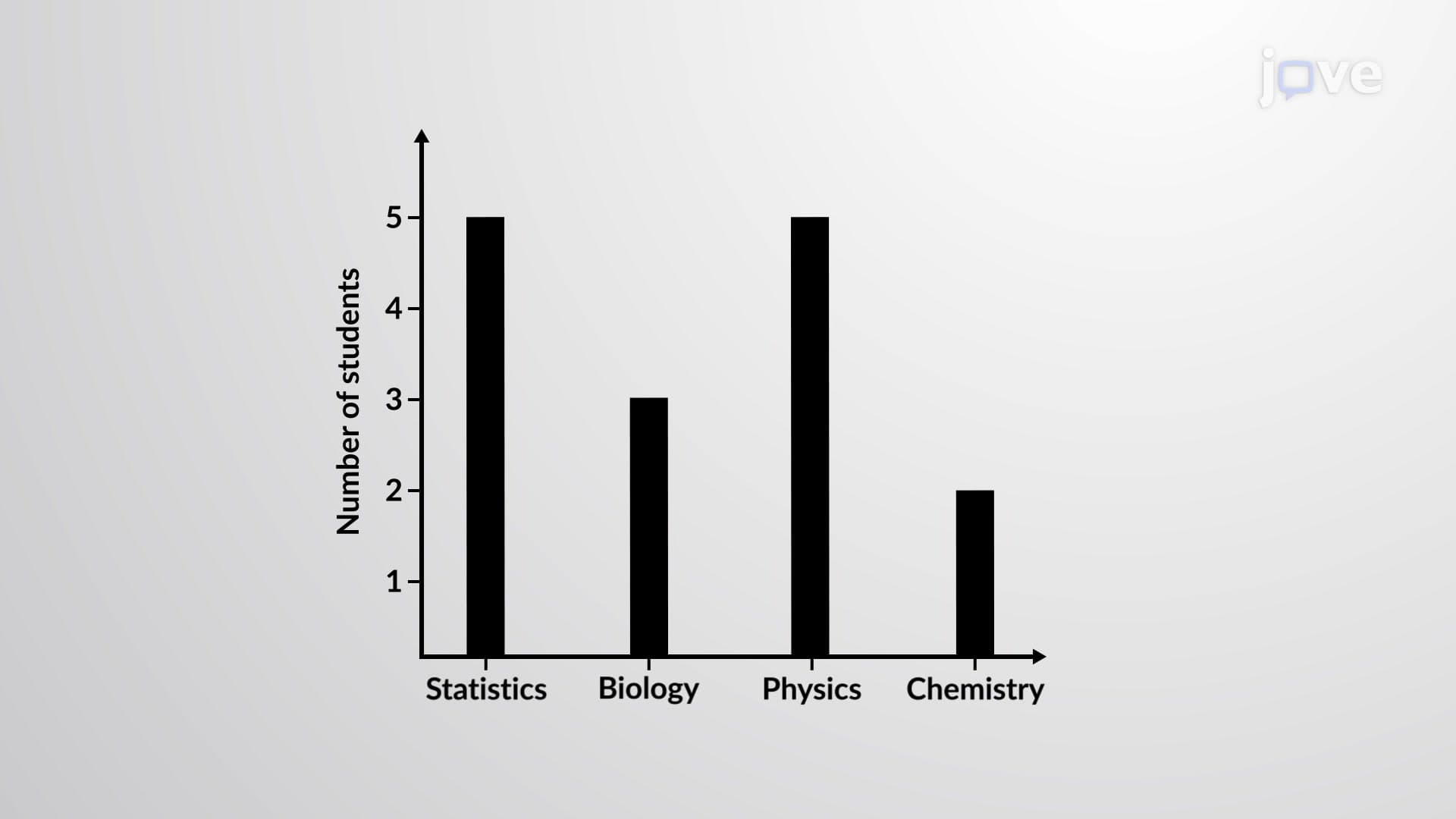
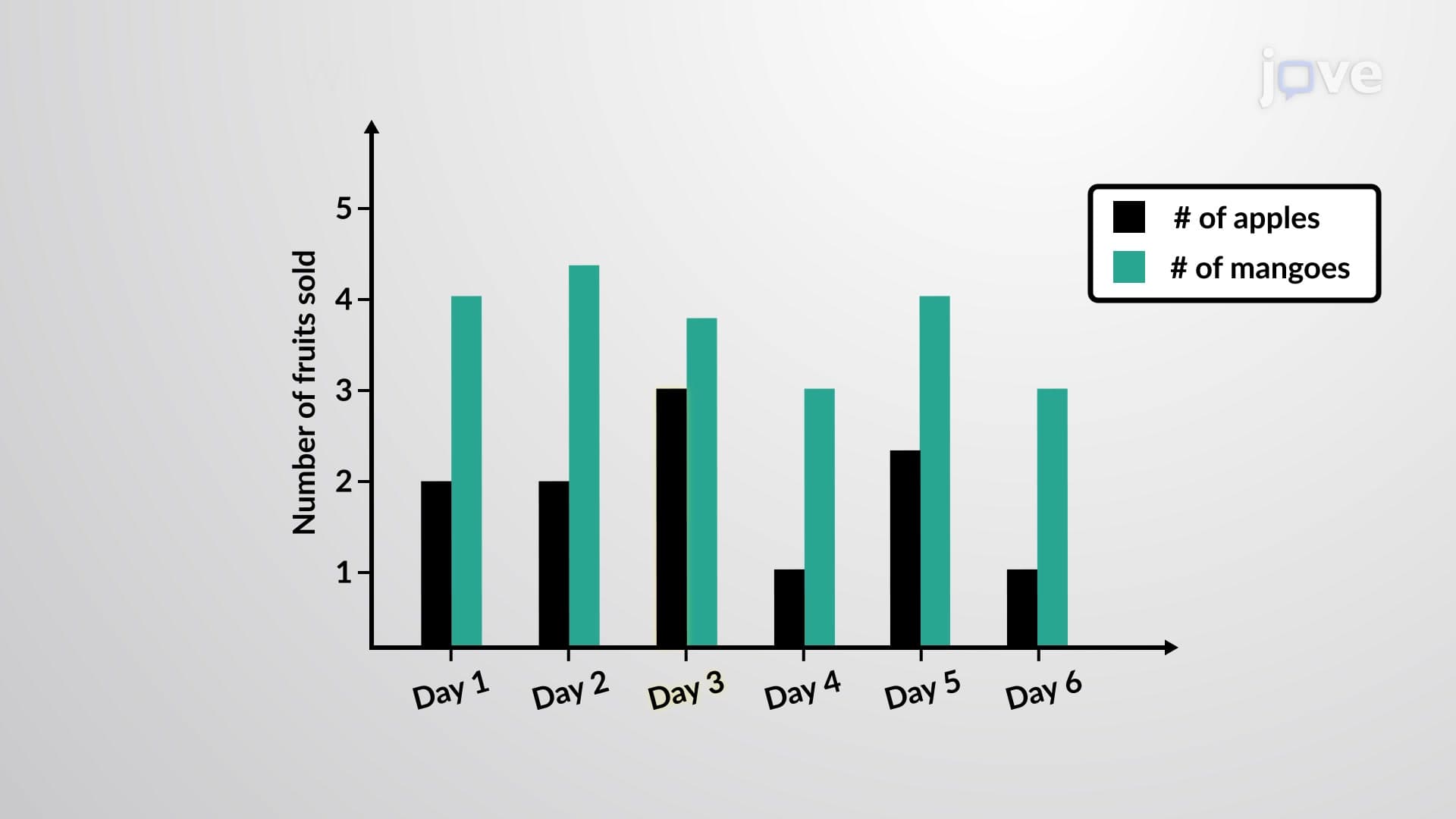
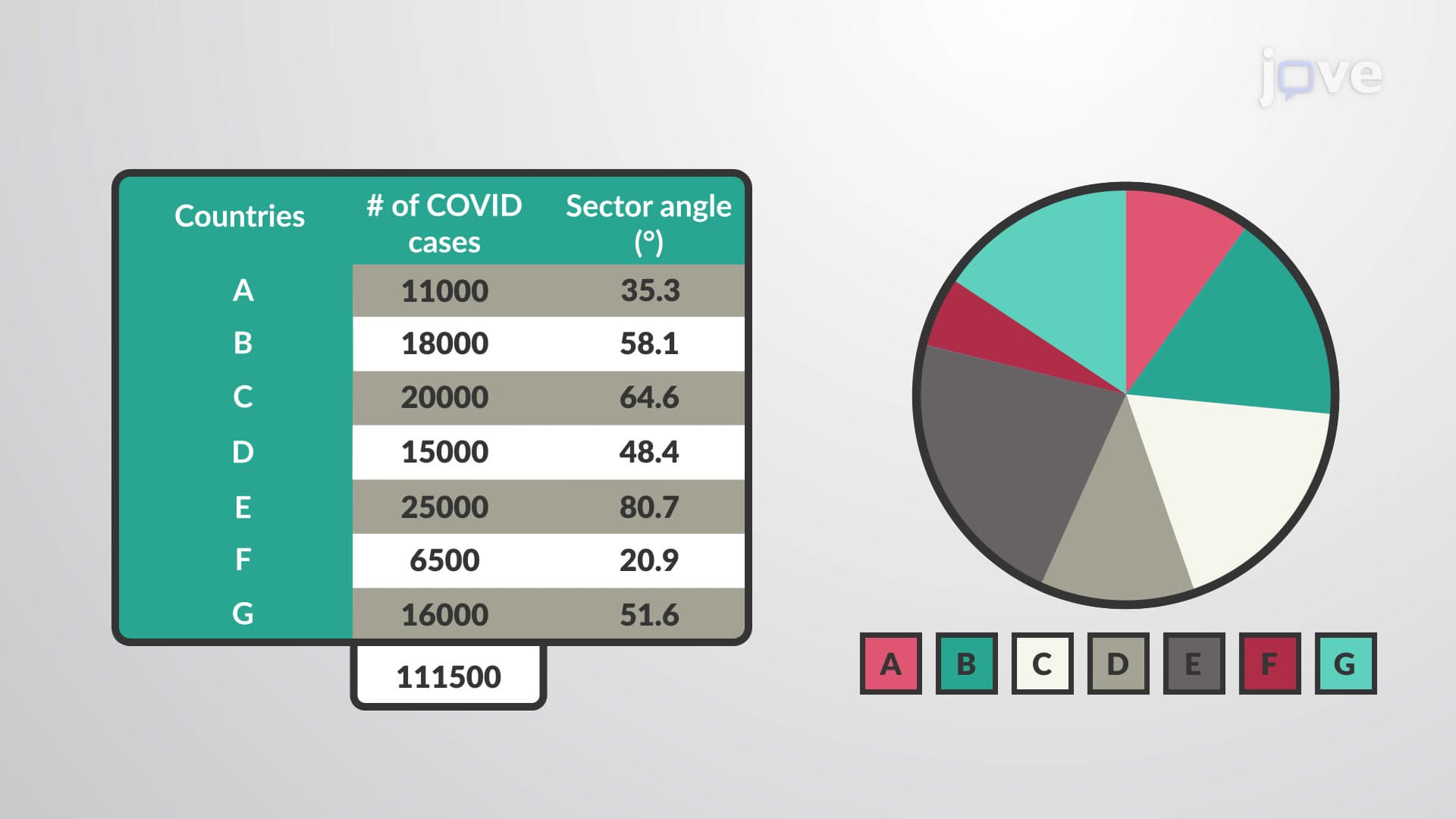
A time series graph represents quantitative measurements collected at sequential time points, creating a visual narrative of how variables change over time. Unlike static bar charts or pie graphs, time series graphs capture the dynamic nature of data, making them indispensable tools in scientific research, business analysis, and academic studies. The fundamental structure requires time as the independent variable (x-axis) and the measured quantity as the dependent variable (y-axis).
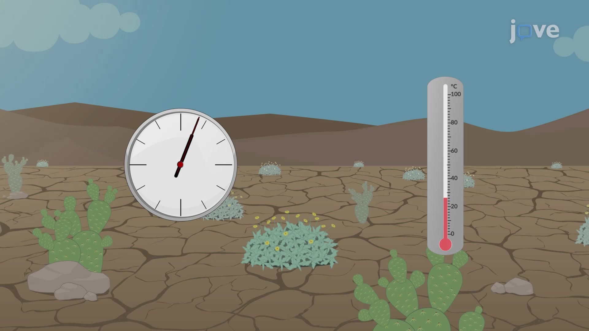
Creating effective time series graphs requires careful attention to several key elements. The time intervals must be consistent and clearly labeled-whether measuring seconds, minutes, days, or years depends on your research question. For AP Statistics students, understanding scale selection proves crucial for accurate interpretation. When plotting temperature changes during a chemistry experiment, minute-by-minute intervals might be appropriate, while tracking quarterly GDP growth requires longer time scales.
The data points connect via continuous lines when dealing with variables that change smoothly over time, such as body temperature or atmospheric pressure. However, discrete measurements like daily website visits or monthly sales figures might be better represented with individual points or stepped lines. College-level statistics courses emphasize this distinction because it affects how viewers interpret trends and make predictions.
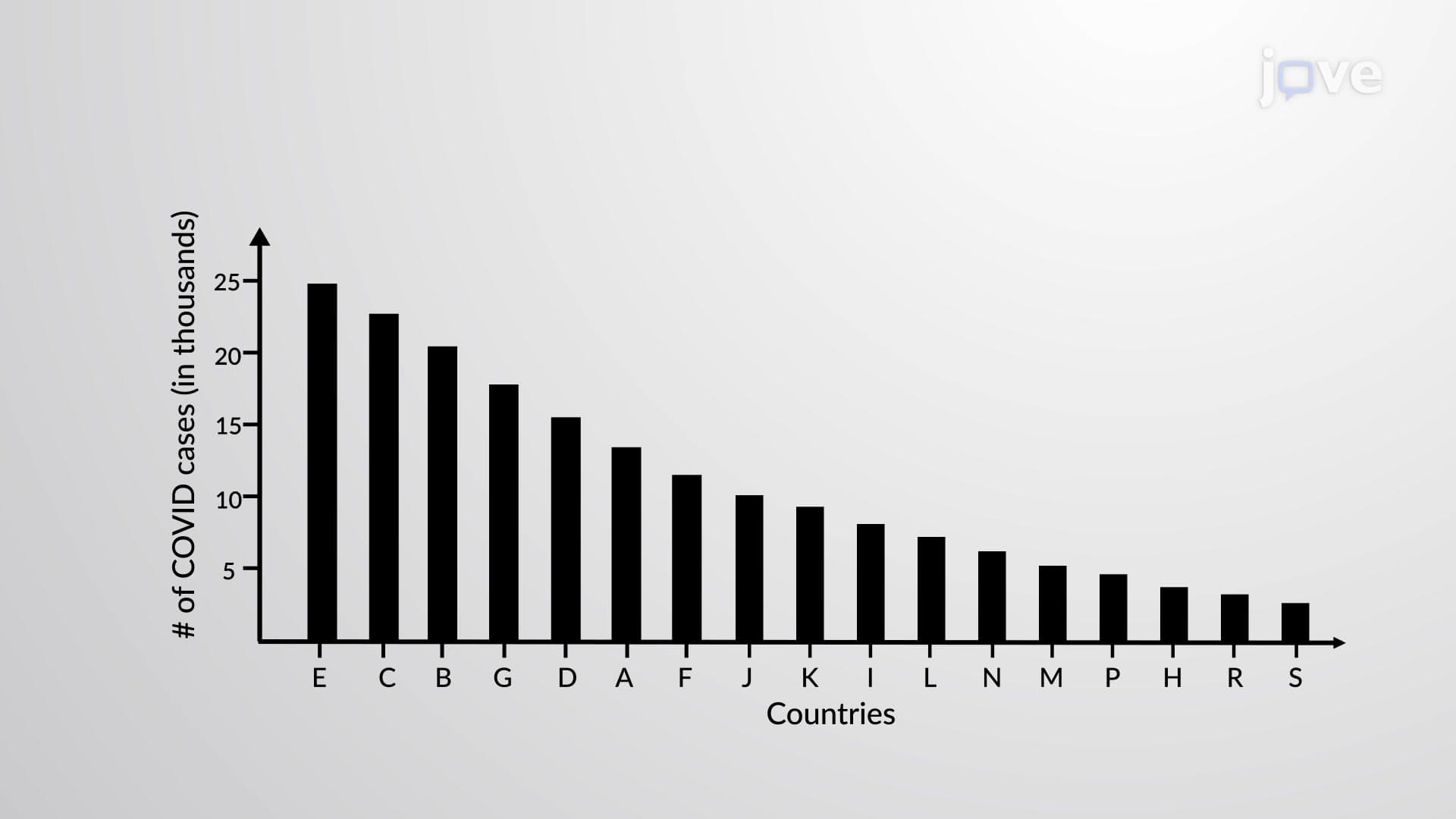
Time series graphs appear throughout American academic and professional environments. In AP Biology, students analyze population growth curves of endangered species like California condors. Economics students track unemployment rates during recessions, while pre-med students preparing for the MCAT examine blood glucose levels over time in diabetes research. The CDC extensively uses time series graphs to monitor disease outbreaks-the COVID-19 pandemic highlighted their importance in public health decision-making.
Financial markets provide another compelling application. The New York Stock Exchange generates millions of time series data points daily, helping investors identify trends in companies like Apple or Amazon. Students studying for business school admissions tests often encounter questions about interpreting stock price movements or commodity futures using these graphical representations.
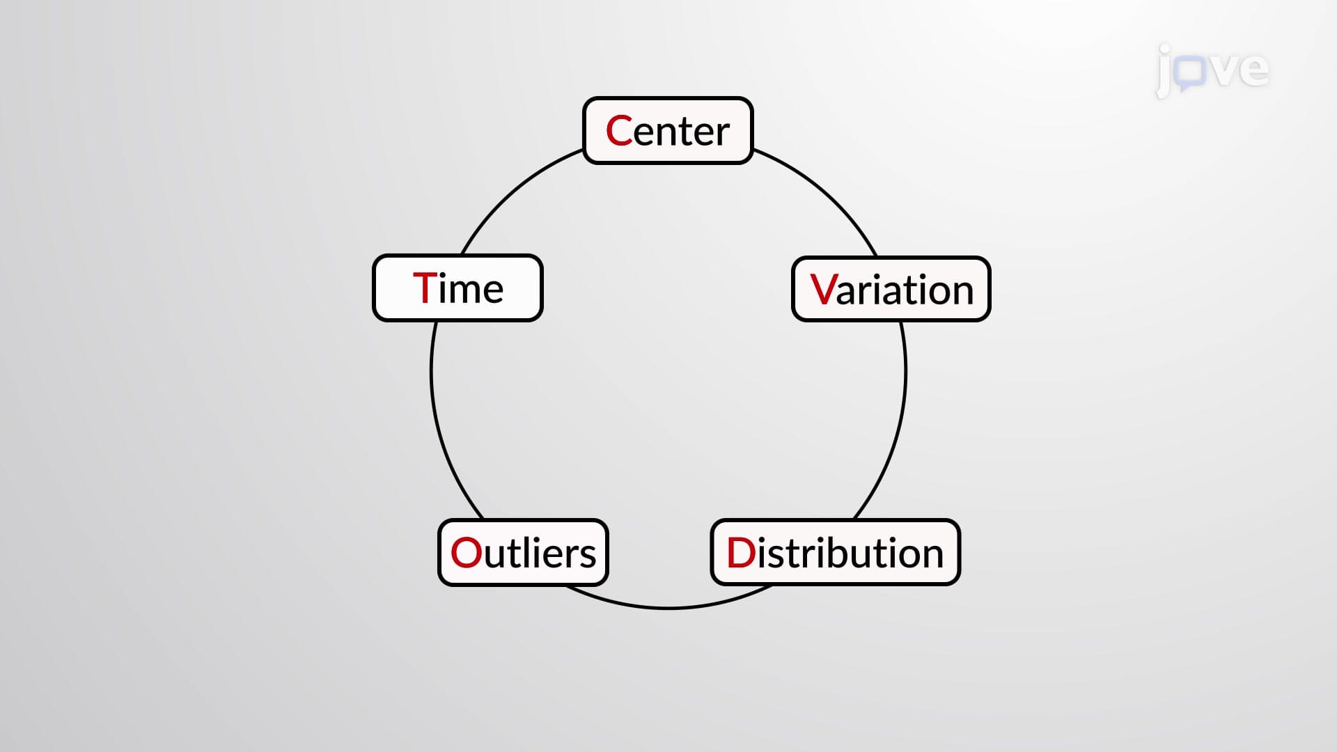
Successful time series analysis extends beyond simple trend identification. Advanced students learn to recognize seasonal patterns (ice cream sales peak in summer), cyclical variations (economic boom-bust cycles), and irregular fluctuations (natural disasters' impact on supply chains). Understanding these patterns proves essential for standardized tests and real-world problem-solving.
Statistical software like Excel, R, and Python enable sophisticated analysis, but hand-construction skills remain valuable for exams and conceptual understanding. Students should practice identifying outliers, understanding correlation versus causation, and recognizing when external factors influence observed trends.
Related Micro-courses