Loading video…

 15 Concepts
 220.3K views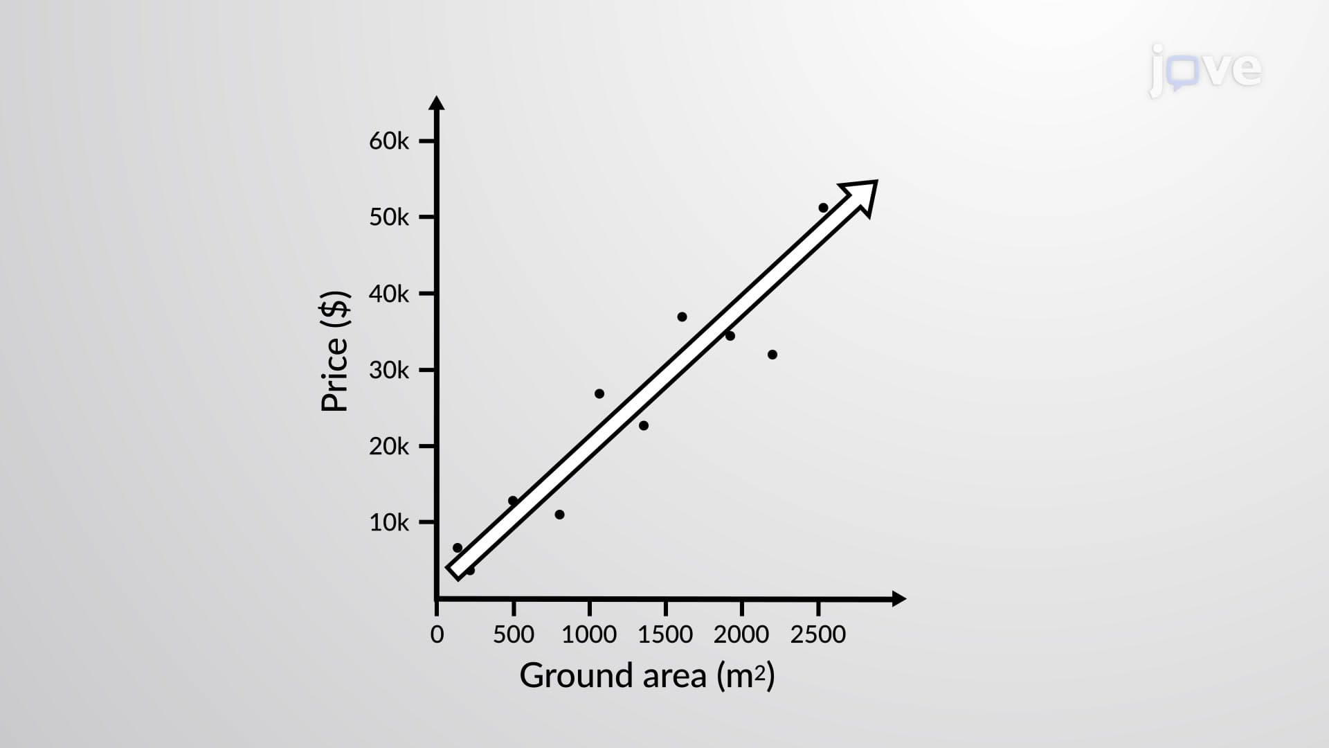

Video Summary: What Is Scatter Plot
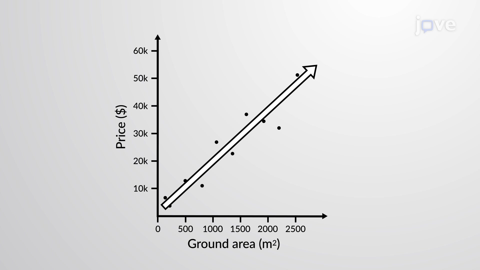
Did you know that every time Zillow estimates home values, they're using the fundamental principles of a scatter plot? A scatter plot reveals relationships between two quantitative variables by plotting data points on a coordinate system. In real estate analysis, housing prices versus square footage create clear visual patterns that help predict market trends. Understanding What is Scatter Plot becomes essential for interpreting bivariate data, identifying correlations, and drawing meaningful conclusions from numerical relationships. Watch the full video on JoVE Coach to master this concept with expert-led visuals and step-by-step explanations.
A scatter plot serves as one of the most powerful tools in statistics for visualizing relationships between two quantitative variables. This graphical representation plots individual data points on a coordinate plane, where each point represents a paired observation from your dataset. The scatter plot definition encompasses both its visual nature and analytical purpose: it transforms numerical relationships into interpretable patterns that reveal hidden connections in data.
In academic settings, scatter plots appear frequently in AP Statistics courses, SAT Math sections, and college-level statistics classes. Students encounter them when analyzing everything from SAT scores versus study hours to medication dosages versus patient recovery times in pre-med coursework.
Every scatter plot contains essential elements that determine its effectiveness. The horizontal x-axis represents the independent variable (the presumed cause), while the vertical y-axis displays the dependent variable (the observed effect). For instance, when analyzing student performance data, hours studied becomes the independent variable plotted horizontally, while test scores serve as the dependent variable plotted vertically.
The construction process involves plotting each data pair as a coordinate point, then examining the overall pattern. Healthcare administration students might plot hospital bed capacity (x-axis) against patient satisfaction scores (y-axis) to understand resource allocation impacts. Engineering students frequently use scatter plots to analyze material stress versus temperature relationships in their coursework.
Positive correlation appears when both variables increase together, creating an upward-trending cloud of points. Consider analyzing average household income versus years of education across US metropolitan areas-higher education levels typically correlate with increased earning potential. Negative correlation shows an inverse relationship where one variable increases as the other decreases, like analyzing vehicle age versus resale value.
No correlation produces randomly scattered points with no discernible pattern, indicating that changes in one variable don't predict changes in the other. This scenario often appears when examining unrelated factors like shoe size versus GPA scores.
The line of best fit (or trend line) represents the linear relationship that best describes your data pattern. This line minimizes the distance between itself and all plotted points, providing a visual tool for making predictions. In business analytics courses, students learn to draw these lines to forecast sales trends, while psychology majors use them to analyze behavioral correlations.
Understanding scatter plot interpretation proves crucial for success on standardized tests like the MCAT, where data analysis questions frequently feature correlation scenarios in biological research contexts.
Related Micro-courses