Loading concepts…


15 Concepts
15 Concepts
13 Concepts
11 Concepts
9 Concepts
14 Concepts
11 Concepts
15 Concepts
13 Concepts
7 Concepts
10 Concepts
10 Concepts
22 Concepts
19 Concepts
16 Concepts
16 Concepts
7 Concepts
 7 Concepts
 4.3K Views
 Popular topics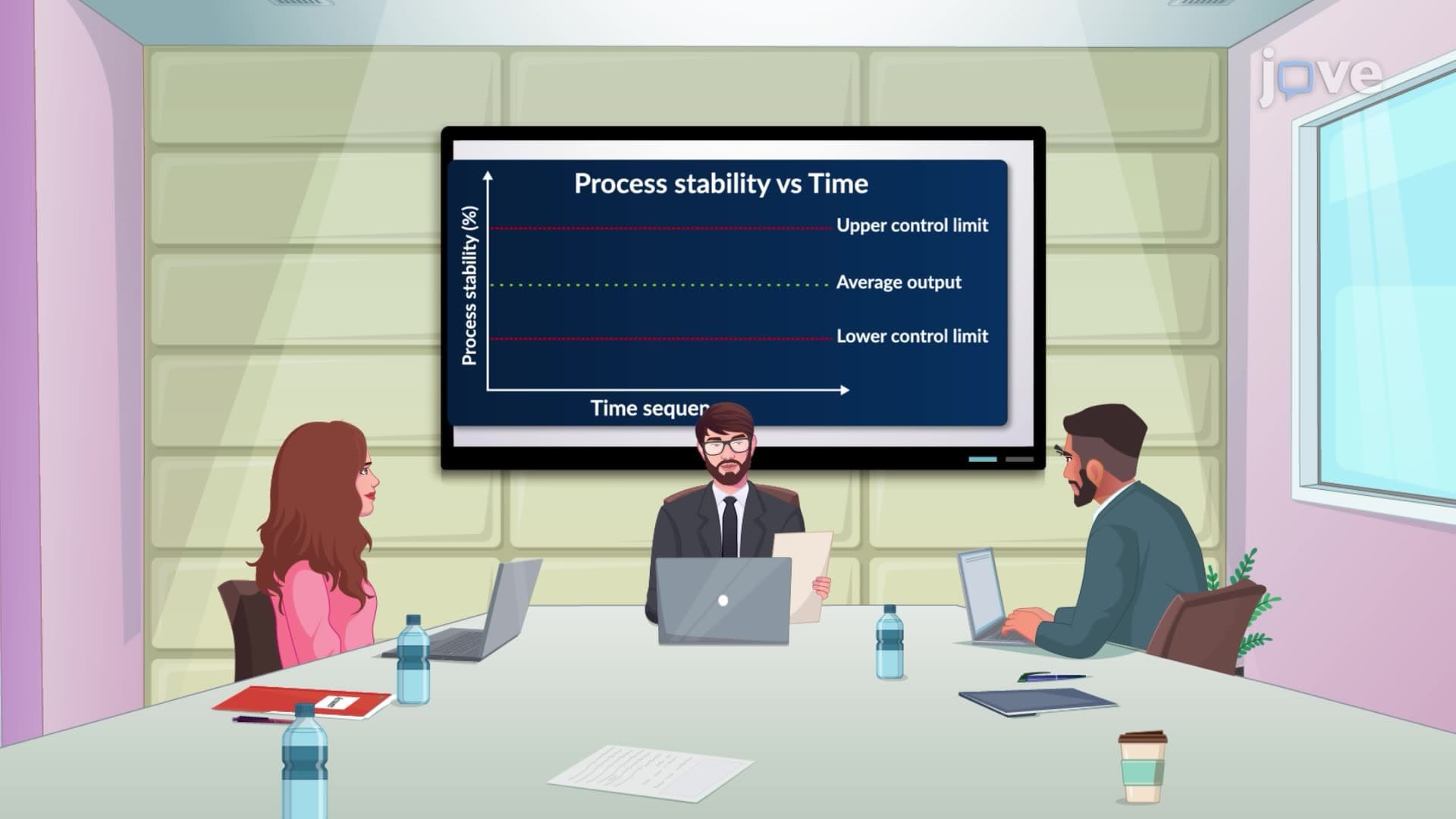
Control charts are fundamental tools in statistical process control that help organizations monitor and improve quality by tracking process variations over time. These powerful visualization tools, including X-bar and R charts, enable businesses across manufacturing, healthcare, and service industries to distinguish between normal process fluctuations and significant deviations that require intervention. JoVE Coach provides comprehensive coverage of control chart methodology and interpretation for quality management applications.
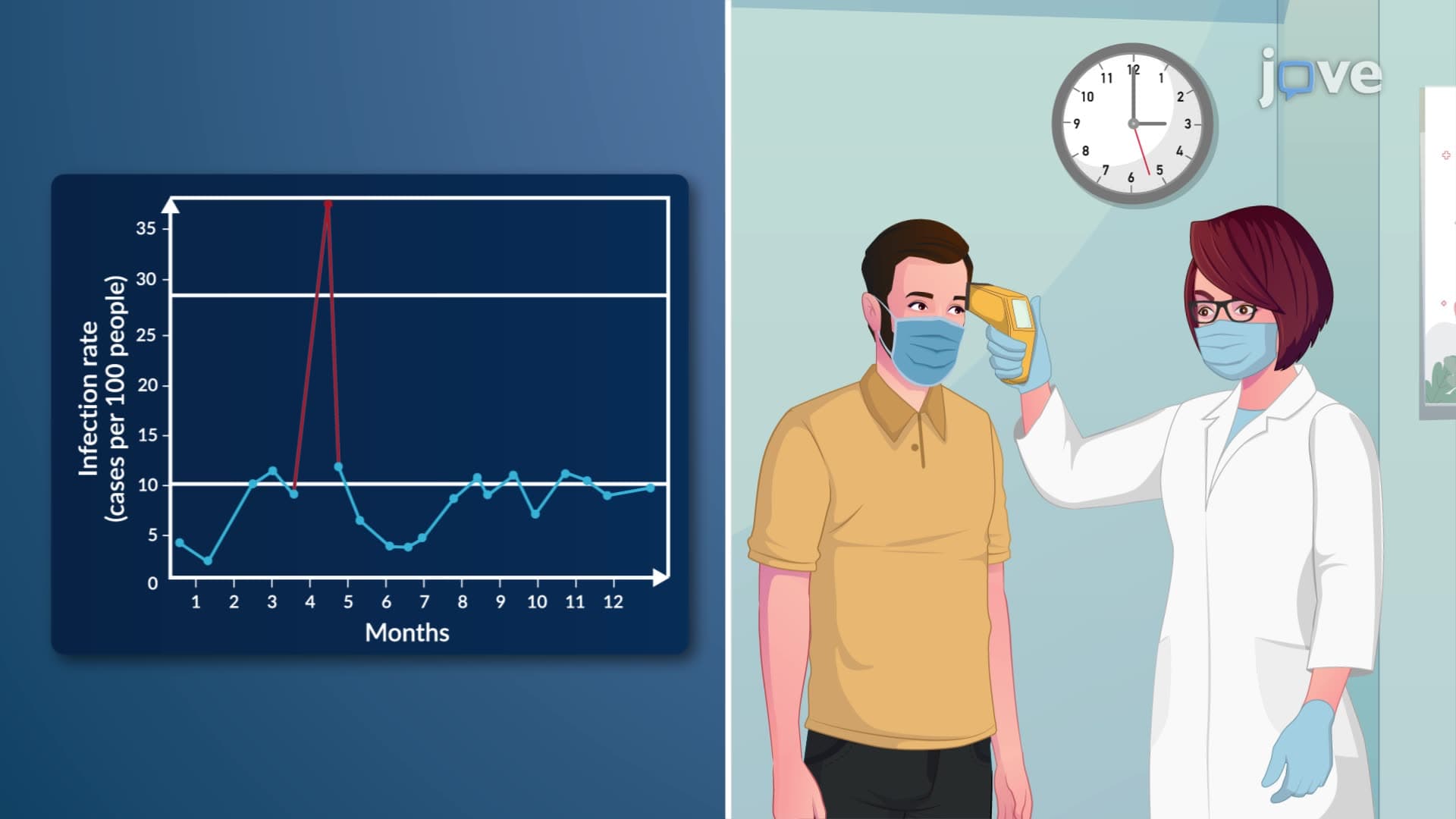
1. Statistical Process Control Fundamentals Statistical process control applies statistical methods to monitor and control processes across industries like healthcare, manufacturing, and laboratories. In U.S. hospitals, SPC helps track infection rates and surgical outcomes, while manufacturing facilities use it to reduce defects and waste. The methodology distinguishes between common cause variation (natural process fluctuation) and special cause variation (significant deviations requiring action). This data-driven approach enables organizations to make informed decisions about process improvements rather than reacting to every minor fluctuation.
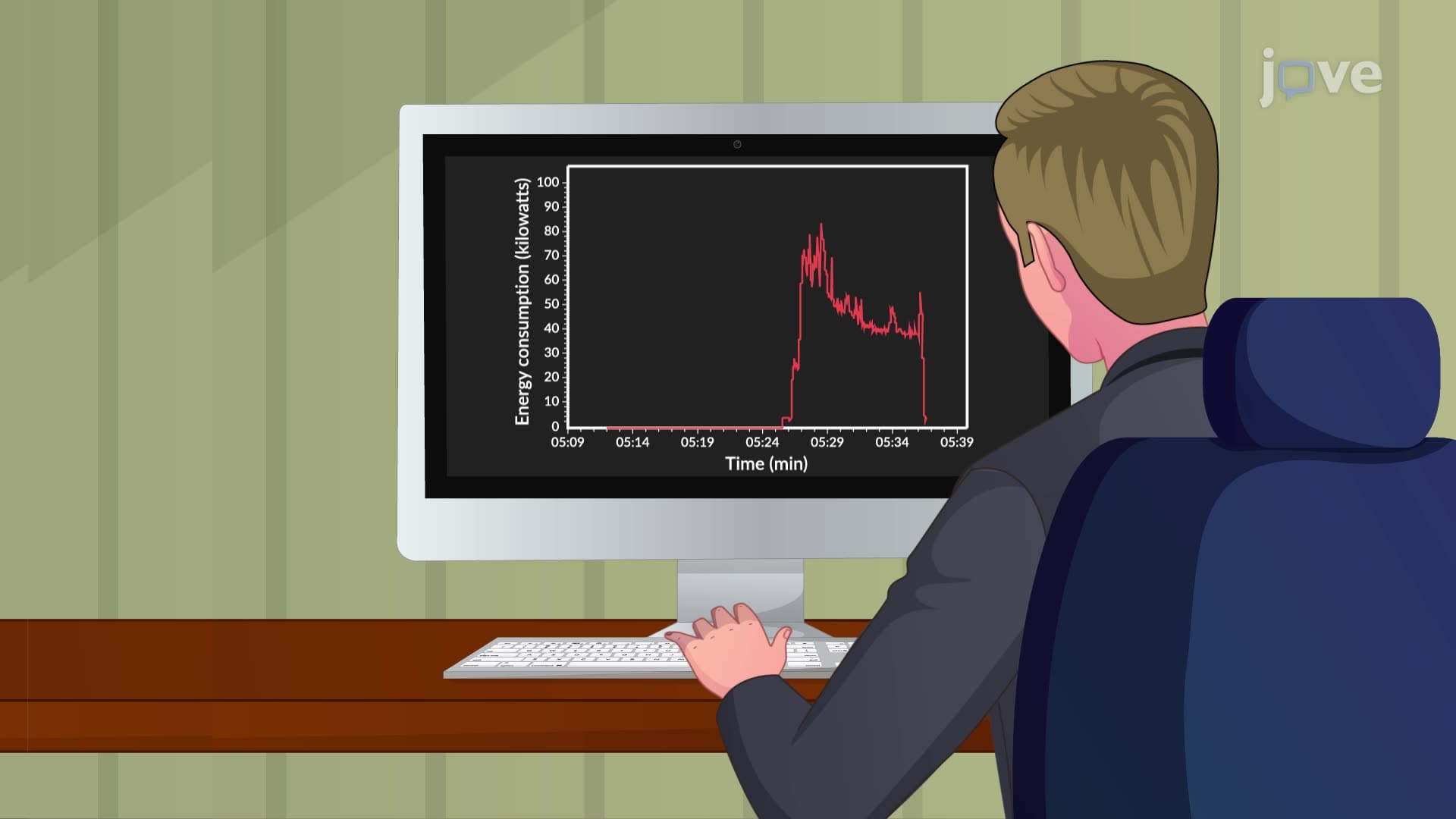
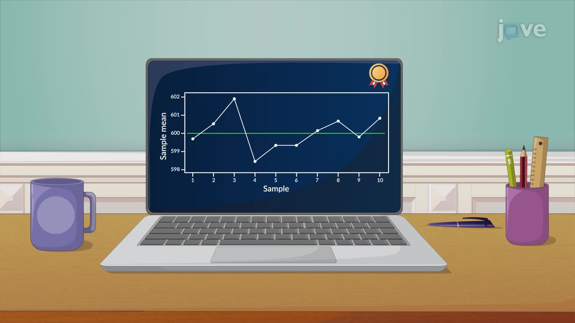
2. Run Charts and Process Stability Assessment Run charts display sequential data points over time as line graphs, revealing trends and patterns in process performance. For example, a medical laboratory might track daily turnaround times for blood tests, or an energy company might monitor power consumption patterns. Stable processes show random scatter around a median line without identifiable patterns. Concerning patterns include consistent upward or downward trends, cyclical variations, or sudden shifts that indicate process instability requiring investigation and potential corrective action.
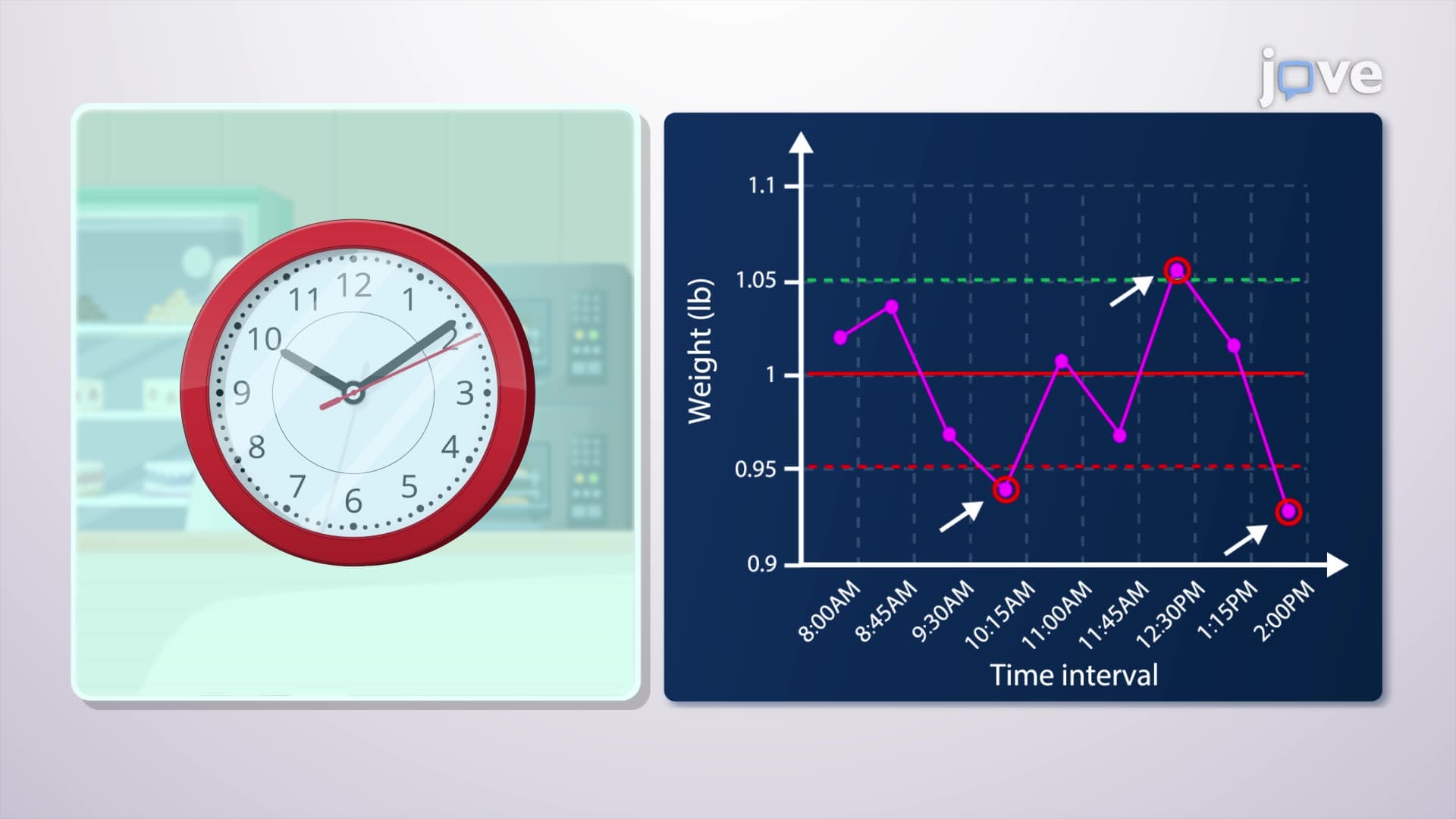
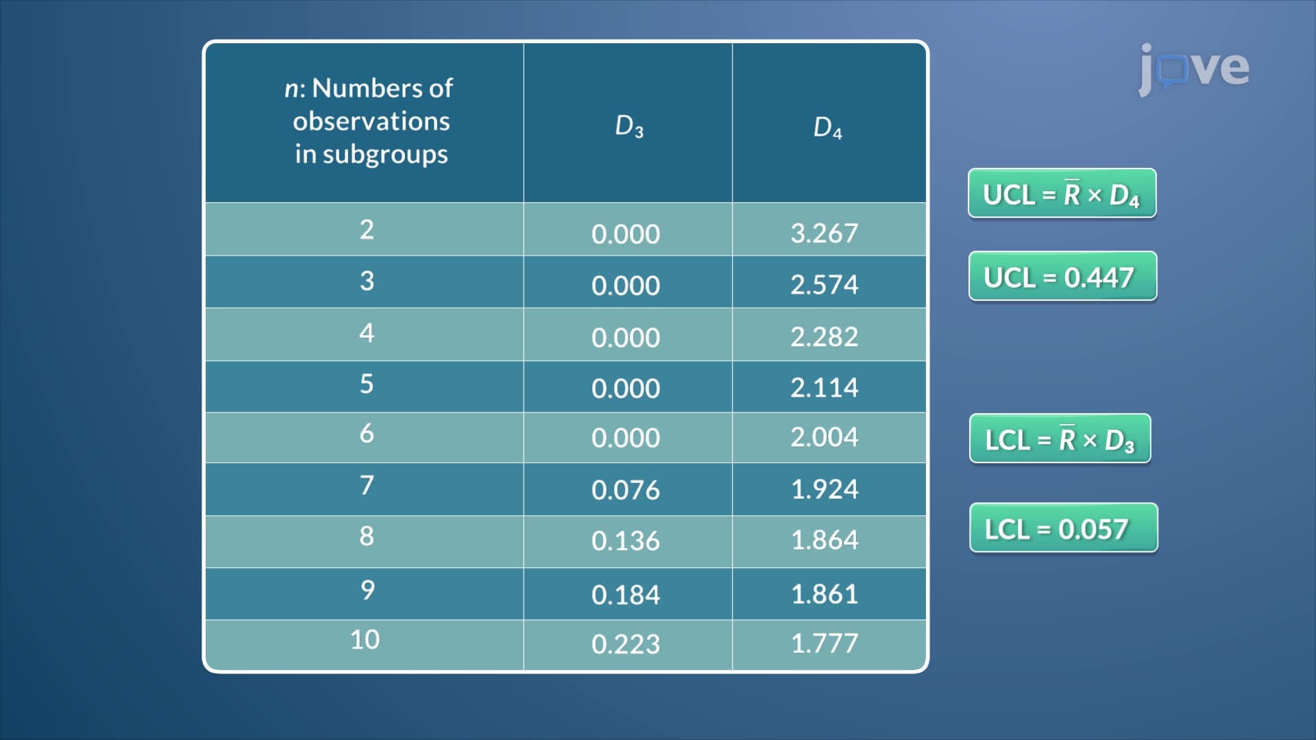
3. R Charts for Variability Monitoring R charts (Range charts) monitor the variability within process subgroups by tracking the range of measurements in each sample. In a bakery producing sandwich bread, an R chart would track the weight variation within each batch of loaves. The chart includes a centerline representing the average range and upper/lower control limits calculated using control chart constants (D3 and D4 values). Points outside these limits indicate excessive variability in the process, signaling potential equipment problems or inconsistent raw materials that need immediate attention.
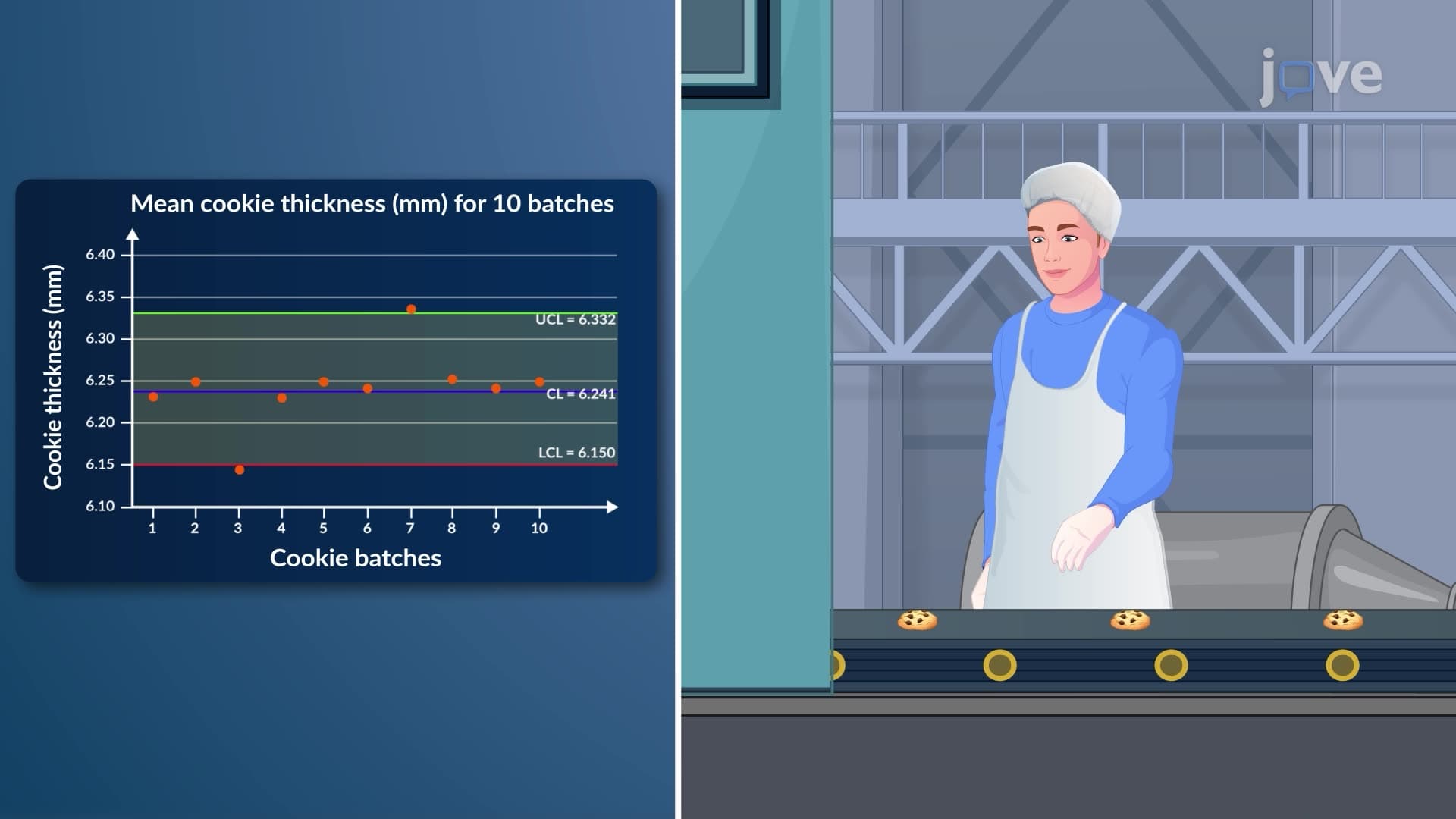
4. X-bar Charts for Mean Process Control X-bar charts monitor the consistency of process averages rather than individual measurements, making them ideal for tracking process centering. A pharmaceutical company might use X-bar charts to monitor average pill weights across production batches. The centerline represents the grand average of all sample means, while control limits are calculated using the A2 constant from standard tables. This chart type helps identify when a process mean shifts away from target, even if individual measurements remain within specification limits.
5. Control Limit Calculations and Chart Interpretation Control limits establish statistical boundaries for normal process variation, typically set at three standard deviations from the centerline. For R charts, limits are calculated by multiplying the average range by D3 and D4 constants, while X-bar charts use the A2 constant. Points outside control limits indicate statistical instability requiring investigation. Patterns within limits, such as seven consecutive points on one side of the centerline or systematic trends, also signal potential process issues that warrant attention before they result in quality problems.