Loading video…


 7 Concepts
 4.3K views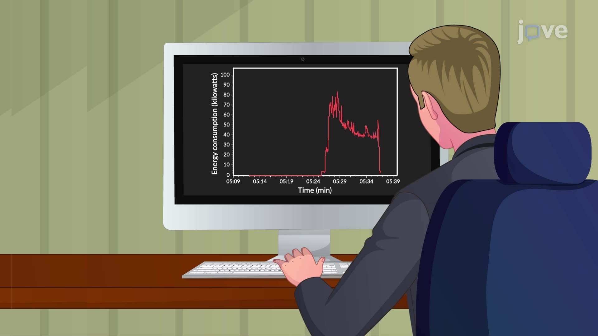

Video Summary: What Is Run Charts
Did you know that Netflix uses run charts to track server performance and prevent those frustrating buffering moments during your favorite shows? Run charts are powerful line graphs that plot sequential data points over time, revealing crucial trends and patterns. For example, the U.S. Energy Information Administration uses run charts to monitor electricity consumption patterns across American households, helping identify peak usage hours and seasonal variations. Watch the full video on JoVE Coach to master this concept with expert-led visuals and step-by-step explanations.
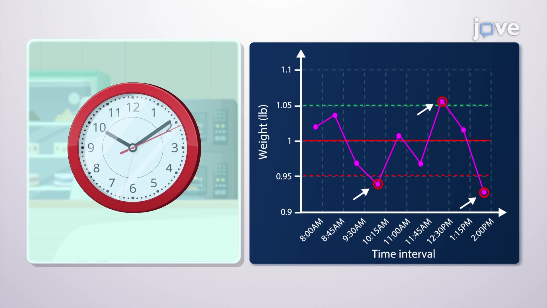
What is run charts in their most essential form? Run charts represent one of the most accessible yet powerful tools in statistical process control, designed specifically to track changes in data over time. Unlike static bar charts or pie charts, run charts capture the dynamic nature of processes by plotting individual data points in chronological sequence, connected by lines that reveal patterns invisible in other visualization methods.
The fundamental structure consists of two axes: the horizontal axis represents time intervals (minutes, hours, days, or any sequential measurement period), while the vertical axis displays the measured variable of interest. This simple yet effective design makes run charts invaluable for students preparing for AP Statistics exams, where understanding time-series analysis forms a crucial component of the curriculum.
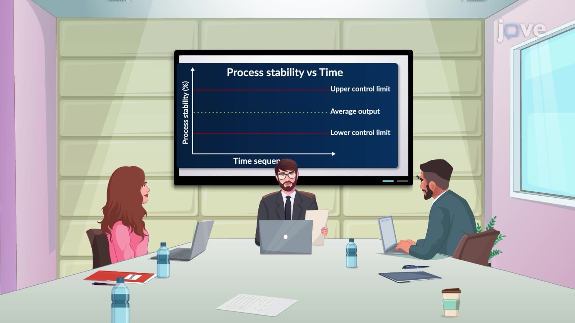
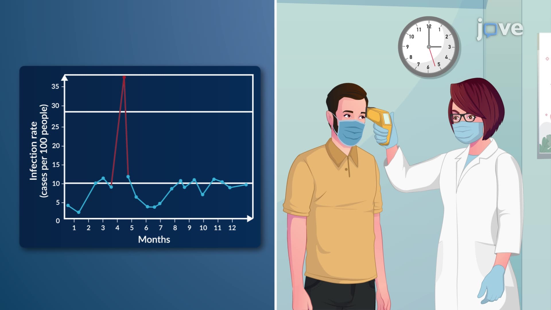
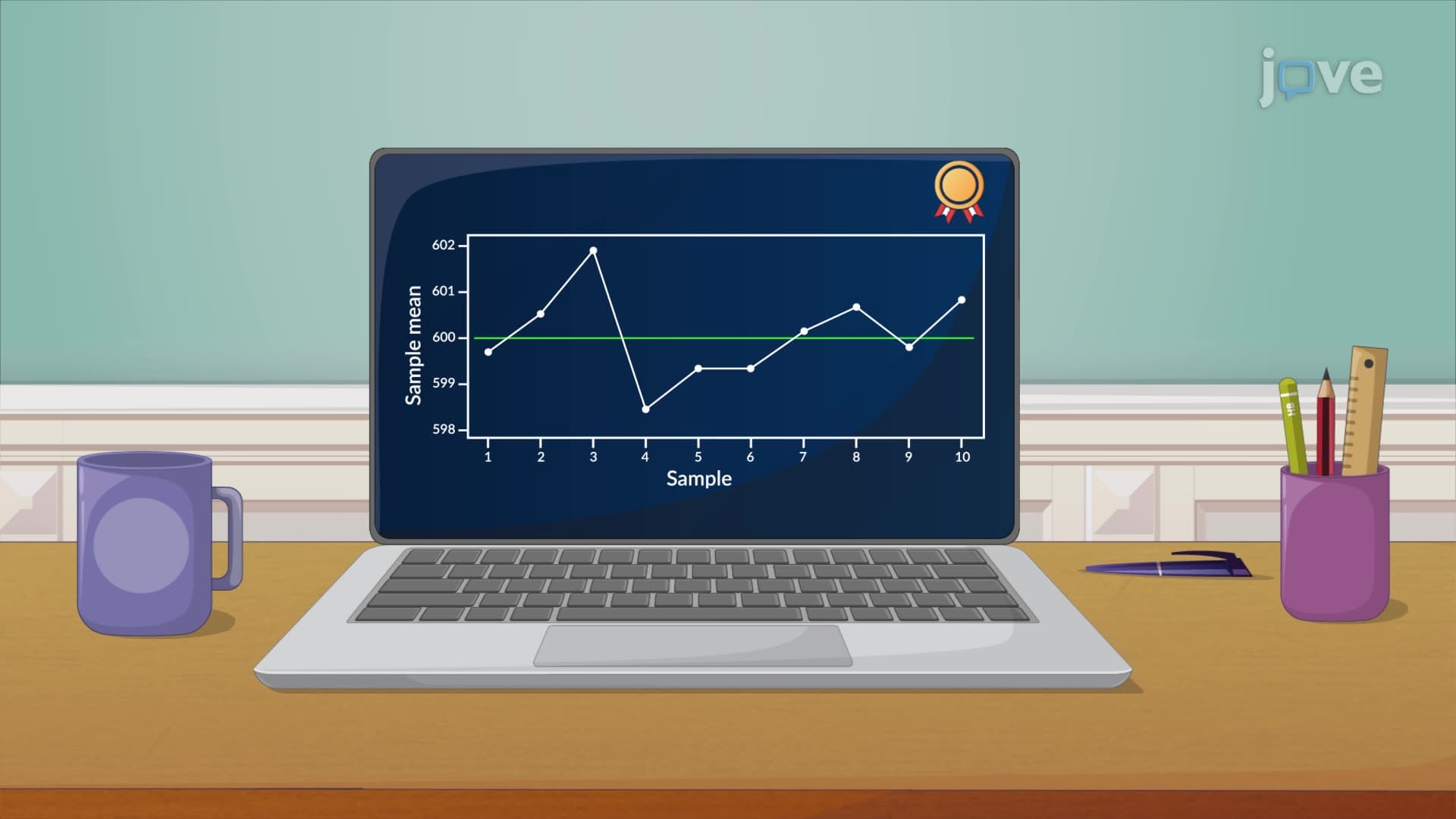
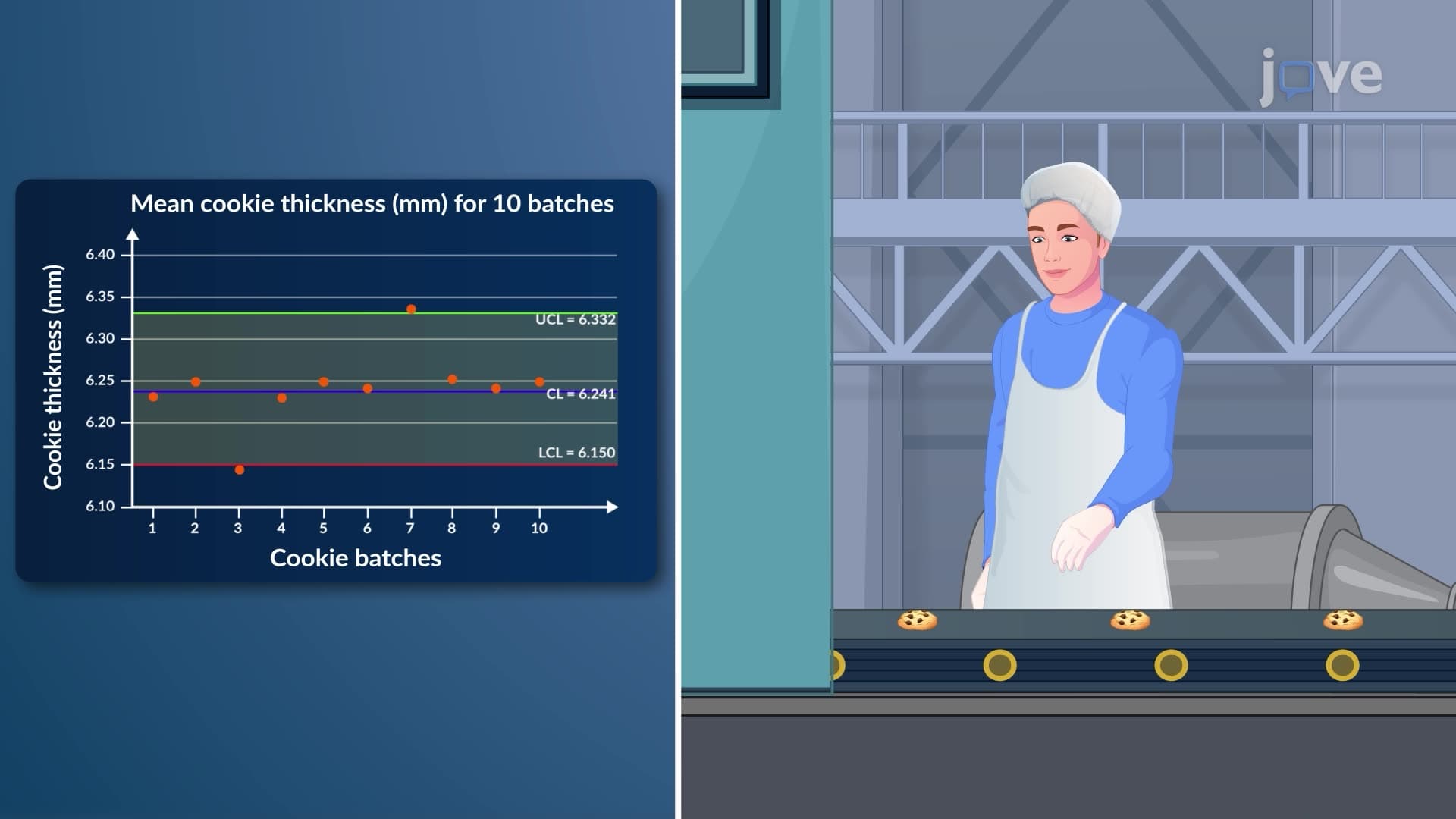
In statistical terms, a process demonstrates stability when data points scatter around a central line without discernible patterns, indicating natural variation inherent to the system. The Centers for Disease Control and Prevention (CDC) extensively uses run charts to monitor disease outbreak patterns across American communities, helping epidemiologists distinguish between normal seasonal fluctuations and concerning epidemic trends.
For college students studying operations management or quality control, understanding process stability becomes critical. When run charts reveal steady ascending or descending trends, they signal process instability requiring immediate investigation. Manufacturing companies like General Motors employ run charts on their assembly lines to monitor defect rates, ensuring consistent vehicle quality standards.
Run chart interpretation requires recognizing specific patterns that indicate different types of process behavior. Cyclical patterns might suggest equipment maintenance schedules or seasonal influences, while sudden shifts could indicate equipment malfunctions or procedural changes. The Federal Aviation Administration (FAA) uses run charts to track flight delays at major airports like Chicago O'Hare and Los Angeles International, identifying patterns that help improve air traffic management.
Students preparing for MCAT examinations encounter run charts in research methodology sections, where understanding how to interpret clinical trial data over time becomes essential. Medical researchers use run charts to track patient recovery rates, medication effectiveness, and adverse event frequencies during drug trials conducted at institutions like Johns Hopkins University and Mayo Clinic.
Run charts appear frequently in college-level statistics courses, particularly in chapters covering quality improvement and process monitoring. Students studying business administration learn to create run charts for sales performance tracking, customer satisfaction scores, and operational efficiency metrics. These skills prove invaluable during internships at companies like Amazon, where continuous process improvement drives competitive advantage.
For high school students taking Advanced Placement courses, run charts provide excellent preparation for understanding more complex statistical concepts like control charts and regression analysis, building foundational knowledge that supports success in college-level STEM programs.
Related Micro-courses