Loading video…


 7 Concepts
 4.3K views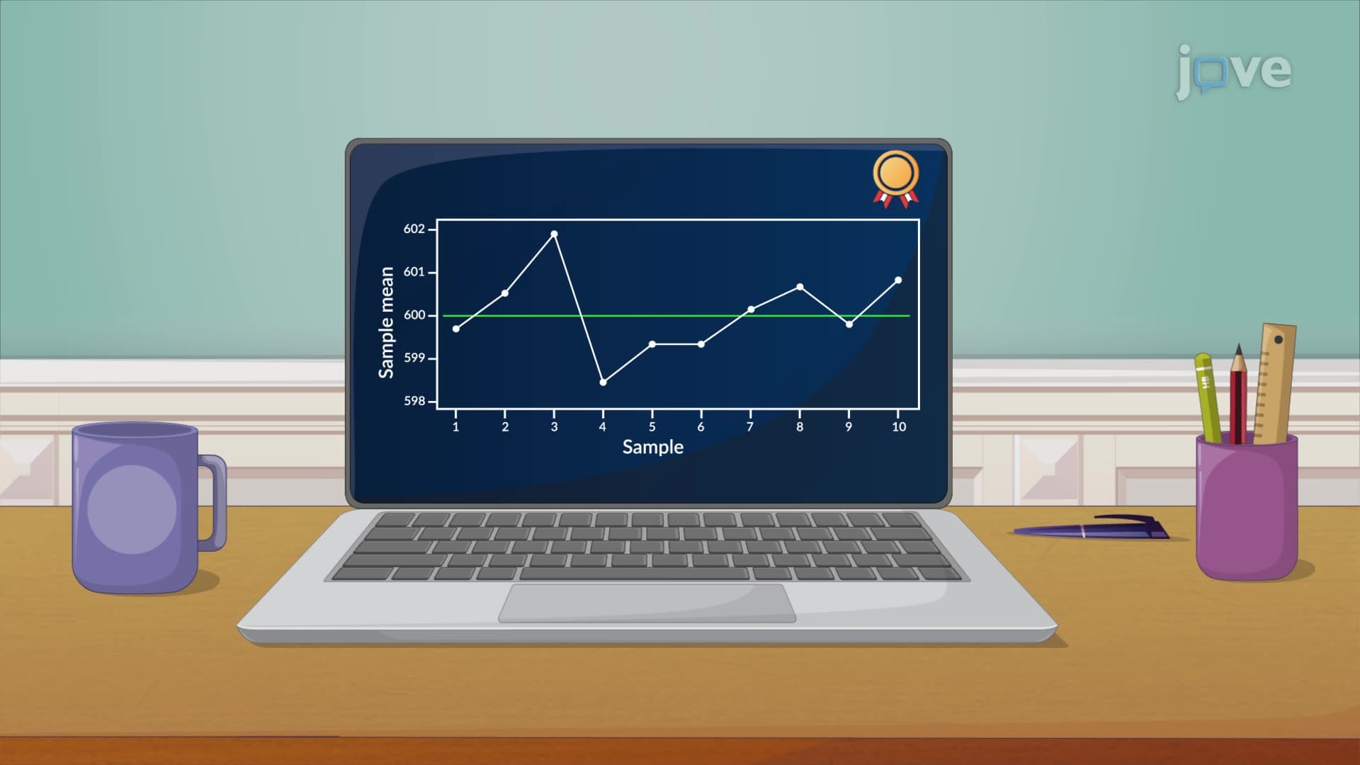

Video Summary: What Is the X Chart
Ever wonder how pharmaceutical companies ensure every pill contains exactly the right amount of medication? The x chart serves as a powerful statistical tool that monitors process consistency by tracking sample means over time. Unlike other control charts that focus on individual measurements, the x chart definition centers on detecting shifts in process averages-making it essential for quality control in industries like manufacturing and healthcare. For example, Boeing uses x charts to monitor the average dimensions of aircraft components across production batches. Watch the full video on JoVE Coach to master this concept with expert-led visuals and step-by-step explanations.
The x chart represents one of the most fundamental tools in statistical process control (SPC), specifically designed to monitor the stability of process means over time. This control chart plays a crucial role in quality management systems across American industries, from automotive manufacturing in Detroit to semiconductor production in Silicon Valley.
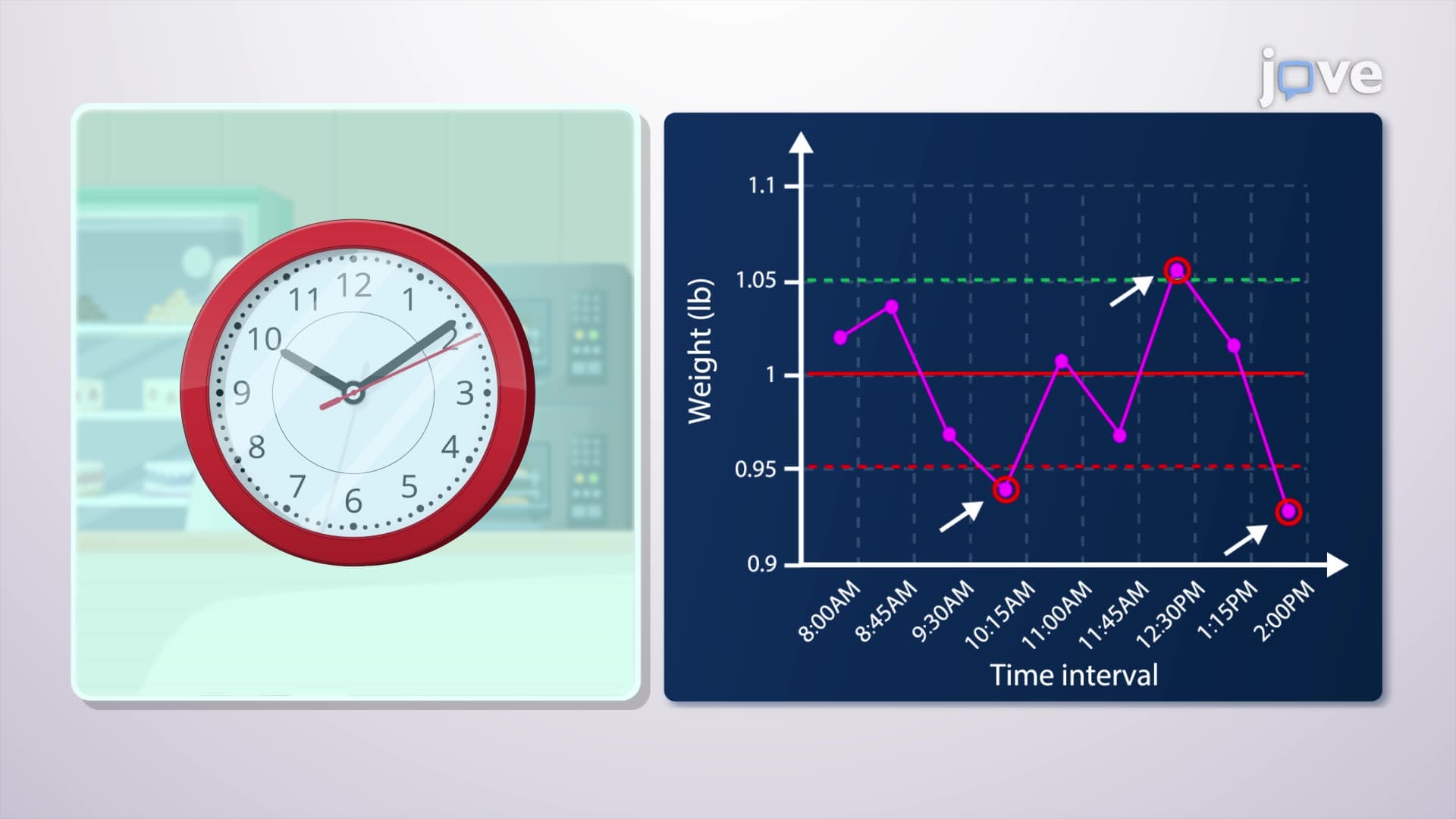
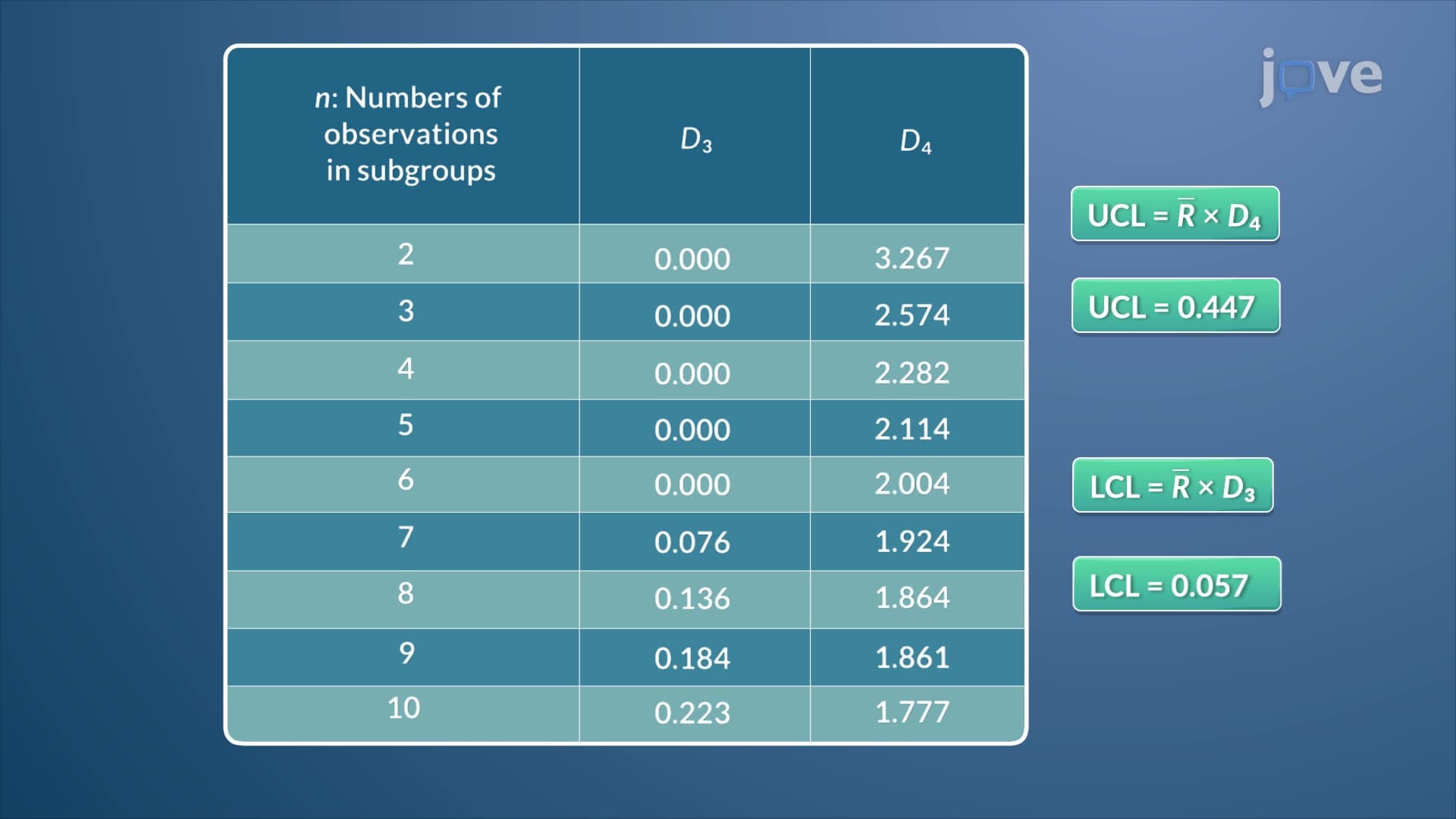
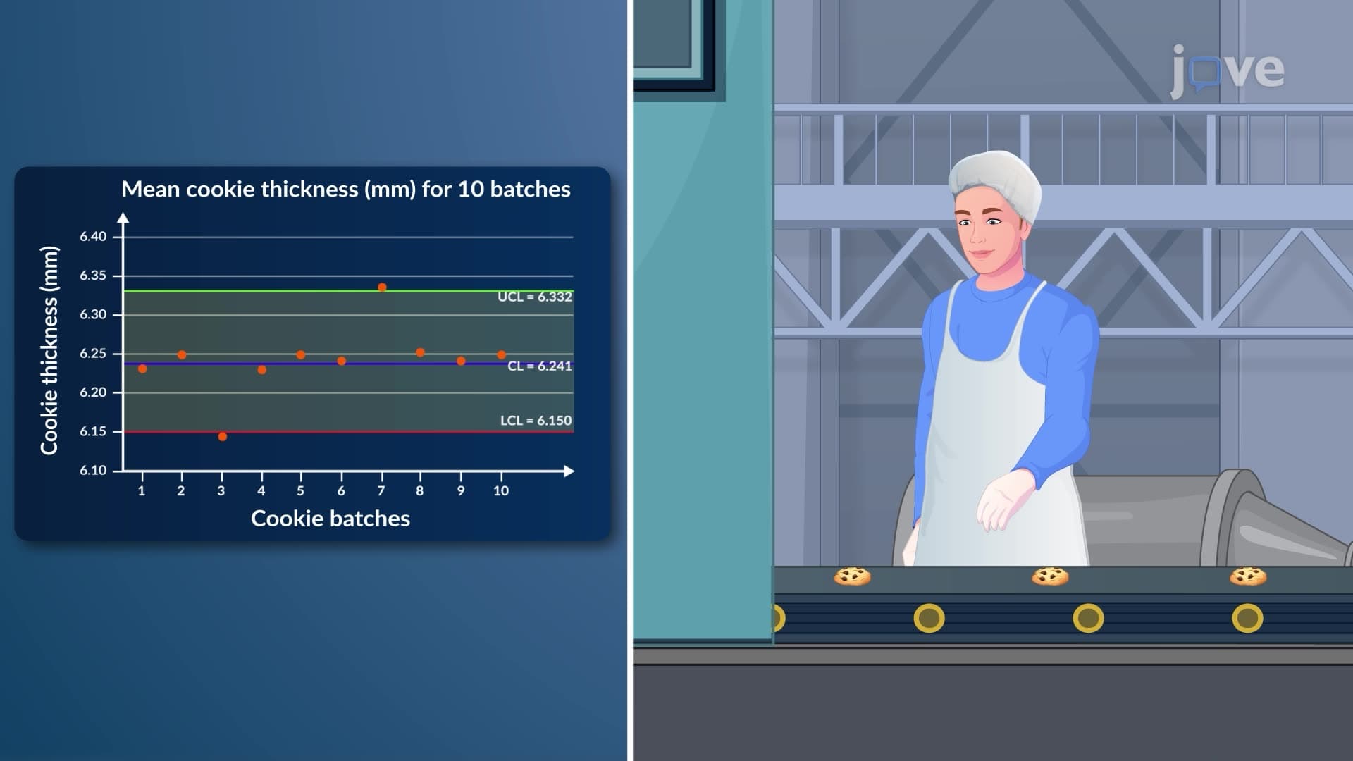
The x chart overview reveals three essential elements that define its structure. The centerline represents the grand average of all sample means, calculated by taking multiple samples from the process and averaging their individual means. The upper control limit (UCL) and lower control limit (LCL) are positioned at specific distances from the centerline, typically three standard errors away, creating boundaries for expected process variation.
These control limits distinguish between common cause variation (natural process fluctuation) and special cause variation (unusual circumstances requiring intervention). The calculation involves the sample size, process standard deviation, and standardized factors from statistical tables-concepts frequently tested in AP Statistics and college-level quality control courses.
The x chart basics extend far beyond theoretical understanding. General Motors employs x charts to monitor the average torque specifications of engine bolts across production shifts. Similarly, Pfizer uses these charts to track the mean concentration of active ingredients in pharmaceutical batches, ensuring consistent therapeutic efficacy.
The x chart concept proves particularly valuable in service industries too. McDonald's franchises monitor average order fulfillment times using x charts, while hospitals track average patient wait times in emergency departments. These real-world applications demonstrate how statistical process control translates into operational excellence.
Understanding the x chart in detail becomes essential for students pursuing STEM careers or business management. The concept appears regularly in AP Statistics curriculum, college-level operations management courses, and quality control certifications. Students preparing for the Certified Quality Engineer (CQE) exam or Six Sigma certification will encounter x chart applications extensively.
The x chart study guide approach should emphasize pattern recognition-identifying trends, shifts, cycles, and outliers that indicate process problems. This analytical skill transfers directly to data interpretation questions on standardized tests and practical problem-solving in professional settings.
Related Micro-courses