Loading video…


 7 Concepts
 4.3K views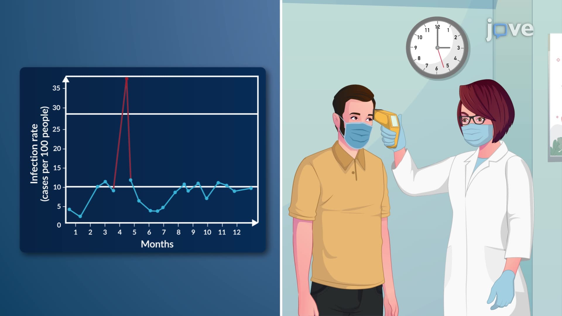

Video Summary: What Is Interpreting Run Charts
Did you know that a single run chart helped the Mayo Clinic identify a critical infection control issue that saved hundreds of patients? Interpreting run charts is essential for detecting patterns, trends, and unusual variations in data over time. Healthcare facilities across the United States rely on these visual tools to monitor everything from patient satisfaction scores to surgical complication rates. Understanding what is interpreting run charts enables students and professionals to make data-driven decisions in medicine, business, and research. Watch the full video on JoVE Coach to master this concept with expert-led visuals and step-by-step explanations.
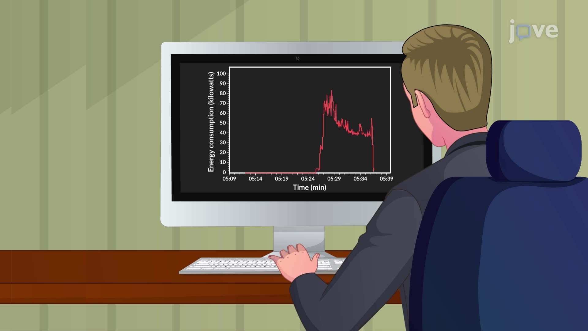
Interpreting run charts is a fundamental quality improvement skill that involves analyzing data points plotted over time to identify patterns, trends, and variations. Unlike static charts that show snapshots of data, run charts reveal how processes behave over time, making them invaluable tools for continuous monitoring and improvement. This concept appears frequently in AP Statistics courses, healthcare administration programs, and business analytics curricula across American universities.
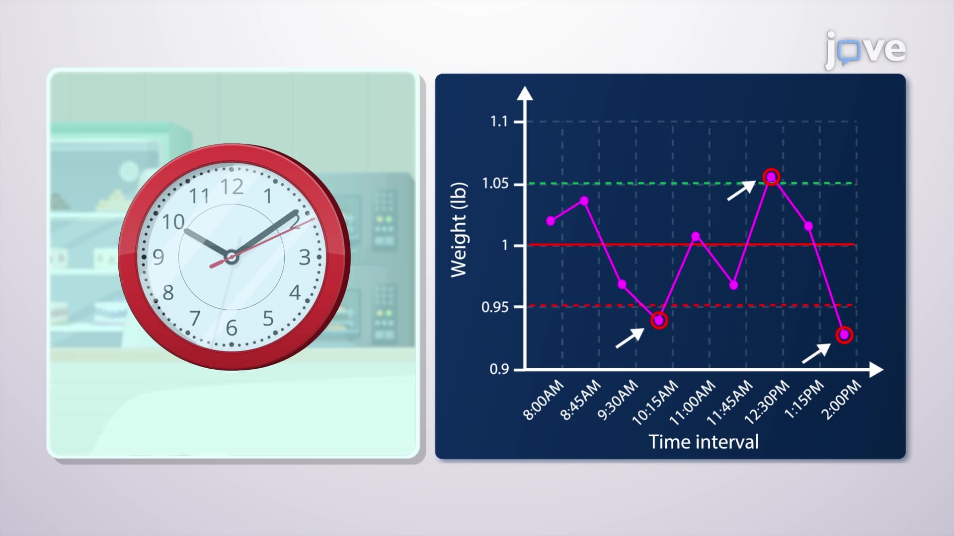
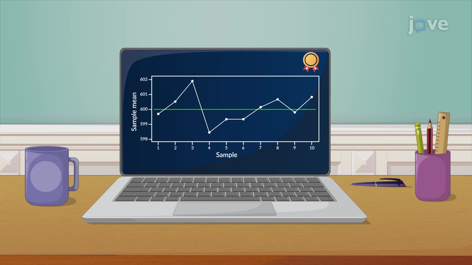
The foundation of run chart interpretation lies in understanding what constitutes normal versus abnormal variation. Random scatter around a median line indicates a stable process under control. For example, when Johns Hopkins Hospital monitors daily patient satisfaction scores, random fluctuations between 85-95% suggest normal variation. However, systematic patterns signal special causes requiring investigation.
Trends represent one of the most critical patterns to identify. An upward trend in hospital readmission rates might indicate declining discharge planning quality, while a downward trend could reflect successful process improvements. The Cleveland Clinic successfully used run charts to identify and address a concerning upward trend in surgical site infections, ultimately reducing rates by 40% through targeted interventions.
Shifts occur when multiple consecutive data points fall consistently above or below the median line. This pattern suggests a fundamental change in the process. For instance, if seven consecutive months show emergency department wait times below the historical median, it likely indicates successful workflow improvements rather than random chance.
Cyclical patterns reveal predictable variations tied to external factors. Emergency departments across the United States consistently see increased patient volumes during flu season (October through March), creating recognizable cyclical patterns in run charts. Understanding these cycles helps administrators prepare staffing and resource allocation accordingly.
Outliers-data points significantly distant from other values-often represent either measurement errors or significant events requiring immediate attention. When a single data point shows infection rates triple the normal range, it could indicate a disease outbreak, data collection error, or equipment malfunction. The key is investigating promptly to determine the cause and take appropriate action.
Students preparing for the MCAT, nursing entrance exams like the HESI A2, or business school admissions tests frequently encounter run chart interpretation questions. These assessments test your ability to distinguish between common cause variation (inherent to the process) and special cause variation (requiring investigation and action).
Related Micro-courses