Loading subject page…

- Microeconomics
- Perfect Competition
- Short-run Profit Maximization II
Micro-course: Perfect Competition
5,343 views
Learn key concepts and earn your certificate.






Short-run Profit Maximization II

00:00
01:22
Video Summary: Short Run Profit Maximization Ii Explained
Why do Apple factories produce exactly 200 million iPhones annually instead of 300 million? Short run profit maximization determines this sweet spot where companies like chair manufacturers find their optimal production quantity. The Short Run Profit Maximization II Explained concept reveals how businesses calculate maximum profit by finding where marginal revenue equals marginal cost, then measuring the profit rectangle between total revenue and total cost. Watch the full video on JoVE Coach to master this concept with expert-led visuals and step-by-step explanations.
- Understand how Short Run Profit Maximization II Explained identifies the optimal production quantity where MR = MC
- Identify the profit-maximizing quantity (q*) on economic graphs using marginal revenue and marginal cost curves
- Analyze total revenue calculation by multiplying price times quantity at the optimal production level
- Evaluate total cost using the U-shaped Average Total Cost curve multiplied by quantity produced
- Apply the profit rectangle concept to visualize profit as the difference between total revenue and total cost
- Recognize opportunity costs of underproduction and losses from overproduction beyond q*
- Compare profit outcomes at different production levels to understand why q* maximizes earnings
- Explore real-world applications for manufacturers and service providers in determining optimal capacity
Understanding Short Run Profit Maximization II Explained
Short run profit maximization represents a fundamental economic principle where firms determine their optimal production level to achieve maximum profitability within fixed operational constraints. Unlike long-run scenarios where all inputs can vary, short-run analysis assumes certain factors remain constant, such as factory size, equipment, or lease agreements.
The profit-maximizing rule states that firms should produce where marginal revenue (MR) equals marginal cost (MC). This intersection point, labeled q* on economic graphs, represents the quantity that generates the highest possible profit. Consider Netflix determining how many original series to produce annually-too few means missed revenue opportunities, while too many leads to diminishing returns and losses.
Calculating Total Revenue and Total Cost
Total revenue calculation involves multiplying the market price by the quantity sold at q*. For instance, if Tesla produces 500,000 Model 3s at $40,000 each, total revenue equals $20 billion. This relationship appears graphically as a rectangle with height representing price and width representing quantity.
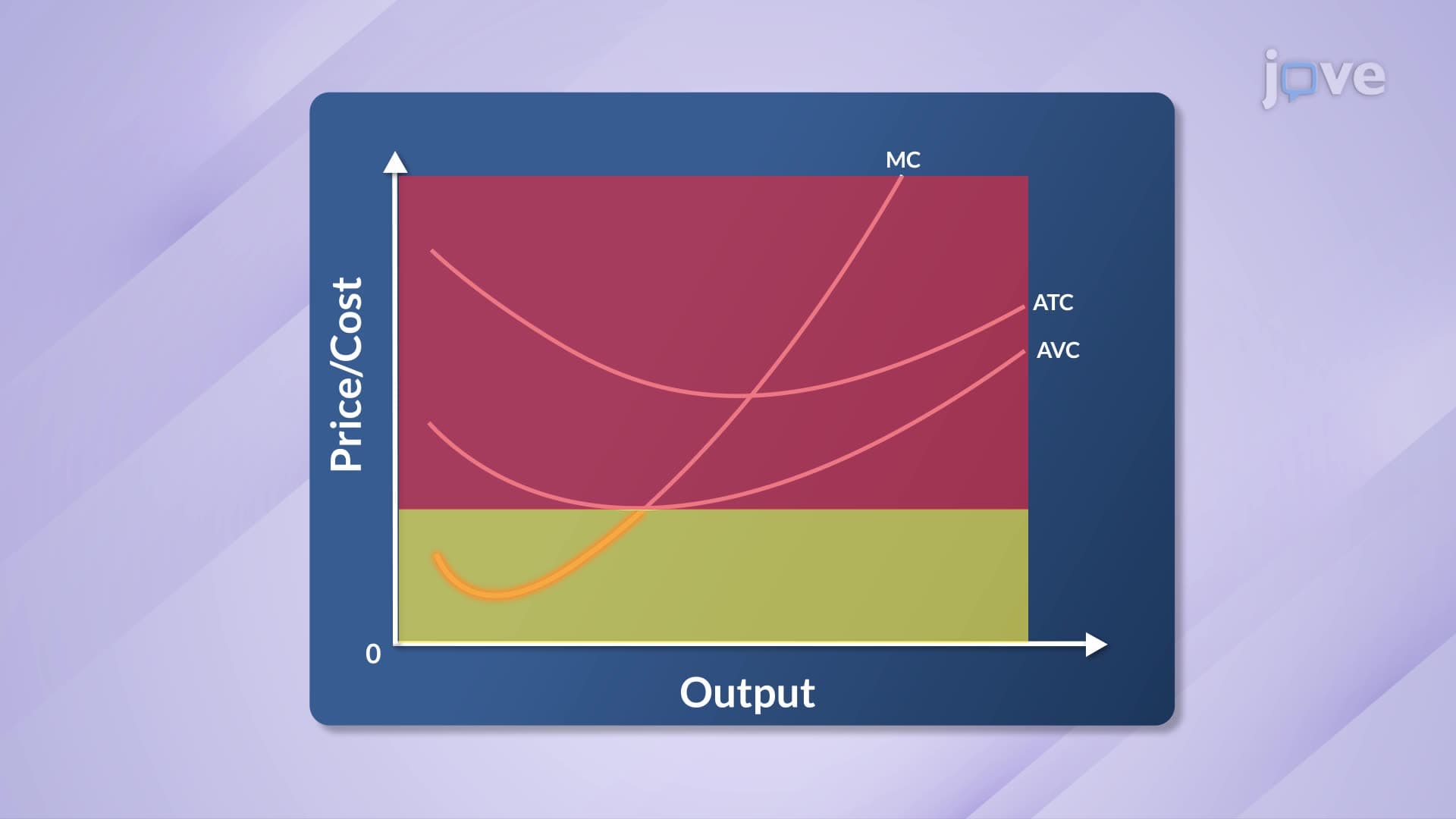
Total cost determination requires the Average Total Cost (ATC) curve, which typically exhibits a U-shape due to economies and diseconomies of scale. Initially, fixed costs spread across more units reduce average costs. However, beyond optimal capacity, inefficiencies increase per-unit costs. Total cost equals ATC multiplied by quantity produced.
Visualizing the Profit Rectangle
The profit rectangle emerges as the area between total revenue and total cost rectangles. When total revenue exceeds total cost, the firm earns economic profit shown as the shaded rectangular area. Larger rectangles indicate higher profits, making this visualization crucial for business decision-making.
Major corporations like Amazon use this analysis when determining warehouse capacity or delivery route optimization. Each additional facility must generate sufficient revenue to cover its costs while contributing to overall profitability.
Consequences of Suboptimal Production
Producing below q* creates opportunity costs-potential profits foregone by underutilizing resources. The missed profit area represents revenue that could have been captured with optimal production levels. Conversely, producing beyond q* generates losses where marginal cost exceeds marginal revenue.
This concept frequently appears on AP Economics exams, college microeconomics courses, and business school case studies. Students must demonstrate understanding through graph analysis, calculations, and real-world applications to succeed academically and professionally.
Frequently Asked Questions
Short run profit maximization occurs when firms produce at the quantity where marginal revenue equals marginal cost (MR = MC). This optimal point, called q, generates the largest possible profit rectangle by maximizing the difference between total revenue and total cost. Firms cannot adjust all inputs in the short run, making this analysis essential for immediate production decisions.
AP Microeconomics frequently tests this concept through graph analysis questions worth 10-15 points. Students must identify profit-maximizing quantity, calculate total revenue and cost rectangles, and explain why production at MR = MC optimizes profits. Practice with College Board released exams helps master these graphical interpretations and mathematical applications.
Essential formulas include Profit = Total Revenue - Total Cost, Total Revenue = Price × Quantity, and Total Cost = Average Total Cost × Quantity. Remember that profit maximization occurs where MR = MC, and the profit rectangle area equals (Price - ATC) × Quantity. Most professors emphasize graphical understanding over pure memorization.
McDonald's applies this concept when determining daily production quotas for menu items. Each restaurant calculates optimal burger quantities by balancing ingredient costs (marginal cost) against sales revenue (marginal revenue). Producing too few burgers means lost sales, while excess production creates waste and storage costs that reduce profitability.
This concept builds naturally on basic supply and demand knowledge taught in introductory economics courses. Students who understand graphs, multiplication, and subtraction can master profit maximization with practice. The visual nature of profit rectangles makes abstract economic theory more concrete and accessible.
Practice drawing and labeling MR, MC, and ATC curves repeatedly until you can sketch them from memory. Focus on identifying q intersection points and calculating rectangular areas for revenue, cost, and profit. Create flashcards with different scenarios and work through practice problems daily rather than cramming.
Companies use sophisticated data analytics and accounting systems to track incremental revenues and costs. Walmart analyzes scanner data to determine marginal revenue from additional inventory, while monitoring labor and storage costs for marginal cost calculations. Modern software automates these calculations for real-time profit optimization decisions.
Progress to long run profit maximization where firms can adjust all inputs, then explore market structures like perfect competition and monopoly. Understanding economies of scale, market entry and exit decisions, and competitive dynamics builds comprehensive microeconomic knowledge essential for advanced business and economics coursework.
Related Micro-courses