Loading…
Loading video…

4,292 views
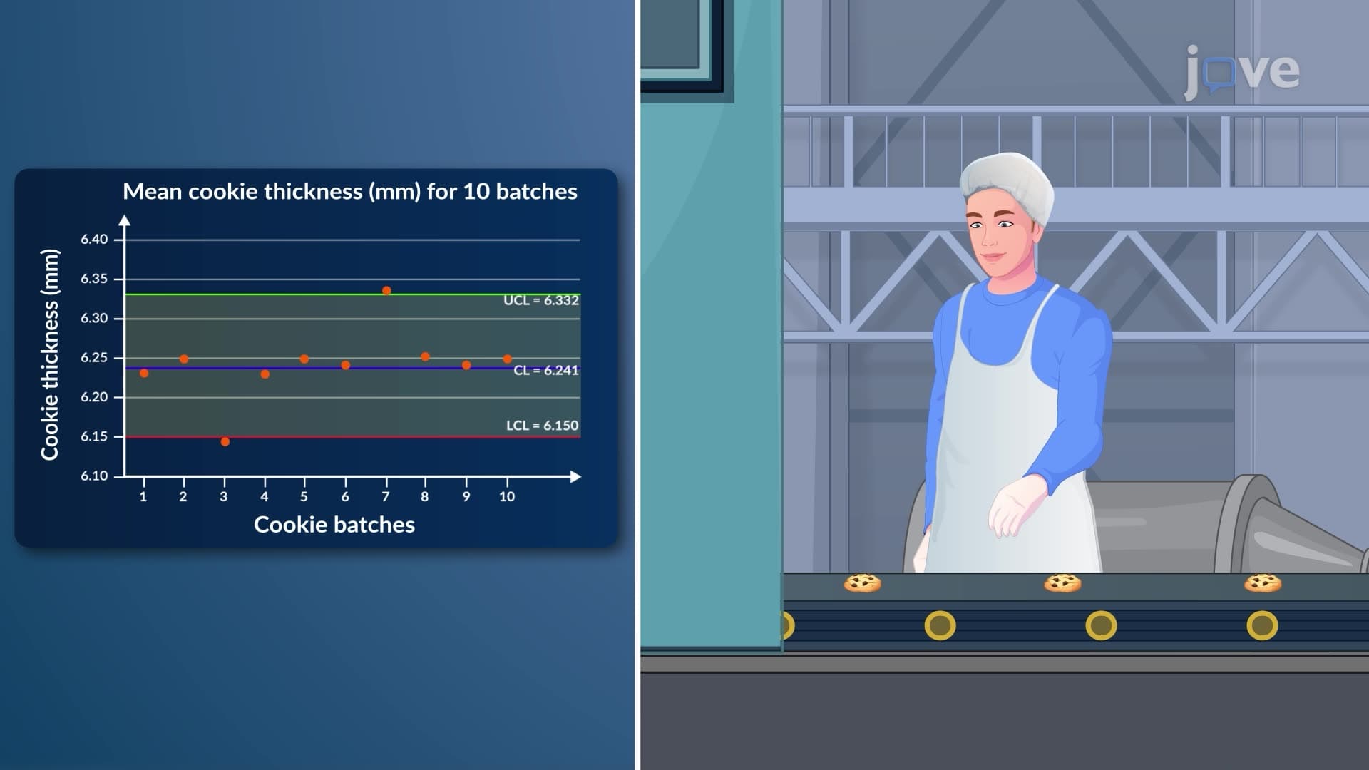
Ever wonder how food manufacturers ensure every batch of your favorite cookies has consistent thickness? Interpreting x charts provides the statistical framework that quality control teams use to monitor process stability and detect variations before they become costly problems. Companies like Kellogg's and Nabisco rely on these control charts to maintain product uniformity across millions of units produced daily. Watch the full video on JoVE Coach to master this concept with expert-led visuals and step-by-step explanations.
Interpreting x charts represents a fundamental quality control methodology that enables manufacturers to distinguish between normal process variation and genuine quality problems. These statistical process control (SPC) tools plot sample means over time, creating a visual representation of process behavior that quality engineers can analyze for stability patterns. In US manufacturing facilities, from Boeing's aircraft assembly lines to Ford's automotive plants, x-charts serve as early warning systems that prevent defective products from reaching consumers.
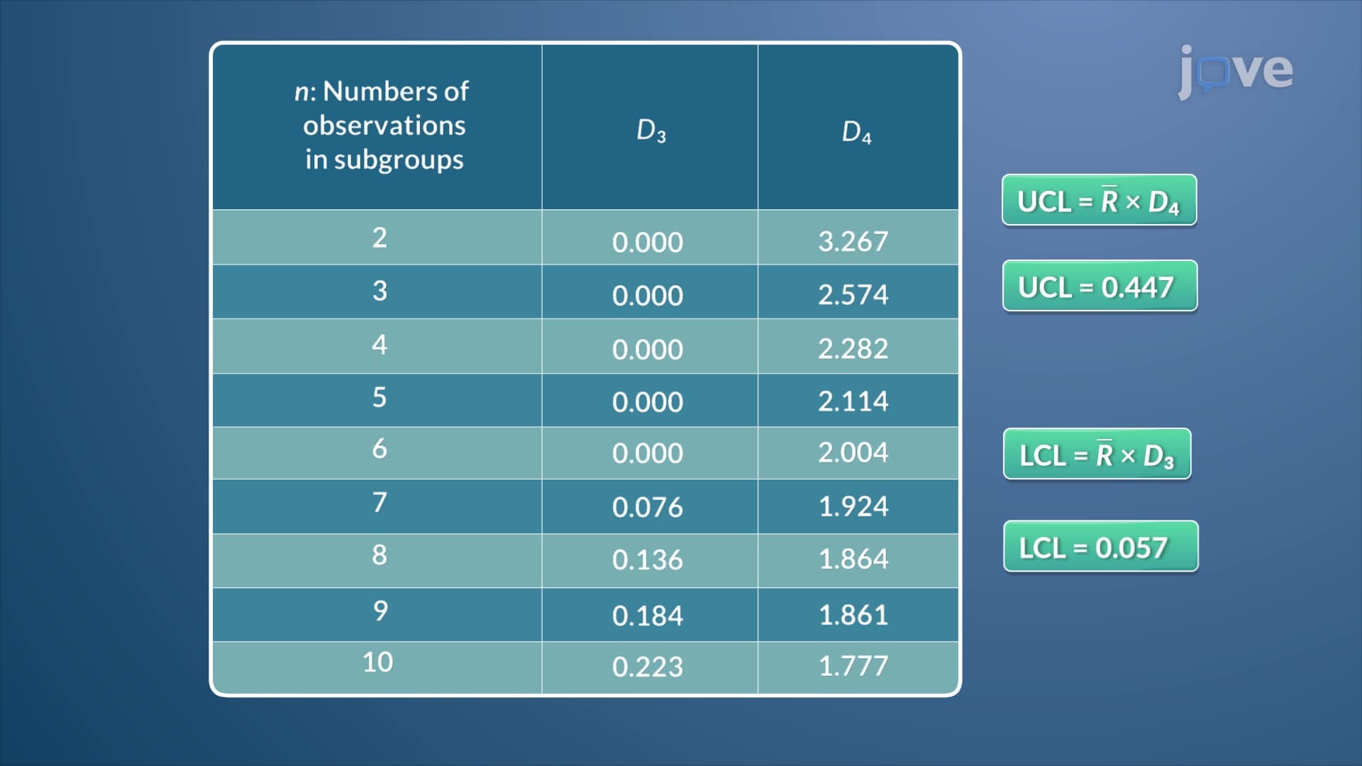
The interpreting x charts definition encompasses both the statistical calculations and practical interpretation skills needed for effective quality control. Control limits establish the acceptable range of variation, calculated using the formula: Upper Control Limit = X-double-bar + (A2 × R-bar) and Lower Control Limit = X-double-bar - (A2 × R-bar). The A2 constant varies based on sample size—for samples of 5 units, A2 equals 0.577, while samples of 10 units use A2 = 0.308. These constants, developed by Walter Shewhart at Bell Labs, account for the expected variation in sample means based on probability theory.
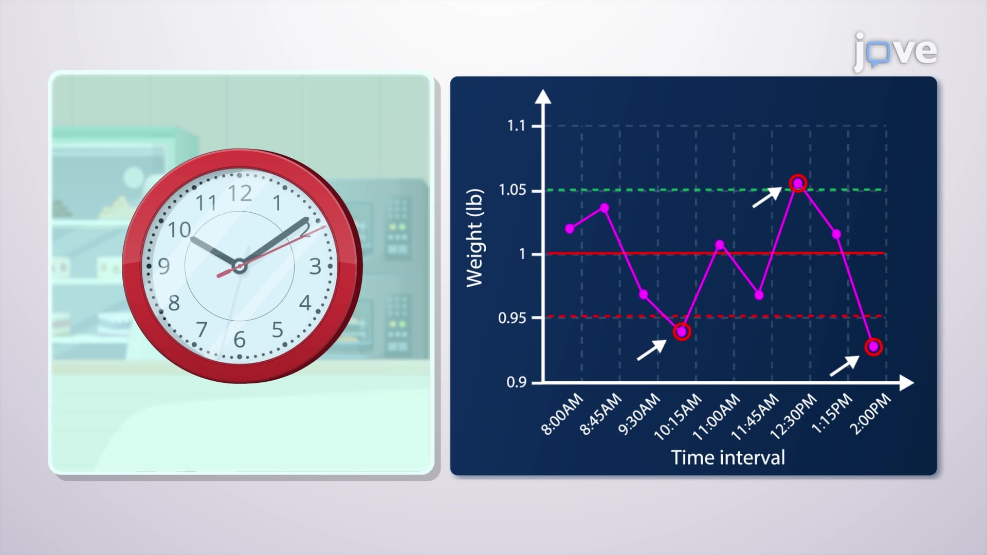
Understanding what is interpreting x charts in detail requires mastering the various out-of-control signals that indicate process instability. Beyond simple points outside control limits, trained operators watch for concerning patterns: seven consecutive points on one side of the centerline, two out of three points in the outer third of the control zone, or systematic trends indicating equipment wear. General Electric's Six Sigma methodology extensively uses these pattern recognition skills, training quality professionals to identify subtle process shifts before they impact customer satisfaction.
Students preparing for AP Statistics exams frequently encounter x-chart interpretation questions that test understanding of Type I and Type II errors in quality control contexts. College-level operations management courses explore these concepts through case studies of US companies like 3M, where statistical process control prevented millions of dollars in defective product recalls. The interpreting x charts study guide approach emphasizes both computational skills and practical decision-making abilities that employers value in quality engineering positions.
Frequently Asked Questions
Interpreting x charts means analyzing statistical control charts that plot sample means over time to monitor process stability. These charts help manufacturers distinguish between normal variation and genuine quality problems, preventing defective products and reducing waste. They're essential tools in industries from pharmaceuticals to food production.
AP Statistics exams typically present x-chart scenarios requiring students to identify out-of-control signals, calculate control limits, or interpret pattern meanings. Questions often involve real manufacturing contexts and test understanding of statistical significance versus practical significance. Practice with actual control chart data strengthens exam performance significantly.
Students need solid algebra skills and basic statistics knowledge including mean calculations and standard deviation concepts. Most high school students can master x-chart interpretation after learning descriptive statistics. The mathematical complexity remains manageable while the practical applications provide engaging real-world connections.
McDonald's uses x-charts to monitor food preparation consistency across thousands of locations, tracking variables like french fry cooking times and burger temperatures. Their quality control systems flag restaurants showing statistical variations, ensuring consistent customer experience nationwide. This application demonstrates x-charts' scalability across service industries.
Operations management, quality engineering, and industrial statistics courses emphasize x-chart interpretation skills. Business schools integrate these concepts into supply chain management curricula, while engineering programs focus on manufacturing applications. Many MBA programs include six sigma certification preparation covering advanced control chart interpretation.
Practice with real manufacturing datasets strengthens pattern recognition abilities more effectively than memorizing formulas alone. Create your own control charts using everyday measurements like daily temperatures or commute times. Focus on understanding the logic behind control limits rather than just computational mechanics.
X-chart mastery provides foundation for capability studies, design of experiments, and advanced SPC techniques like CUSUM charts. Understanding basic interpretation principles prepares students for lean manufacturing, six sigma certification, and quality engineering career paths. These skills remain highly valued in data-driven industries.
While MCAT focuses primarily on biological sciences, understanding statistical process control helps with research methodology questions and data interpretation passages. Nursing entrance exams like HESI A2 may include basic statistics questions where control chart principles apply to healthcare quality metrics and patient safety monitoring.
Related Micro-courses


Related Subjects
 Physics 33 micro-courses›
 Math Fundamentals 11 micro-courses›