Loading video…

 10 Concepts
 65.9K views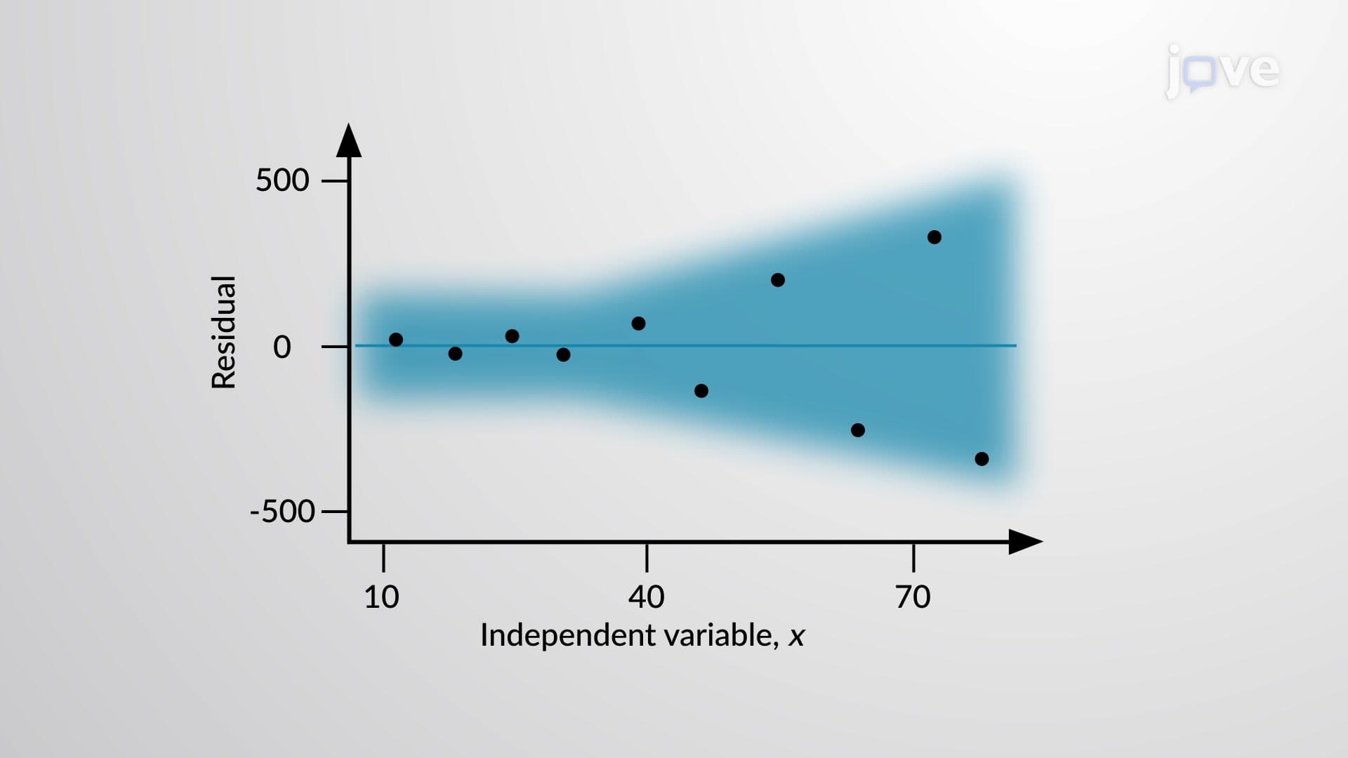

Video Summary: What Is Residual Plots
Ever wonder how economists predict gas prices or airlines set ticket costs? Residual plots reveal whether statistical models like the relationship between crude oil prices and airfare costs actually work in the real world. These diagnostic tools show the difference between predicted and actual values, helping analysts at companies like ExxonMobil determine if their linear regression models accurately capture market trends. Watch the full video on JoVE Coach to master this concept with expert-led visuals and step-by-step explanations.
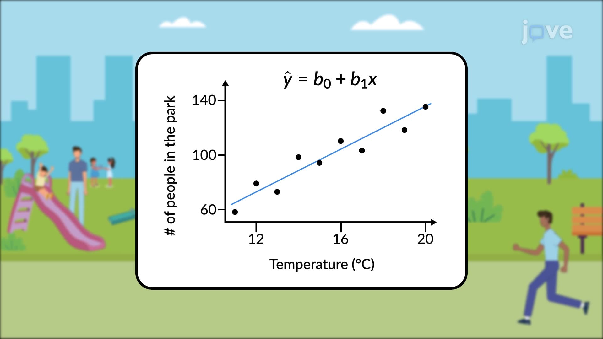
Residual plots serve as essential diagnostic tools that help statisticians, researchers, and students evaluate whether linear regression models accurately represent relationships in data. When you create a scatter plot and fit a regression line through data points, residuals represent the vertical distances between actual data points and the predicted values from your regression equation. By plotting these residuals against the independent variable (x-values), you create a residual plot that reveals crucial information about your model's performance.
Creating effective residual plots requires understanding the mathematical foundation behind residuals. Each residual equals the observed y-value minus the predicted y-value from your regression equation. For example, if the Federal Reserve analyzes the relationship between interest rates and housing prices, they would calculate residuals by subtracting predicted housing prices from actual market values. These residuals then get plotted against interest rates to create the diagnostic plot.
The residual plots definition extends beyond simple calculation to encompass interpretation. A well-constructed residual plot displays residuals on the y-axis and the independent variable on the x-axis, allowing analysts to spot patterns that indicate model inadequacy. This visualization technique proves particularly valuable in AP Statistics courses and college-level econometrics classes.
What is residual plots in detail becomes clear when examining different pattern types. An ideal residual plot shows random scatter around the horizontal line at y = 0, indicating that the linear model captures the relationship appropriately. This random pattern suggests that residuals are independent and identically distributed, meeting key assumptions for linear regression.
However, problematic patterns reveal model deficiencies. Curved patterns in residual plots suggest that the relationship between variables is nonlinear, requiring polynomial regression or other advanced techniques. For instance, when the Department of Agriculture studies crop yields versus fertilizer application, a curved residual pattern might indicate diminishing returns that linear models cannot capture.
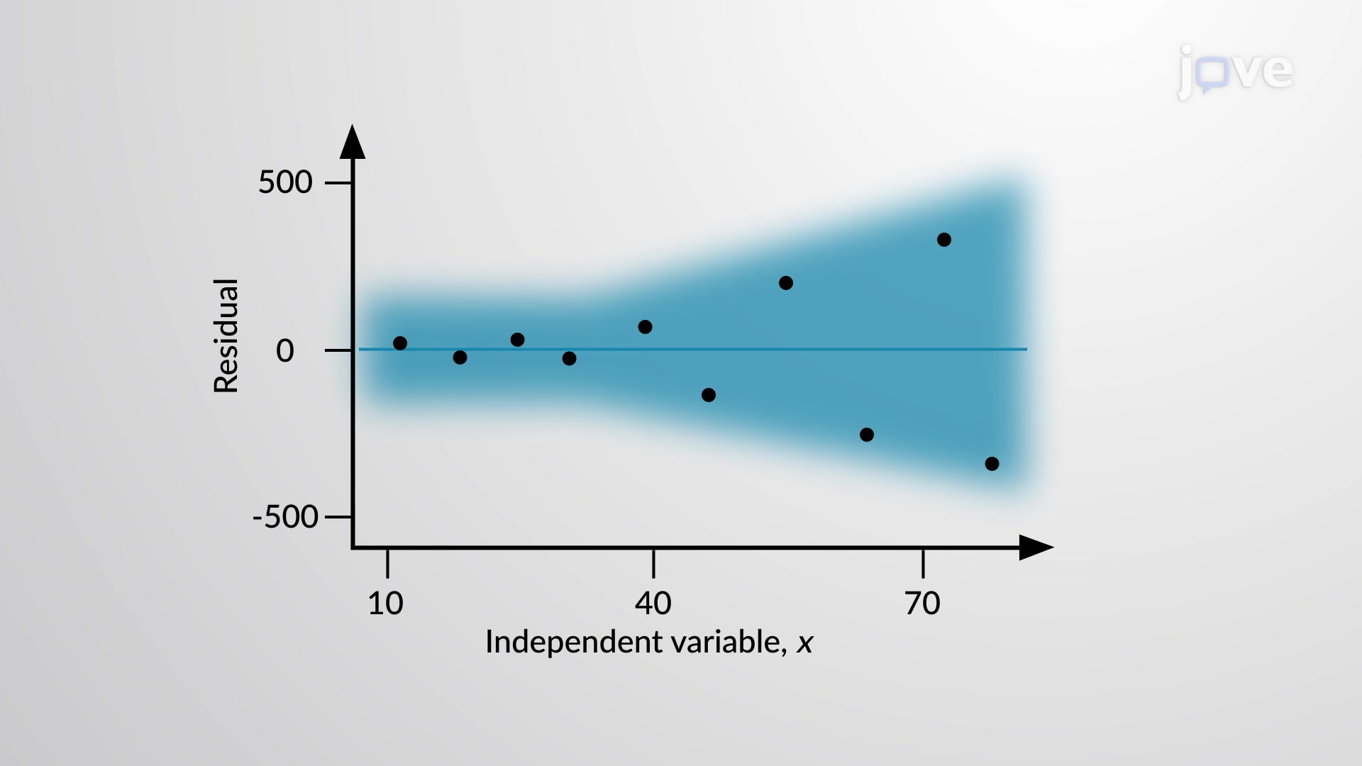
Funnel-shaped patterns, where residuals spread wider at higher x-values, indicate heteroscedasticity, a violation of the constant variance assumption. This pattern frequently appears in economic data, such as income versus spending relationships, where higher-income individuals show greater spending variability.
Residual plots appear frequently in standardized assessments including AP Statistics exams, SAT Subject Tests, and college statistics courses. Students must interpret residual plots to determine model adequacy, making this concept crucial for academic success. The College Board often includes residual plot analysis in free-response questions, requiring students to identify patterns and suggest alternative modeling approaches.
In professional settings, residual plot analysis guides decision-making across industries. Pharmaceutical companies use residual plots when analyzing clinical trial data for FDA submissions, while financial analysts at firms like Goldman Sachs employ these tools to validate risk models. Understanding residual plots empowers students to think critically about statistical models and their limitations, preparing them for advanced coursework in statistics, economics, and data science.
Related Micro-courses