Loading subject page…


13,776 views


Video Summary: Degrees of Elasticity of Demand Graphical Interpretation
Ever wonder why a 10% gas price hike barely reduces consumption, but a similar increase in movie ticket prices sends customers fleeing to streaming services? The degrees elasticity demand: graphical representation reveals this economic mystery through visual demand curves. From Netflix subscriptions (relatively elastic) to insulin for diabetics (perfectly inelastic), understanding Degrees of Elasticity of Demand: Graphical Interpretation helps predict consumer behavior across different markets. Watch the full video on JoVE Coach to master this concept with expert-led visuals and step-by-step explanations.
The degrees elasticity demand: graphical approach transforms abstract economic theory into visual understanding. Unlike mathematical formulas that can intimidate students, demand curve slopes immediately reveal how consumers respond to price changes. This graphical method proves essential for AP Economics students and college undergraduates tackling microeconomics principles.
Perfectly Elastic Demand appears as a horizontal line, representing theoretical scenarios where any price increase eliminates all demand. While rare in reality, this concept helps students understand competitive markets like commodity trading, where identical products from different suppliers create extreme price sensitivity.
Perfectly Inelastic Demand displays as a vertical line, indicating zero quantity response to price changes. Life-saving medications like insulin exemplify this category-diabetic patients require consistent doses regardless of cost fluctuations. Emergency room visits during heart attacks also demonstrate perfectly inelastic demand.
Relatively Elastic Demand shows flatter, downward-sloping curves. Restaurant dining, streaming subscriptions like Netflix, and vacation travel fall here. When Chipotle raises prices 15%, customers easily substitute with Qdoba or home cooking, creating significant quantity decreases.
Relatively Inelastic Demand exhibits steeper downward slopes. Gasoline, electricity, and prescription drugs demonstrate this pattern. Even when gas prices jump from $3.50 to $4.50 per gallon, most Americans continue driving similar distances due to limited short-term alternatives.
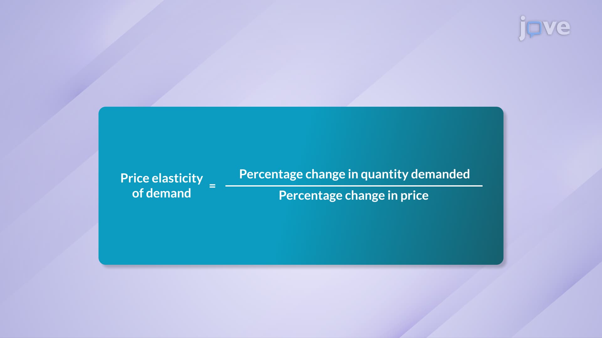
Unitary Elastic Demand creates rectangular hyperbola curves where percentage price changes exactly equal percentage quantity changes. This unique relationship means total revenue remains constant despite price adjustments-a crucial concept for business strategy and AP Economics free-response questions.
Understanding these graphical interpretations proves vital for AP Economics exams, college microeconomics midterms, and business strategy courses. Students frequently encounter questions asking them to sketch demand curves for different products or explain why certain industries can raise prices without losing significant customers.
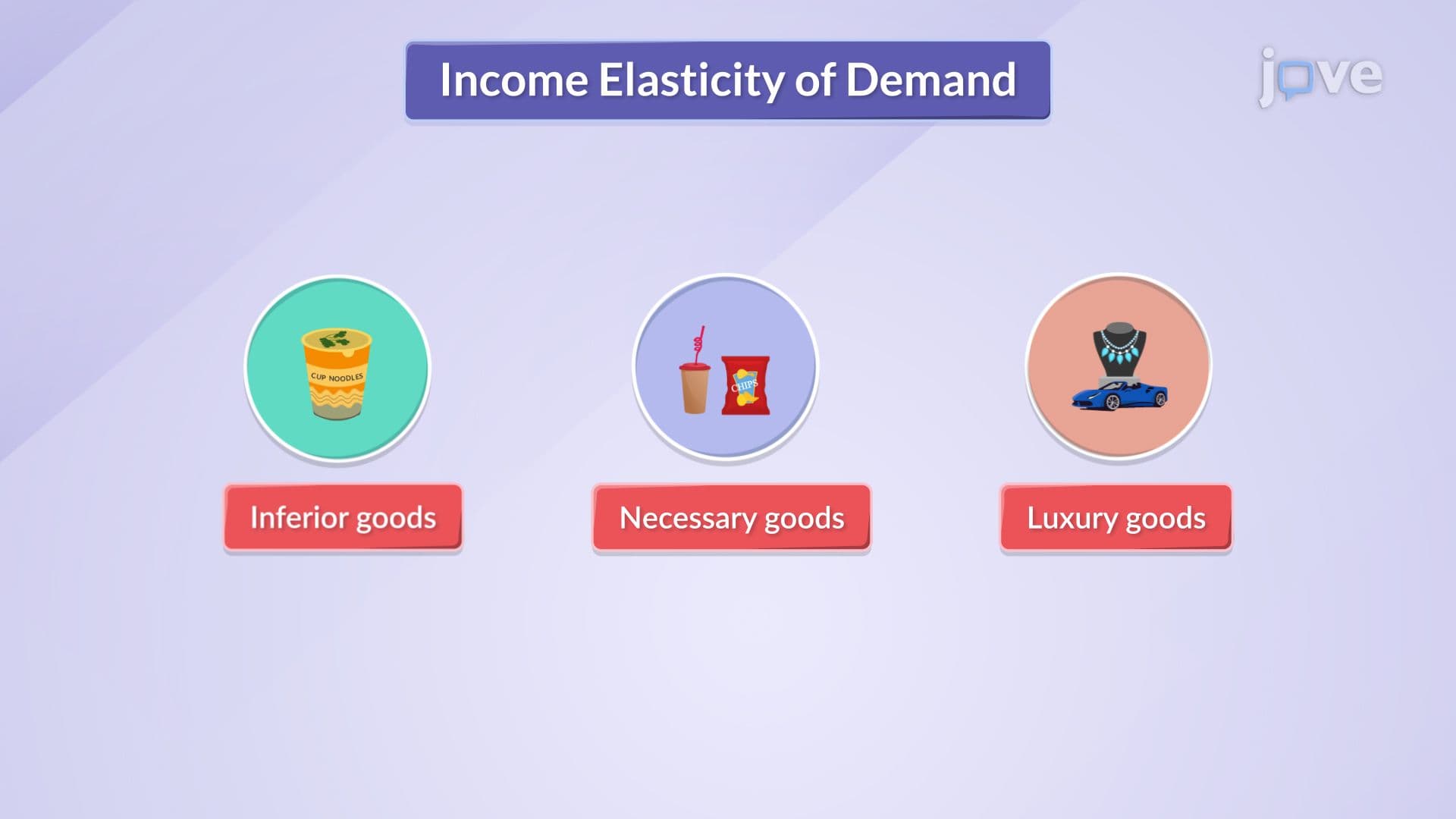
Major retailers like Walmart and Target use elasticity analysis when setting prices across product categories. Luxury items receive different pricing strategies than household necessities because their demand curves exhibit different elasticity degrees. This practical application connects classroom theory to real business decisions affecting millions of consumers daily.
Related Micro-courses