Loading video…

 14 Concepts
 173.2K views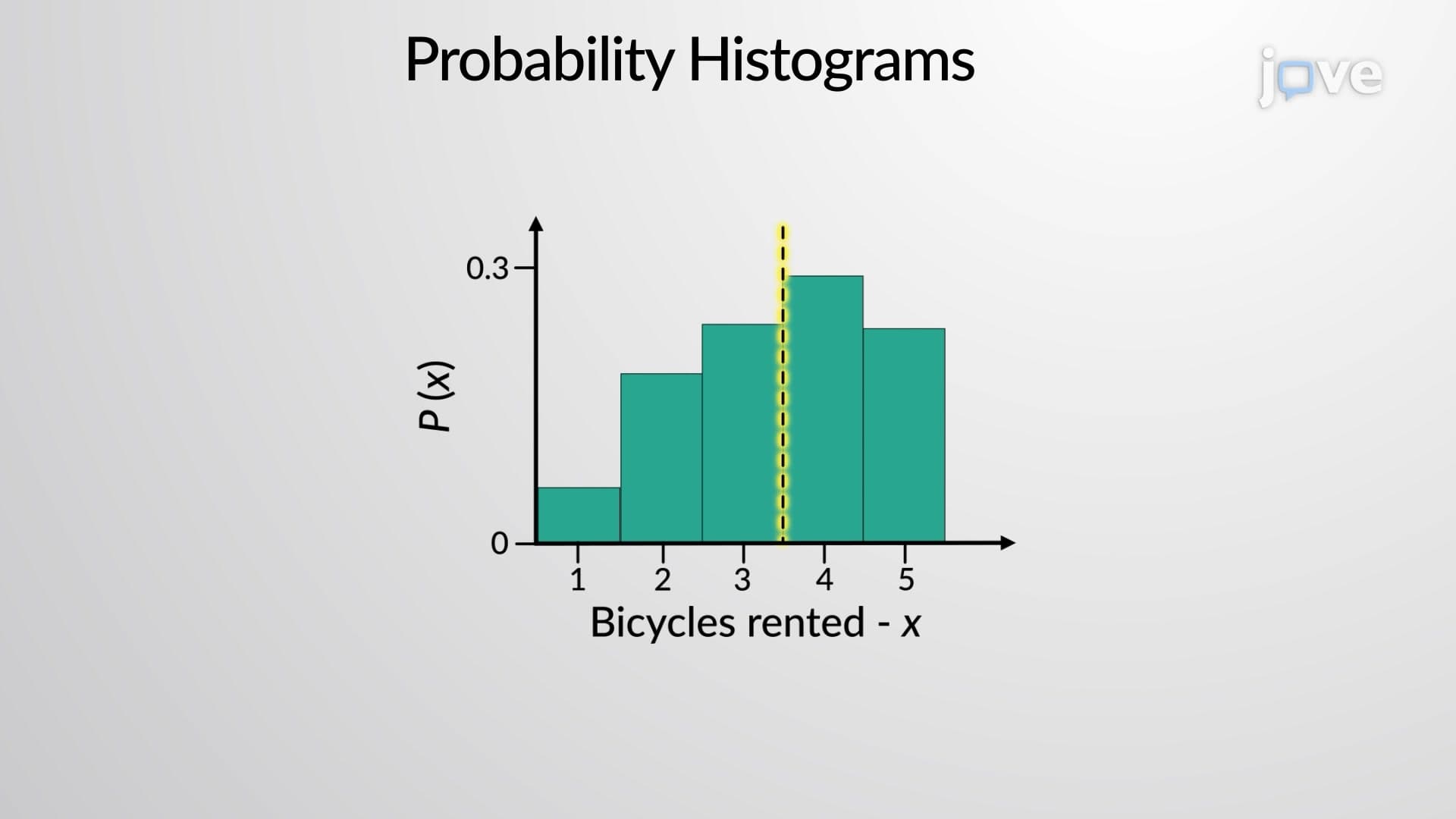

Video Summary: What Is Probability Histograms
Did you know that the TSA processes over 2.9 million passengers daily, and probability histograms help predict security checkpoint wait times? Probability histograms transform complex statistical data into visual representations, making it easier to understand how likely different outcomes are in real situations. For instance, analyzing carpool occupancy rates reveals patterns that simple tables cannot convey effectively. Watch the full video on JoVE Coach to master this concept with expert-led visuals and step-by-step explanations.
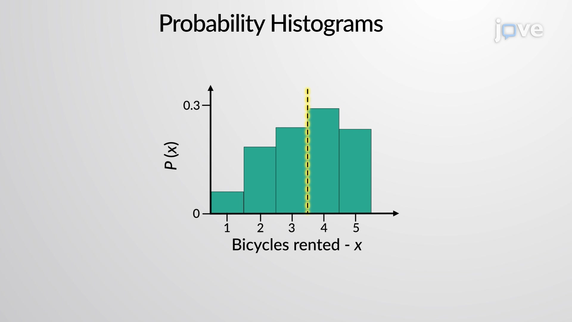
Probability histograms serve as powerful visual tools that transform abstract statistical concepts into comprehensible graphical representations. Unlike regular histograms that display frequency counts, probability histograms plot the likelihood of specific outcomes occurring. Each rectangular bar represents a possible value of a random variable on the x-axis, while the corresponding probability appears on the y-axis.
The construction of probability histograms follows specific mathematical principles. When each bar maintains unit width, the area of each rectangle directly equals the probability of that outcome. This relationship makes probability histograms particularly valuable for visual learners who struggle with tabular data interpretation. For example, analyzing SAT score distributions across different demographic groups becomes much clearer when presented as probability histograms rather than numerical tables.
Probability histograms enable direct calculation of important statistical measures. The mean (expected value) emerges by multiplying each x-value by its corresponding probability and summing these products. Variance calculation involves multiplying the squared deviation of each x-value from the mean by its probability, then summing these results. The standard deviation simply represents the square root of the variance, providing insight into data spread.
In practice, probability histograms appear frequently in business analytics, quality control, and risk assessment. Insurance companies use them to model claim frequencies, while manufacturing firms analyze defect rates. For students preparing for AP Statistics or college-level statistics courses, mastering probability histograms proves essential for success on exams and future coursework. These visualizations frequently appear on standardized tests, making comprehension crucial for academic achievement.
The transition from discrete to continuous probability distributions also relies heavily on histogram interpretation. Students who understand probability histograms find it easier to grasp concepts like normal distributions and confidence intervals in advanced statistics courses.
Related Micro-courses