Loading…
Loading video…
15,481 views

Ever wonder how doctors determine if a COVID-19 rapid test is actually reliable? A receiver operating characteristic plot is a powerful statistical graph that measures how well diagnostic tests distinguish between healthy and sick patients. The U.S. FDA uses ROC curves to evaluate everything from mammography screening tools to pregnancy tests before approving them for clinical use. This essential biostatistics concept helps medical professionals balance test sensitivity with specificity to minimize both false positives and false negatives. Watch the full video on JoVE Coach to master this concept with expert-led visuals and step-by-step explanations.
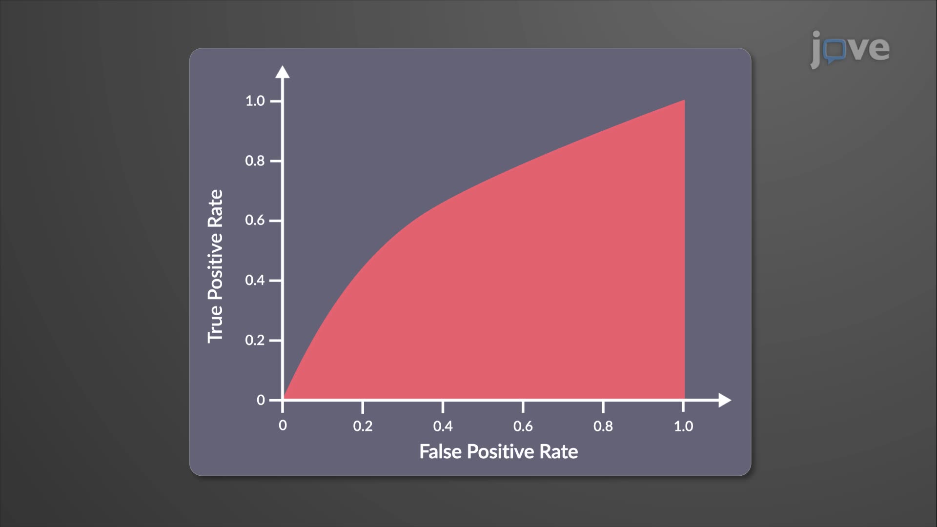
A receiver operating characteristic plot serves as a critical tool in medical statistics and diagnostic testing, originally developed during World War II for radar signal detection. This graphical representation plots the true positive rate (sensitivity) against the false positive rate (1-specificity) across various threshold settings, creating a curve that reveals a test's discriminatory power.
The receiver operating characteristic plot definition encompasses its role as a performance measurement tool that helps clinicians and researchers evaluate how well a diagnostic test separates diseased from non-diseased individuals. Unlike simple accuracy measurements, ROC curves provide comprehensive insights into test behavior across all possible decision thresholds.
When examining what is receiver operating characteristic plot in detail, three key elements emerge: the diagonal reference line, the ROC curve itself, and the area under the curve (AUC). The diagonal line represents random chance performance (AUC = 0.5), where a test performs no better than flipping a coin. Effective diagnostic tests produce curves that bow toward the upper-left corner, maximizing sensitivity while minimizing false positives.
The AUC quantifies overall test performance, with values approaching 1.0 indicating excellent diagnostic accuracy. For instance, the Pap smear for cervical cancer screening typically achieves an AUC of 0.85-0.90, while cardiac troponin tests for heart attack diagnosis often exceed 0.95. These metrics help the FDA and medical professionals determine which tests merit clinical implementation.
Understanding receiver operating characteristic plot concepts proves essential for optimizing diagnostic strategies in U.S. healthcare systems. Emergency departments at institutions like Johns Hopkins and Mayo Clinic rely on ROC analysis to establish decision thresholds for conditions ranging from pulmonary embolism to sepsis. The optimal threshold depends on clinical consequences: cancer screening tests typically favor high sensitivity to minimize missed cases, while confirmatory tests prioritize high specificity to reduce unnecessary treatments.
ROC curves feature prominently in standardized examinations including the MCAT, USMLE Step 1, and AP Statistics. College biostatistics courses at universities like UCLA and University of Michigan emphasize ROC interpretation as fundamental to evidence-based medicine. Students encounter these concepts in epidemiology, clinical research methods, and healthcare quality assessment coursework, making mastery essential for pre-med and public health career tracks.
Frequently Asked Questions
A receiver operating characteristic plot is a graph that evaluates diagnostic test performance by plotting sensitivity against 1-specificity across different thresholds. It's crucial because it helps medical professionals determine how well a test distinguishes between healthy and sick patients, guiding clinical decision-making and FDA approval processes for medical devices.
ROC curves commonly appear in MCAT psychology and biology sections, testing your ability to interpret diagnostic accuracy and research validity. You'll encounter questions about AUC interpretation, threshold selection, and comparing test effectiveness. USMLE Step 1 also includes ROC analysis in epidemiology and biostatistics sections.
The area under the curve (AUC) quantifies overall diagnostic accuracy, ranging from 0.5 (random chance) to 1.0 (perfect discrimination). An AUC of 0.7-0.8 indicates acceptable performance, 0.8-0.9 represents good performance, and above 0.9 suggests excellent diagnostic capability for clinical use.
The CDC uses ROC curves to evaluate COVID-19 rapid antigen tests, comparing their performance against PCR gold standards. For instance, the BinaxNOW test demonstrates different sensitivity and specificity values depending on symptom onset, with ROC analysis helping determine optimal testing strategies for schools and workplaces.
No advanced statistics background is required for basic ROC interpretation. High school students can grasp core concepts with algebra and basic probability understanding. The visual nature of ROC curves makes them accessible, though deeper statistical analysis requires college-level biostatistics knowledge.
Focus on understanding sensitivity, specificity, and their relationship to true/false positives and negatives. Practice interpreting AUC values and comparing multiple ROC curves. Khan Academy and college prep resources offer excellent practice problems, and reviewing FDA medical device approval examples reinforces practical applications.
ROC plots reveal test performance across all possible thresholds, showing the trade-off between sensitivity and specificity that simple accuracy masks. This comprehensive view helps clinicians select optimal decision points based on clinical consequences, whether prioritizing early detection or minimizing false alarms.
Consider studying multi-class ROC analysis, cost-sensitive learning, and Youden's index for optimal threshold selection. Advanced students might explore ROC regression, time-dependent ROC curves for survival analysis, and machine learning applications in diagnostic test development used by companies like IBM Watson Health.
Related Micro-courses
Related Subjects


