Loading video…

 16 Concepts
 15.9K views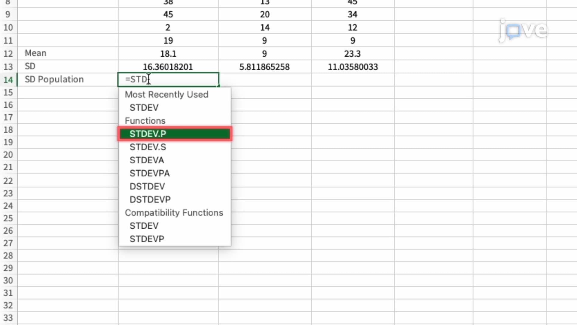

Video Summary: Microsoft Excel Plotting Mean Sd Explained
Ever wondered how clinical researchers at Johns Hopkins visualize patient recovery data with precision? Microsoft Excel plotting mean sd transforms raw datasets into compelling visual stories that reveal hidden patterns in everything from SAT scores to medical trials. This powerful technique combines statistical calculations-means, standard deviations, and standard errors-with Excel's charting capabilities to create professional error bar visualizations that communicate data uncertainty effectively. Watch the full video on JoVE Coach to master this concept with expert-led visuals and step-by-step explanations.
Microsoft Excel plotting mean sd represents a cornerstone skill for students entering STEM fields, business analytics, or healthcare professions. This technique bridges descriptive statistics with data visualization, enabling users to communicate both central tendency and data variability in a single, compelling chart. Whether you're analyzing AP Biology lab results or preparing economics data for college coursework, mastering these Excel functions provides a competitive advantage in academic and professional settings.
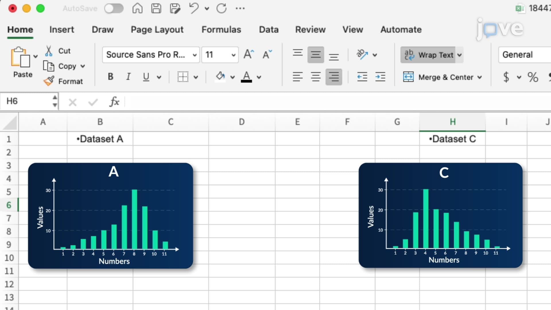
The process begins with proper data organization. Excel requires clean, column-based datasets where each column represents a distinct group or condition. For instance, a psychology student might organize reaction time data from three different experimental conditions, while a business student could compare quarterly sales performance across regional offices. This structured approach ensures accurate calculations and meaningful visualizations.
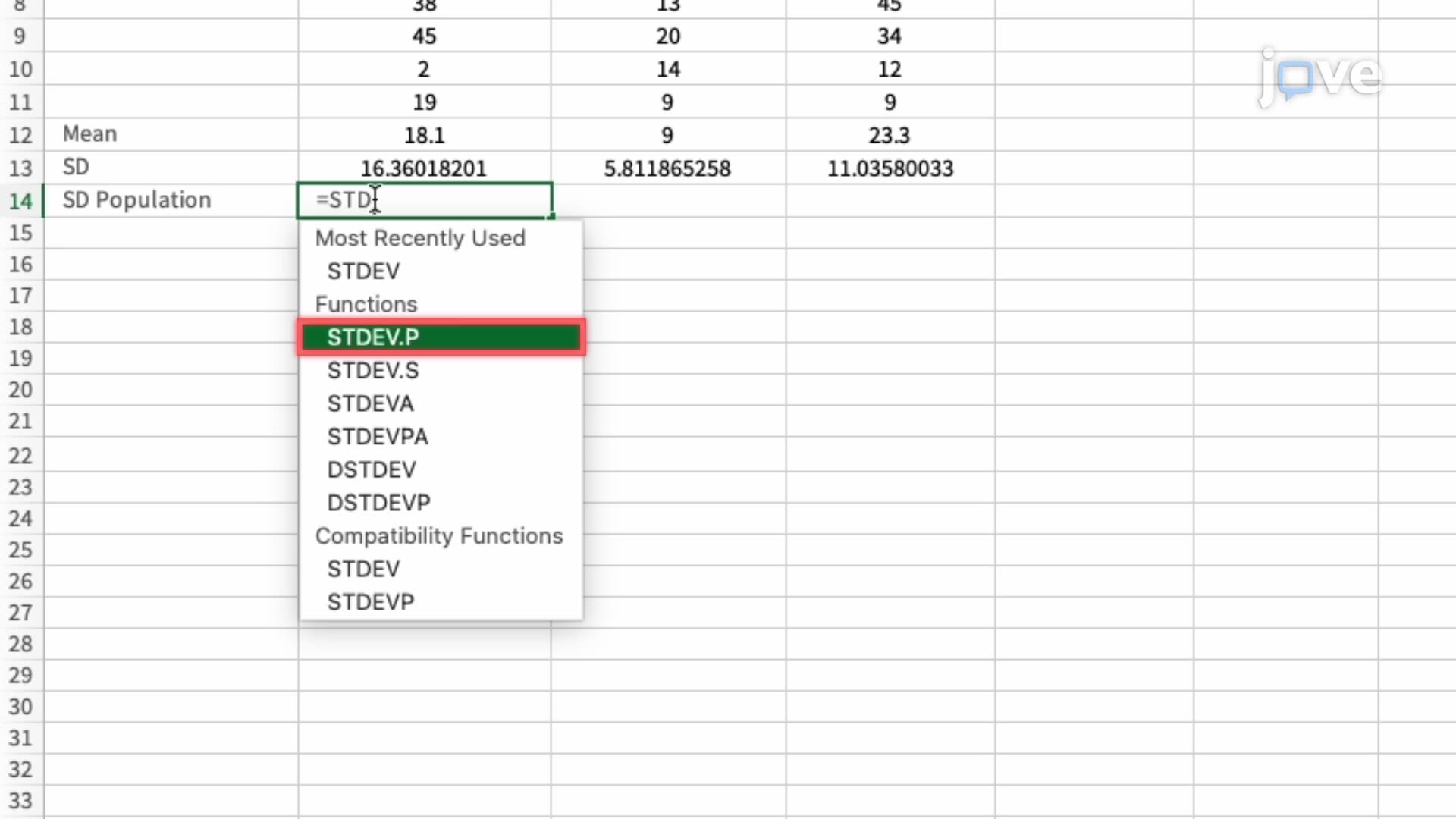
The AVERAGE function serves as your primary tool for calculating arithmetic means across dataset ranges. However, the distinction between STDEV.S and STDEV.P functions often confuses students preparing for AP Statistics or college-level research methods courses. STDEV.S calculates sample standard deviation, appropriate when analyzing data that represents a subset of a larger population-the most common scenario in educational and research contexts. Conversely, STDEV.P applies only when your dataset includes the entire population, a rare occurrence in practical applications.
Standard error calculation requires dividing the sample standard deviation by the square root of the sample size. This metric proves crucial for understanding data precision and forms the foundation for confidence intervals and hypothesis testing concepts encountered in advanced statistics courses. Students planning to take the MCAT or pursue graduate studies in psychology, biology, or economics will encounter these concepts repeatedly.
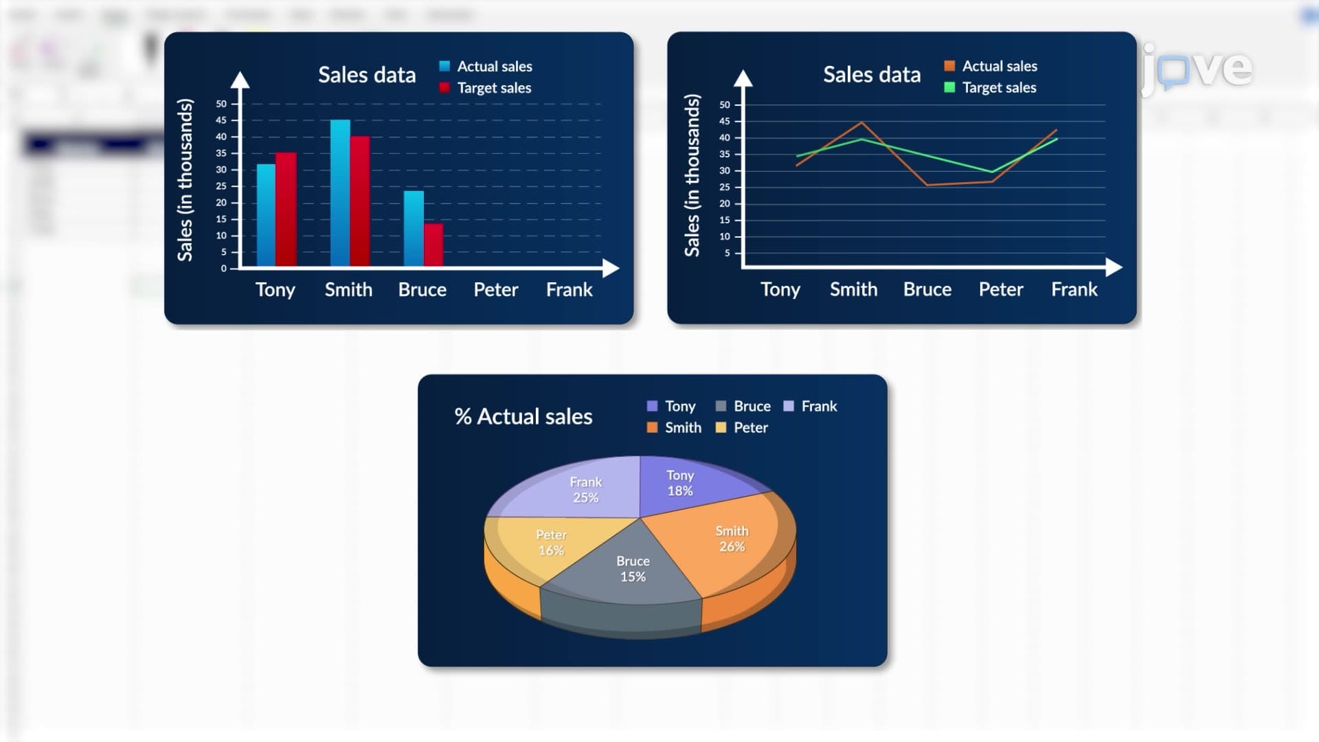
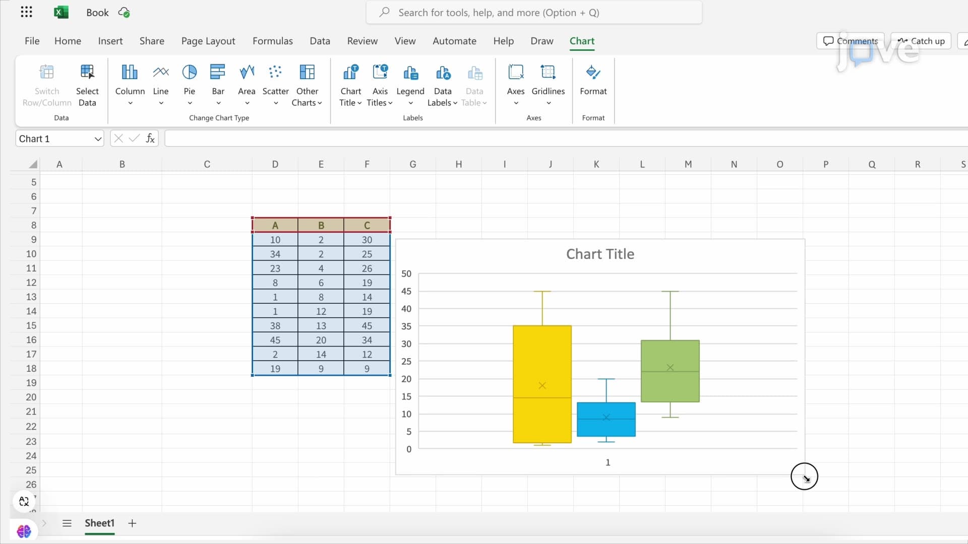
Excel's Insert Chart functionality transforms calculated statistics into professional visualizations suitable for academic presentations or internship reports. Bar charts typically provide the clearest representation of group means, while error bars communicate data variability effectively. The customization process involves selecting appropriate error bar types-standard deviation shows data spread, while standard error indicates mean precision.
Real-world applications span numerous disciplines. Pre-med students might visualize drug efficacy across treatment groups, business majors could display customer satisfaction scores across product lines, and environmental science students often chart pollution measurements across sampling sites. These skills directly transfer to laboratory courses, capstone projects, and entry-level research positions at institutions like the CDC or EPA.
Related Micro-courses