Loading video…


 16 Concepts
 15.9K views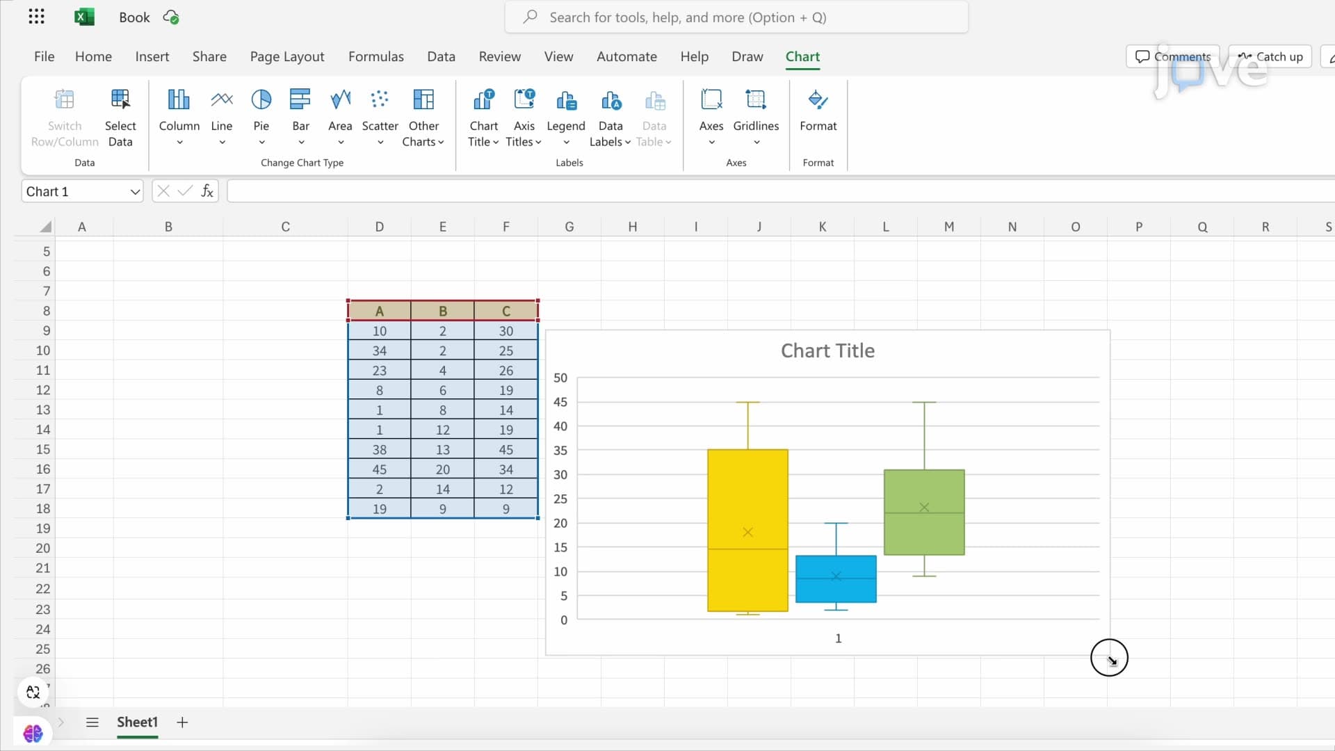

Video Summary: Microsoft Excel Median Quartile Range Explained
Did you know that Fortune 500 companies rely on quartile analysis to evaluate employee performance and set salary benchmarks? Microsoft Excel median quartile range analysis transforms raw datasets into meaningful insights through statistical visualization. When analyzing SAT score distributions across US high schools, understanding Microsoft Excel Median Quartile Range Explained becomes essential for identifying performance patterns and outliers. This powerful combination of median calculations, quartile functions, and box plot visualization helps students and professionals make data-driven decisions. Watch the full video on JoVE Coach to master this concept with expert-led visuals and step-by-step explanations.
Microsoft Excel median quartile range analysis forms the foundation of descriptive statistics, enabling users to summarize large datasets through five key values: minimum, first quartile (Q1), median (Q2), third quartile (Q3), and maximum. This statistical approach proves invaluable for analyzing everything from AP exam scores to college admission data across US institutions.
The median represents the middle value when data points are arranged in ascending order, effectively dividing the dataset into two equal halves. Excel's MEDIAN function automatically calculates this central tendency measure, providing a robust alternative to the arithmetic mean that remains unaffected by extreme outliers.
Excel offers two distinct quartile calculation methods through QUARTILE.EXC and QUARTILE.INC functions. The QUARTILE.EXC function excludes endpoints, using only internal data points to determine quartile positions. This method aligns with exclusive quartile definitions commonly taught in AP Statistics and introductory college statistics courses.
Conversely, QUARTILE.INC includes the entire dataset range, accepting parameters 0 through 4 to return minimum, Q1, median, Q3, and maximum values respectively. This inclusive approach often appears in standardized test prep materials and business analytics applications where comprehensive data representation matters.
Box and whisker plots translate quartile calculations into visual representations that immediately reveal data distribution characteristics. The central box spans from Q1 to Q3, representing the interquartile range (IQR) containing 50% of all data points. The median line within this box shows central tendency, while whiskers extend to minimum and maximum values.
US college admissions offices frequently use box plots to analyze SAT score distributions across different demographic groups or geographic regions. Similarly, healthcare researchers employ these visualizations to study treatment effectiveness across patient populations, making quartile range analysis essential for pre-med students preparing for MCAT statistical reasoning sections.
Understanding quartile range analysis proves crucial for students planning careers in data science, business analytics, or academic research. Major US corporations like Amazon and Google use these statistical measures to evaluate employee performance distributions and set compensation benchmarks across different job levels and geographic markets.
In academic contexts, professors analyzing exam score distributions rely on quartile calculations to identify students who may need additional support or advanced challenges. This application directly connects to classroom assessment strategies and helps educators make informed decisions about curriculum pacing and intervention strategies.
Related Micro-courses