Loading video…


 16 Concepts
 15.9K views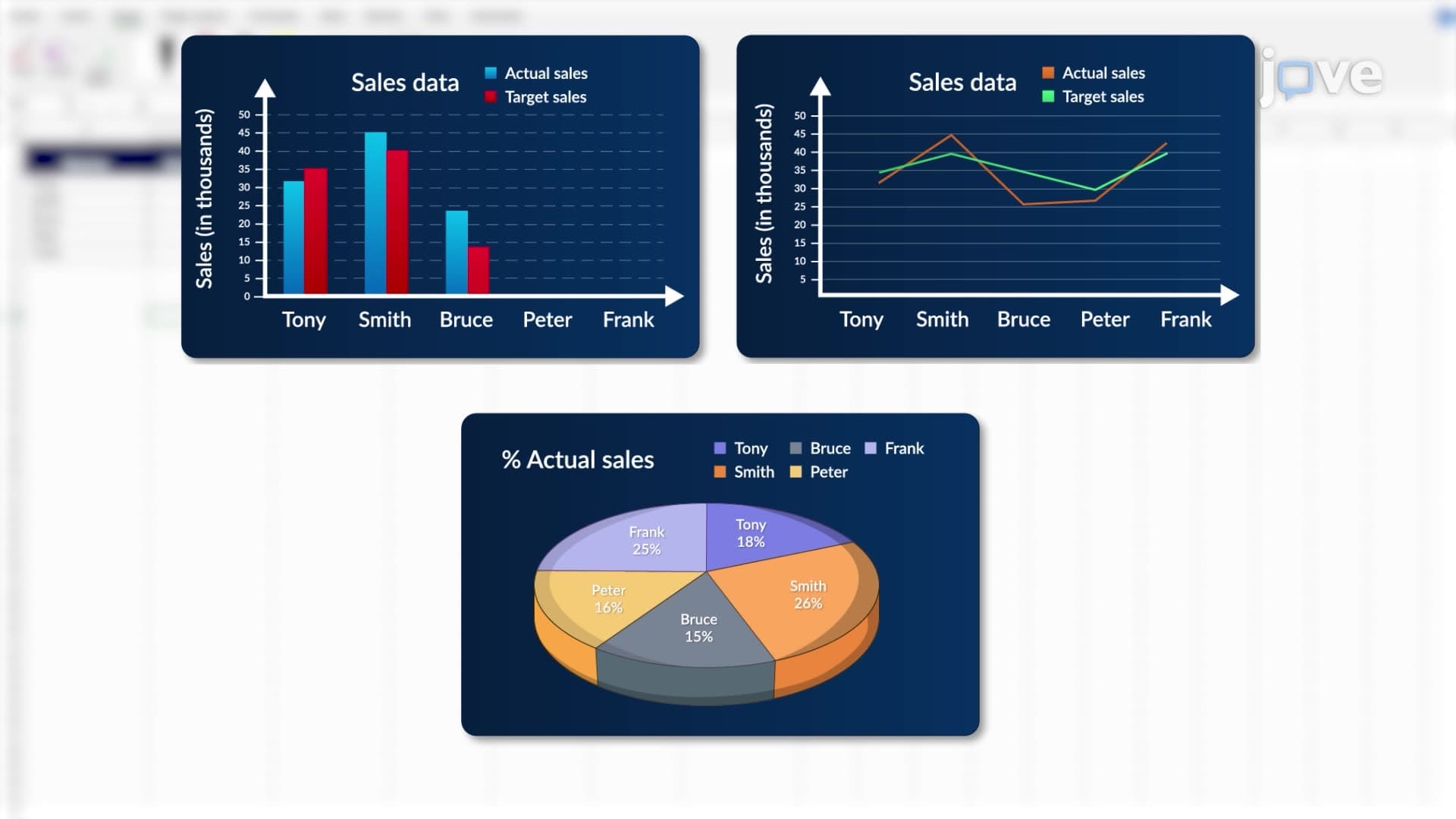

Video Summary: Overview of Microsoft Excel as Explained
Did you know that 89% of Fortune 500 companies rely on Microsoft Excel for critical business decisions? An overview of Microsoft Excel as a comprehensive data analysis tool reveals its power to transform raw numbers into actionable insights through spreadsheet organization, statistical functions, and dynamic visualizations. From analyzing stock market trends on Wall Street to tracking patient outcomes at Mayo Clinic, Excel's user-friendly interface makes complex data manipulation accessible across business, healthcare, and academic sectors. Watch the full video on JoVE Coach to master this concept with expert-led visuals and step-by-step explanations.
Microsoft Excel stands as one of the most influential data analysis tools in modern academia and industry, transforming how we approach statistical computation and data interpretation. This spreadsheet application revolutionizes data management through its intuitive grid-based structure, where information flows seamlessly across rows and columns, creating a foundation for sophisticated analytical processes.
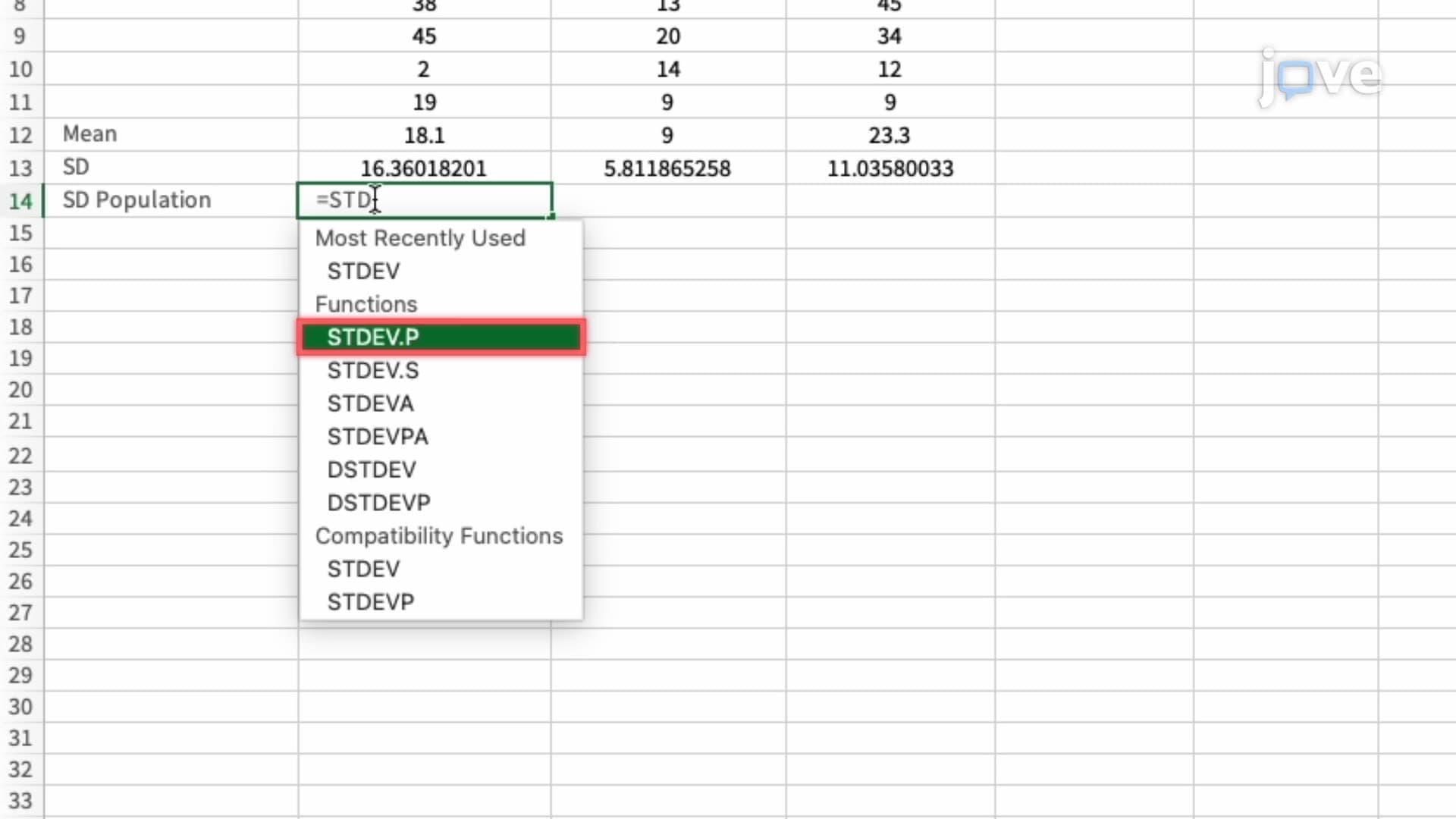
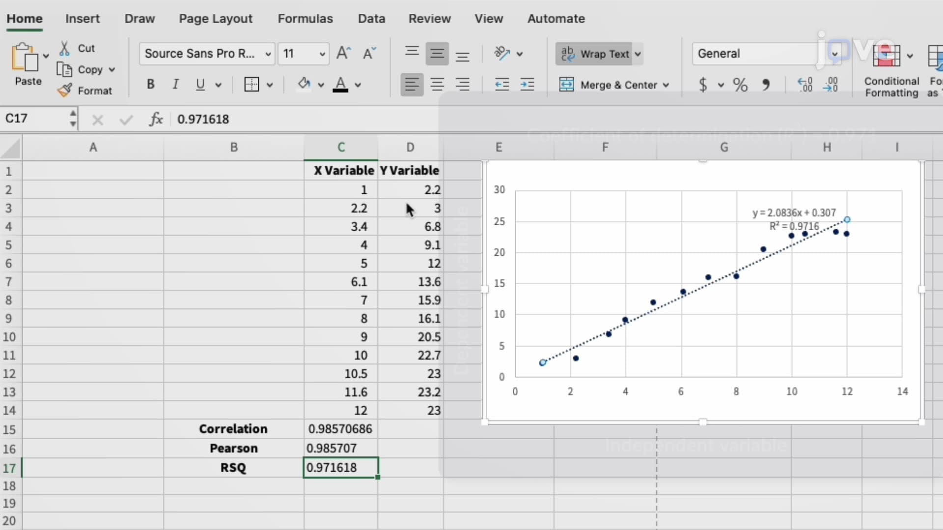
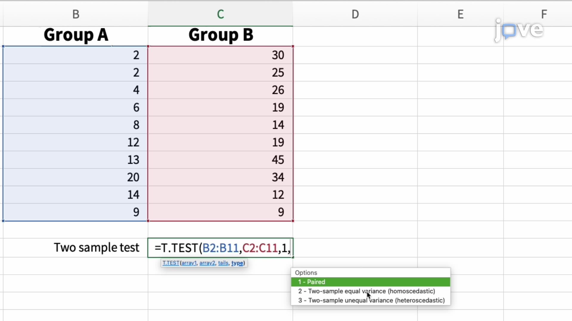
Excel's statistical arsenal extends far beyond basic arithmetic operations. The software incorporates comprehensive descriptive statistics functions including mean, median, mode, standard deviation, and variance calculations. For students preparing for AP Statistics or college-level statistics courses, Excel provides hands-on experience with hypothesis testing procedures, regression analysis, and correlation studies. Advanced functions like T.TEST, CORREL, and LINEST enable students to conduct legitimate statistical research comparable to specialized software packages.
The Analysis ToolPak add-in significantly expands Excel's analytical reach, offering tools for ANOVA, regression analysis, sampling, and descriptive statistics generation. Students can perform t-tests for comparing means, chi-square tests for independence, and F-tests for variance comparison-all essential components of standardized tests like the AP Statistics exam and college statistics coursework.
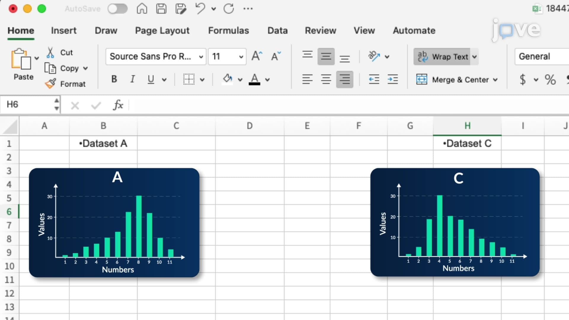
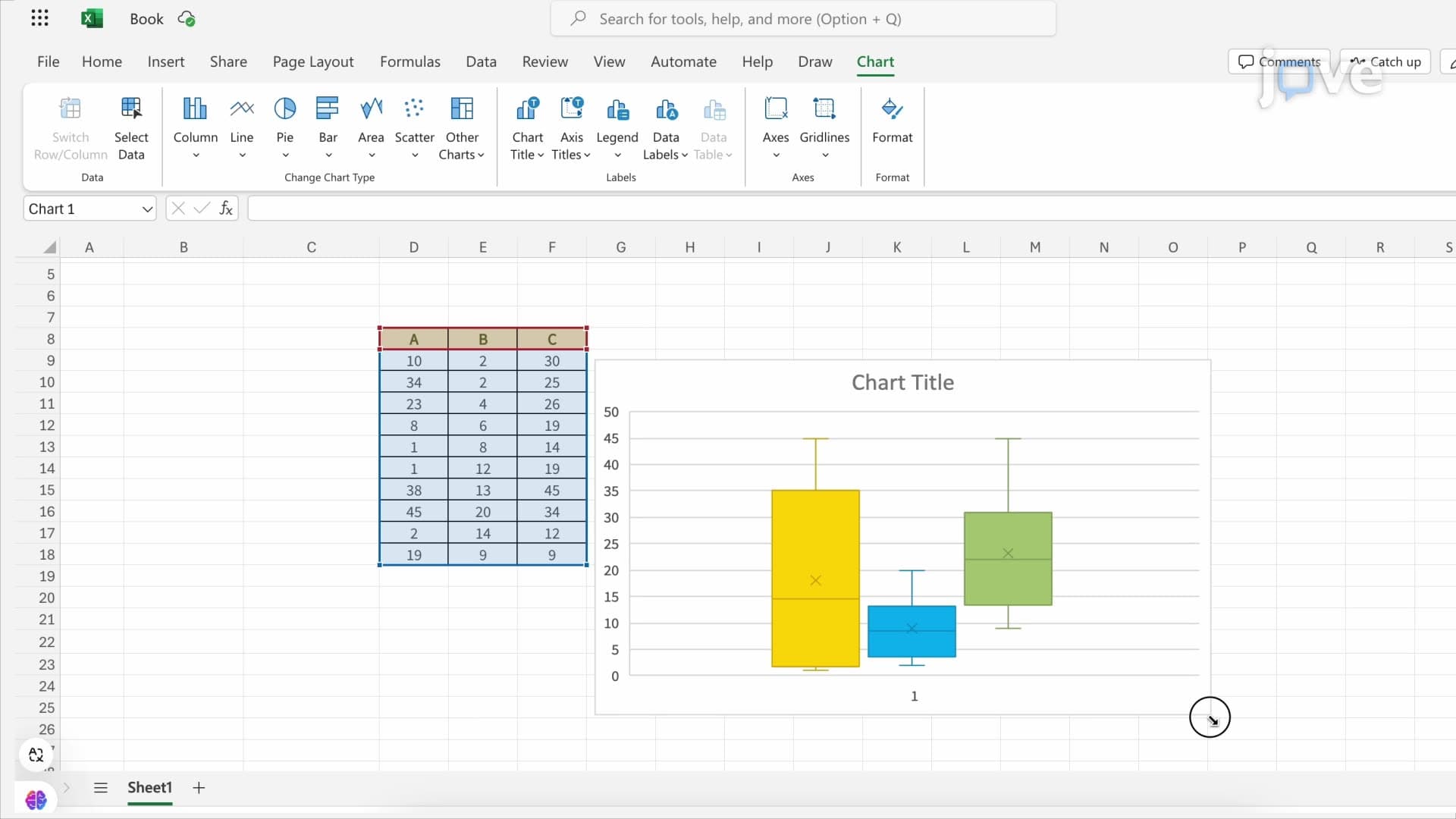
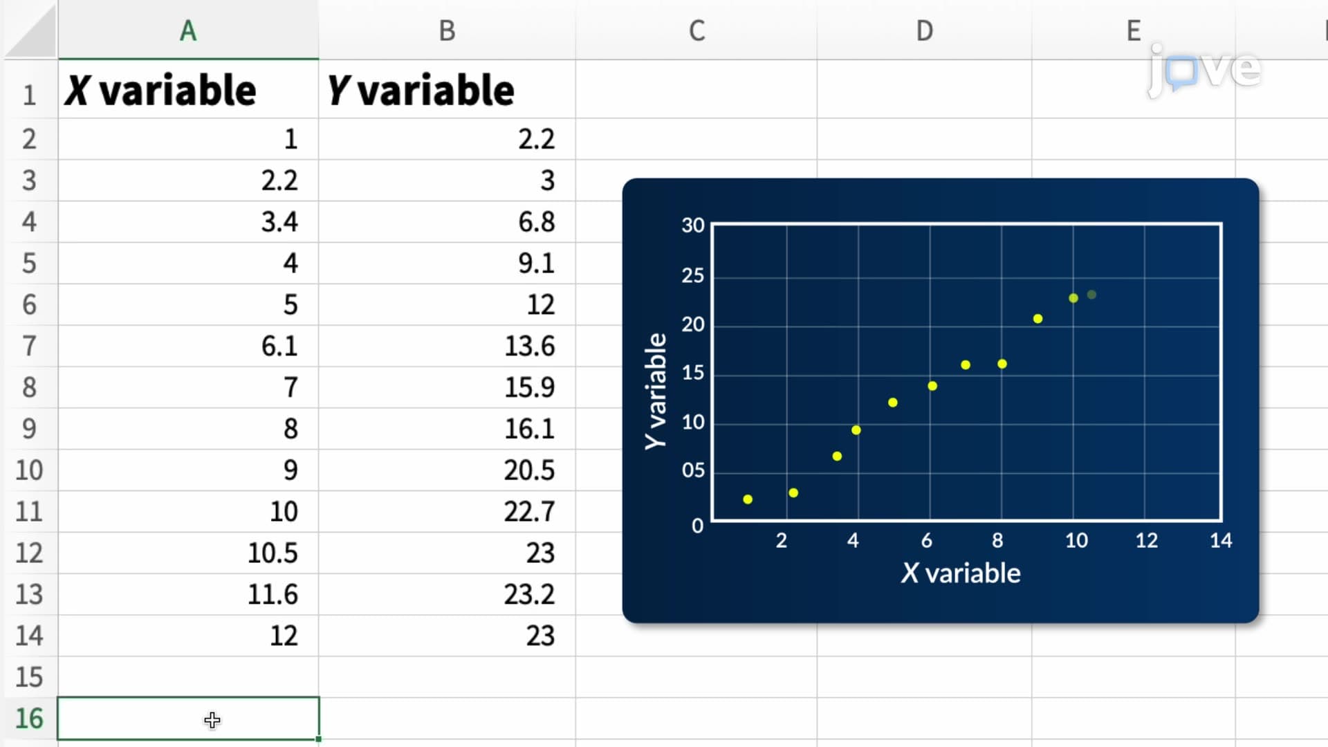
Excel's visualization capabilities transform abstract numerical data into compelling visual narratives. Chart types including histograms, scatter plots, box plots, and regression lines help students understand statistical concepts visually-a crucial skill for SAT Math Level 2 and college statistics exams. Pivot tables revolutionize large dataset analysis, enabling dynamic data summarization and cross-tabulation analysis essential for business statistics applications.
Real-world applications demonstrate Excel's practical value: investment firms use Excel for portfolio analysis, hospitals track patient outcomes through statistical dashboards, and academic researchers conduct preliminary data analysis before transitioning to specialized statistical software. These applications directly connect classroom learning to professional practice.
In academic settings, Excel bridges theoretical statistical concepts with practical implementation. Students can verify hand-calculated statistics homework using Excel's built-in functions, creating confidence in both manual computation and software-based analysis. This dual proficiency proves invaluable in college statistics courses, where professors often require both analytical understanding and technological competency.
Excel's accessibility makes it an ideal learning platform for introductory statistics concepts, while its advanced features support sophisticated analyses comparable to dedicated statistical software, preparing students for advanced coursework and professional applications.
Related Micro-courses